
Open Up the Quick Start Tutorial
Jump To
Here is the page’s table of contents. If you get lost, then just hit the back to top button then the scroll down button—your cursor will be right over the top of it—then you can scroll to where you want to go from here.
- You DON”T Need to Know All of This
- Customizer & Pages
- Menus
- Header Space (Featured Media)
***like at the top of this page*** - Excerpts
- Finding Images and Videos
- WooCommerce
- Page Builders
- Common Problems with Simple Solutions
- Advanced Topics
- Forum
Keeping It as Simple as Possible
The Big Scene theme was built with the belief that there are many WordPress users that want a theme that gives them options, but they don’t want a theme that makes them take responsibility for every decision. With that in mind the Big Scene theme was built by attempting to create a theme that could be modified by offering solid default settings and high impact choices. The following instructions page should not be considered mandatory reading. It should be treated as a reference. You should only feel obligated to read the sections of the instructions that you are likely to use. Many users will find that they can build their entire site by just opening the customizer and following the instructions for the controls they need. However, if you only read one section of these sections, I highly recommend the Gutenberg Block Extensions section. If you have any problems, then feel free to contact me.
Customizer
Most of what you’ll need to do to set up your WordPress site is in the customizer. It is broken down into eleven sections:
- Site Identity
- Navigation
- Layout
- Colors
- Typography
- Homepage Header Media
- Background Media
- Menus
- Widgets
- Homepage Settings
- Additional CSS
There are instructions for each control written directly into the customizer, so if you want to change something in the future, you won’t have to go looking all over the place for what to do.
Pages
Pages have been set up so that when you add new blocks, you should usually be able leave the options in the default settings so that you can push out your content as fast as possible. Every attempt is made to keep up with the latest WordPress updates, and every attempt is made to try keep styling options strict in anticipation of user mistakes and to compensate for existing content being imported to this theme.
Menus
There are two ways to add menus. You can add one through the main admin page, but the simplest way to add menus is to do it through the customizer. First, you will go to the menu option in the customizer and click “Create New Menu”. You will need to create a unique menu for each area where you want a menu to appear when it is being featured on a large screen, but you are not required to place a menu in every area. Once you have created your menus, you can back out to the main customizer page, then go to the menu option, then select “View All Locations”. From each dropdown you can choose which menu you want to add to each area. When the primary and sidebar menus are featured on a small screens, they will automatically be relocated into the slide panel.
Gutenberg Block Extensions:
Add Unique Header and Background Media
to Individual Pages and Posts
Preface
If you aren’t ready to add featured media yet, you can reduce the header featured media area in the customizer by selecting Layout > Highlight Featured Media > Off.
Basics
Gutenberg styling options have been added to video blocks, image blocks, and featured image blocks.
Featured Video
WordPress doesn’t have a true featured video option, but the Big Scene theme provides a high quality substitute. When you add a video block, you are given an extra styling option labeled featured. If you select this, then the video will disappear from the body of the page, and be reset into the background so that it can be fully displayed at the top of the page. You can also add this video to your excerpts which is explained in the excerpt section below.
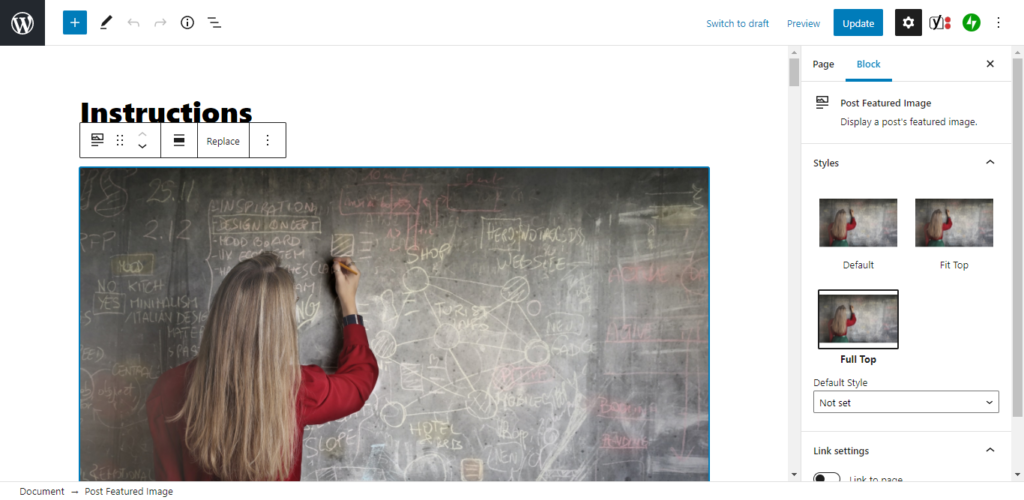
Featured Image
If you have already used featured images by using the classic method for adding one, then the Big Scene theme will set the images for you. However, if you use the new featured image block, then you will be given additional options. Each featured image block has two new styling options which you can access in the right hand settings panel under the block tab. The first option is Fit Top. This will remove the featured image from the body then set the featured image into the background so that it can be displayed at the top of the page. It is set as large as your user’s monitor will allow without going outside of the screen. The second option is full top. This fills the image into the entire screen while pushing as little of the image off of the screen as possible.
Block Images
The featured image styling options are also available for block images.
Excerpts
The Big Scene theme automatically creates excerpts for you. And If you use a featured image, then it will automatically add that to the excerpt as well. You also have the option of creating a custom excerpt. Under the post tab in the right hand setting options, there is a section labeled Excerpt. There are many ways that you can fill this in.
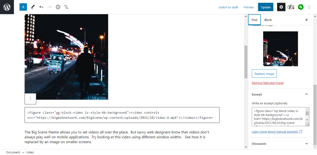
If you want to create a video excerpt, I recommend clicking on the video block, then selecting the three dots on the right of the options panel above the block, then select edit as html—make sure you select featured first in the block styling options. Copy and paste the html then put it in the excerpt, then copy and paste or write whatever you want written beneath it. And if you are familiar with html, you can also wrap the video block in an anchor to your post.
If you do this with a featured image attached to your post, then the featured image will replace the video on small screens. If you don’t use a featured image, then the video will always display. If you don’t add a video to the custom excerpt and you use a featured image, then the featured image will always be featured in the excerpt; and on the main page for that post, it will replace the featured video on small screens.
A Note on featured videos, excerpts, and the query loop block.
TL;DR: If you add a featured video in an excerpt, then you may have issues if you also use an excerpt in a query loop block or a latest posts block on a single page or post that displays featured media in the header area.
Featured videos were designed prior to the creation of the query loop block. Back then, excerpts were segregated to certain pages of the site. Now, with the addition of the query loop block and an updated latest posts block, excerpts can be featured anywhere. This can be problematic when you have both a featured video and a featured image present on a single page or post. Although I have done my best to try turn off the display of featured videos when they are inappropriately placed, some compatibility issues seem unavoidable.
In particular, sometimes, if you have a page that displays a featured image in the header area (single pages and posts), then the presence of a featured video will tell the theme to try to display it in the header area on wide screens. I would like to come up with a permanent solution to this problem that doesn’t require you to show concern for how to place this media, but the problem doesn’t seem to reproduce with consistency, so it is hard to test and resolve. It may depend on which version of WordPress is being used or if you’re using the most updated version of the blocks that I referenced.
If you use the above referenced combination, then you should definitely preview and test your page or post before publication.
If you have any issues with these features, then please report them in the discussions area.
Finding Images and Videos
If you don’t have any images or videos, you should consider getting some for your site. You can find tons of great free images and videos using the following sites:
WooCommerce
WooCommerce is designed to be compatible with every theme. However, the Big Scene theme was designed for versatility and extensibility, so it may be helpful to know a few things about WooCommerce’s features when using it with the Big Scene theme.
First, WooCommerce seems to have been designed with the expectation that it would be presented with dark text on a bright background. The Big Scene’s basic customizer color options extend well beyond what is compatible with WooCommerce. So you should make updates to your colors in the customizer to accommodate this. The simplest solution is to pick dark text with a light foreground color. If you want to use a dark theme then you should read the instructions below.
Second, in the “Layout” section of the customizer, you will probably find that it is most intuitive to turn Highlight Featured Media off.
Third, you should consider using a single background image for the entire site since you probably won’t be using featured images. This means that you will want to turn off the Background Images All Pages control on in the “Background Media” section. You can do this as a supplement to using Home Header Media or as a replacement for it.
Fourth, WooCommerce seems to have taken a pretty spartan attitude toward delivering it’s CSS. In other words, it seems to provide all of the options your user might need, but they don’t necessarily look ideal. Accordingly, I have written some CSS updates below that you can copy and paste into the Additional CSS section of the customizer to make WooCommerce look better. Feel free to contact me with questions.
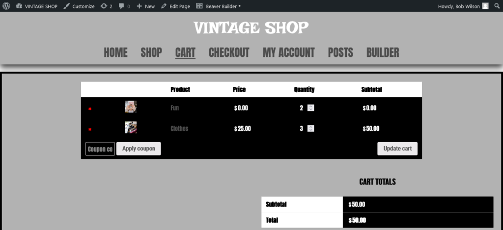
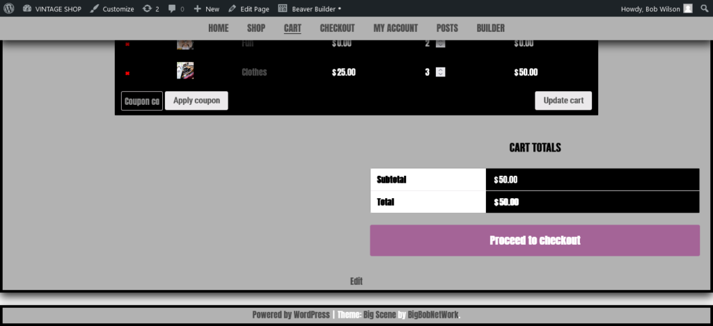
Here are a couple of sample shots of the cart page after the updates. It also uses page builder space modifications. The modifications don’t require a page builder. No page builder was used on the sample pages below.
You can copy and paste the code below into the Additional CSS section of the customizer.
.woocommerce {
	margin-top: 20px;
}


#bb-popout .woocommerce ul {
	margin-left: 50px;
}

.sideStick .woocommerce {
	margin-top: -10px;
}

.woocommerce h3 {
	text-align: left;
}
.woocommerce-account .woocommerce-MyAccount-navigation ul {
	list-style: none;
	margin-top: 20px;
}

.woocommerce form .form-row-last, .woocommerce-page form .form-row-last {
    float: left;
}
You may also want to consider the page builder CSS updates even if you don’t use a page builder.
What About a Dark Scheme and WooCommerce?
You may have chosen the Big Scene theme because it has a default dark color scheme. It doesn’t seem impossible to use WooCommerce with this scheme, but you will have to make some adjustments. You will want to pick a link color that shows up well on both a dark and light background color (a neutral gray or blue is a good choice). You will also need to make some updates in the Additional CSS section of the customizer. The following CSS should only be added if you want to use WooCommerce with a dark scheme. Feel free to contact me with questions.
/*Color Updates*/
#add_payment_method #payment, .woocommerce-cart #payment, .woocommerce-checkout #payment p {
    color: #000;
}
.woocommerce bdi {
	color: #fff;
}

/*HIGH IMPACT UPDATE
 * This is necessary to update the option dropdown.*/
body  {
	color: #000;
}

.site-footer {
	color: #fff;
}
Page Builders
The Big Scene theme was designed for Gutenberg compatibility, and Gutenberg is the recommended method for building pages. Although page builder plugins are not recommended, they aren’t discouraged. Just make sure you realize what you’re committing to before you use a page builder with this or any theme. The first thing that you need to realize about page builders is that they tend to assume that you will be working with a dark text. Depending on your page builder you may be able to override the text color that you chose for the Big Scene theme, or you can use the Big Scene theme to choose a dark text. After that you may only want to use the Big Scene theme for the header, footer, sidebar and posts. And you may want to build the body of your pages with the page builder. You can set the page builder so that it dominates the screen (except for the Sticky Navbar and footer) by first going to the Layout section of the customizer then turn “Highlight Featured Media” off. After that you’ll want to add the following code to the Additional CSS section of the customizer. Note that the fourth code block update should only implemented if your homepage configuration is appropriate, and you might want to update the number in the second code block.
/*bring the page to the top*/
.page .custom-header-markup,
.page .site-branding,
.page .entry-header {
	display: none;
}

/*This number can be adjusted to change how close you want the body to the top of the page based on the height of the menu*/
.page .entry-content {
	margin-top: 100px;
}

/*This is necessary so that nothing changes on the home page */
.home .entry-content {
	margin-top: 0px;
}

/* This will need to be added if the title and tagline is displayed below the navbar on the homepage*/
.home .site-branding {
	display: block;
}
Common Problems with Simple Solutions
This section will be devoted to areas where people can be easily stuck even though there is a simple solution, however the solution may not be that obvious.
Problem 1: Your logo isn’t fitting right.
I hate to throw WordPress under the bus, but their customizer isn’t perfect. The Big Scene logo function is brought to you by WordPress. All I did was approve its use in my theme. It actually works pretty well, but on occasion, it has problems auto-sizing the logo. You can tell because when the logo is centered and you scroll down the screen, it doesn’t disappear, leaving just the menu exposed. The solution is usually simple. Just remove the logo and set it again.
Make sure you add the logo using the customizer. Don’t add your logo using the logo block.
However, sometimes that doesn’t work.
The next most simple solution is to go into your WordPress dashboard then go to Media, then select your logo, then select edit image, then go to scale image on the right and reset the height (that’s the second number) to 88 pixels.
If that doesn’t work, then it means that the solution no longer falls under the category of simple. What may be happening is that the file size that you tried to upload with is too large to be properly manipulated. You can try downloading it into your WordPress image database again, but it may not work. If it doesn’t work, then it means you have to download your image after it has been manipulated. You don’t want to use a logo file that is any larger than it has to be because it will adversely affect your site’s loading speed. You should consider using an image manipulation program to shrink the size of your logo (it doesn’t need to be taller than 88 pixels). And you should consider converting your file to a .jpg extension if you haven’t already. If you don’t have an image manipulation program, then you can get GIMP for free.
Problem 2: The customizer doesn’t make your update.
Sometimes you may click a control on the customizer and you don’t see a change. There are two reasons that this might happen:
First, you may not be on a page where the change has an impact. Consider what the control is supposed to do and whether or not you are on the appropriate page.
Second, you know you’re on the right page, but you still don’t see the change. Once again, I hate to throw WordPress under the bus, but sometimes their selective refresh is a little too selective. Even though the update was made, you may not see it reflected in the customizer. If you don’t see a change, then try switching the control back to its previous position, then wait for a full refresh, then switch it back to the position you want.
Problem 3: A block remains when you don’t use a page title.
UPDATE
Version 1.1 offers a new “Page Titles” control in the layout section of the customizer.
1/2/22
I realize that some people don’t like titles on all their pages, and I’ve been trying to think of the best way to add a control to facilitate title removal, but I want to make sure that I come up with a solution that is simple and easy to use. Fortunately, you don’t need to wait for my solution. All you have to do is copy and paste one of the four sections of code below into the Additional CSS Section of your customizer.
/*Removes the title block everywhere on your site*/
.entry-header {
	display: none;
}

/*Removes the title block on your homepage*/
.home .entry-header {
	display: none;
}

/*Removes the title block on your individual post pages*/
.single .entry-header {
	display: none;
}

/*Removes the title block on your pages (not posts)*/
.page .entry-header {
	display: none;
}
If you like the above adjustments, you may also want to try the adding the CSS updates to suit page builders. You don’t have to use a page builder to benefit from the page builder CSS updates.
Advanced Topics
Here are some topics to help push your site to its limitations. If you’re new to building websites, then you probably want to make sure that you have the basics down first. But if you’ve got your site set up the way you want it, and you want to learn how to make your site faster and more powerful by using your brains and not your wallet, then check out these posts.
- Ways to Improve Loading Time from a Shared Server
- How to Set Up a Cache to Improve Loading Time
- How to Add a Table of Contents for a Page to a Sidebar
Let’s Collaborate
You don’t have to be a WordPress expert to collaborate with me. My contact links are in the footer, or you can leave a comment on this page. Feel free to reach out through whatever way makes you feel comfortable. I don’t charge people who have basic questions about my theme. And there’s a good chance your question will lead to a great way for me to update this instructions page or my theme. WordPress is huge, and there is no way that I have figured out how to make my theme compatible with everything it has to offer. I appreciate any time that you are willing to give to provide me with feedback.
HI Bob,
Love this theme. My site is looking great after just a couple hours of work.
I notice that all my pages except the home page have a tall, dark header area below the menu. How do I hide that area so that my content can shift upward?
Thanks!
Thanks for the question. I’m glad you’re enjoying the theme.
In the Customizer under the layout section, there is a control labeled “Highlight Featured Media”. Just switch that off.
Thanks for your feedback. I’m glad you like it.
Hi Bob, when the page is loading on mobile, the header image is squished horizontally, until I start scrolling up.
“Set Header Media to Background” and “Big Header Image” are both set to on. Is there a way to correct this?
Thanks so much for your feedback. I believe I resolved your problem. Please update to version 1.2.3. If you have any more problems, please let me know.
Hi! The update helped (thanks!) but now the header image that loads is blurry. I have used the suggested dimensions, and then uploaded larger/longer images. I don’t know how to resolve the issue. If you have any suggestions, please share! Thanks.
Hi — Also, I don’t know what happened, but now the problem I was experiencing on mobile (where the header was getting squished during loading), is happening on a desktop browser. This time the image appears stretched until the page loads fully.
If you set the image so that “Set Header Media to Background” is off and “Big Header Image” is on, then the dimensions are set before the page loads. Otherwise, the image dimensions will be set after the page loads and you will see the effect that you referenced. You can conceal this effect by turning on the preloader in the site identity section of the customizer.
Unfortunately, there is nothing I can do to control how clear an image is. You may have to go through a bit of trial and error to get it right. You want to try to use the largest and highest quality image that you can get away with without compromising the loading speed of your site too much.
Okay! Thanks.