Sticky navbars can be tricky to implement, maintain, and update. This is why that although they have tremendous practical and visual value, many sites don’t bother to include them. The best way to implement a sticky navbar is to utilize a theme that provides a sticky navbar feature because, as you will learn in this tutorial, sticky navbars will change the layout of your entire webpage.
Pick the Right Theme for Adding a Sticky Navbar
I’m going to show you how to implement a sticky navbar using the Big Lights theme. You can download Big Lights by going into to your WordPress admin center, then select Appearance > Themes > Add New, then type “Big Lights” into the search box. You can also use the Big Chill theme to build your sticky navbar. The Big Chill theme is similar to the Big Lights theme except the Big Chill theme has different default settings and more features. The instructions below should work for either theme.
Assumptions
This tutorial assumes that you have already established the bulk of your content. If you haven’t determined what content will be presented in your site, then you should determine that before you begin this process. Once you have determined what content you want to use, then you should get a good idea of how to present your content using block patterns. You can read a recent tutorial that I wrote about how to do this here. After you have established what content will go into different pages, you can determine how many page links you will need in your navbar which will serve as the foundation of your site’s sitemap. In addition to determining content, you should also determine your site’s fonts and colors which you can learn about here.
Starting Your Navbar
Now that you have determined an at least approximate layout of your site’s sitemap, you can begin adding content to your site’s navbar. From your admin center, you can either build your menu by going to either Appearance > Menus, or you can go to Appearance > Customize > Menus. Feel free to use whichever user interface is the most intuitive to you.
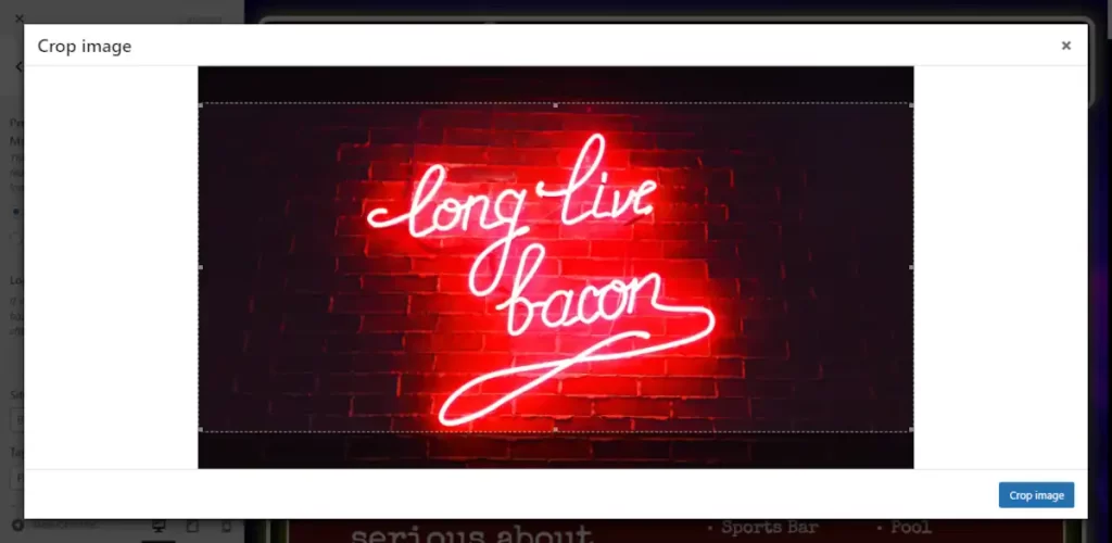
Don’t worry too much about how well your menu items fit. Just figure out everything that you want to be in there. The only limitations that you want to keep in mind is that you should make sure that you don’t have so many menu items that they become squished on small screens, and if you use a logo, then you want to make sure that it fits properly. Make sure that you use the cropping feature.
Choose Whether or Not Your Navbar Content Should be Centered
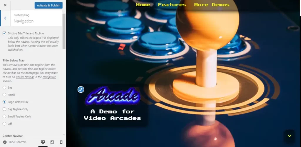
After you have decided what your navbar’s content will be, you should have an idea of how much space you have to work with. If your menu is long, then you should choose the default centered navbar. You can also decide if you want to set the title below the navbar on the homepage, which will leave just the menu items in the navbar.
If you are electing to choose a centered menu, then all you have left to do in the Navigation section is choose your menu size and determine if you want to add a tagline.
You can skip ahead to the determining the body position section of this tutorial if you have decided on a centered navbar. But if you want to try for a more space efficient navbar, then keep reading.
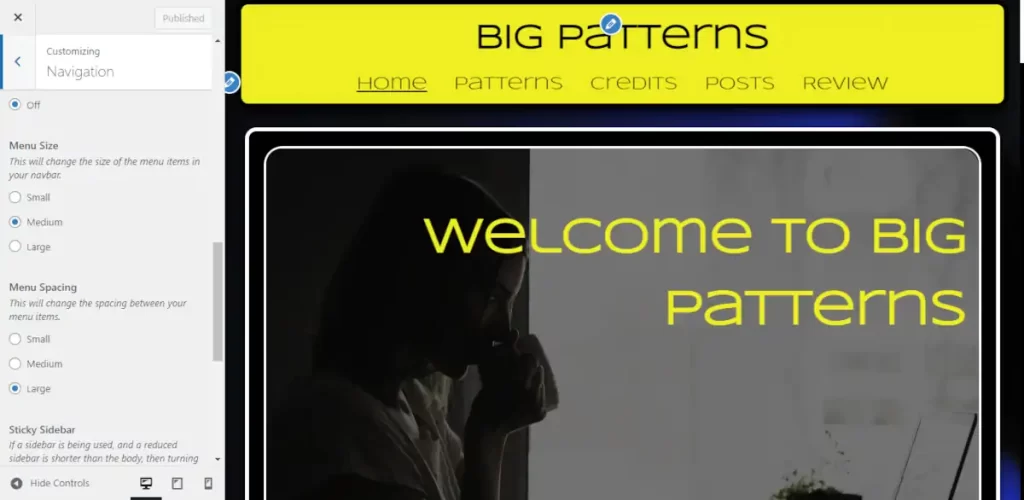
Using a Smaller Navbar
If you don’t have that many menu items, then you should consider floating you title or logo to the left and floating your menu to right. To do this, you will find a Center Navbar control in the Navigation section. Turn it off. Once you have turned it off, you will want to make sure that your menu items fit on smaller screens. If they don’t, then you can use the menu sizing controls referenced above to give yourself more room.
If you can’t achieve enough room, then you should switch to a centered navbar. If you have enough room then you should decide if you want your tagline in your menu with the “Add Tagline When Title is in Navbar” control. Once you have done this, then you should determine the menu’s position, as well as the menu button’s position for mobile browsing. You will need to determine the position under five circumstances:
- At the top of large screens.
- After it has scrolled down large screens.
- The top of tablets.
- Scrolled down tablets.
- Phones
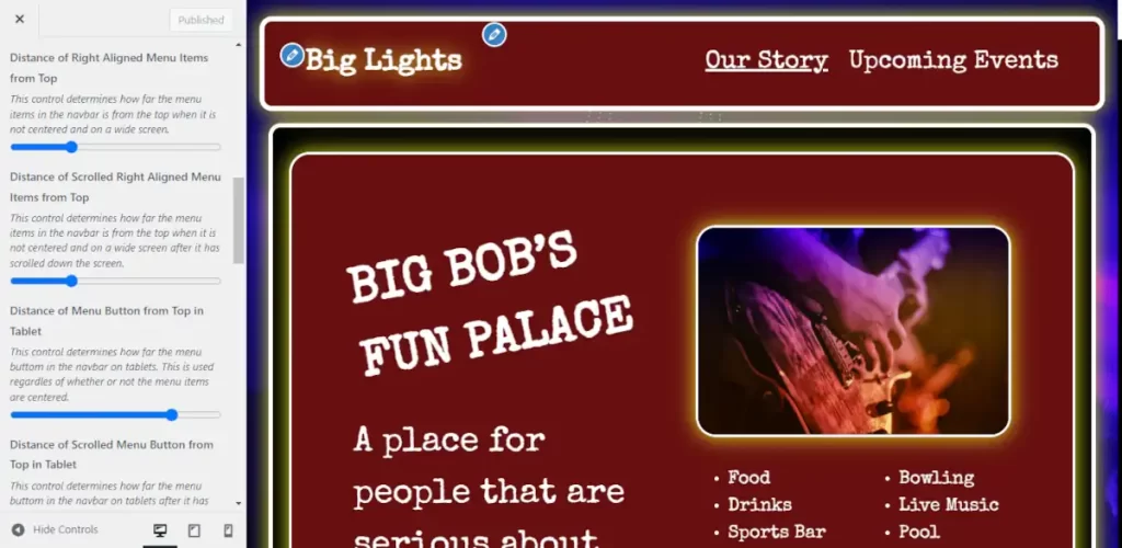
You can switch between different screen sizes by using the three display controls in the lower right corner of the controls window on the left side of the screen.
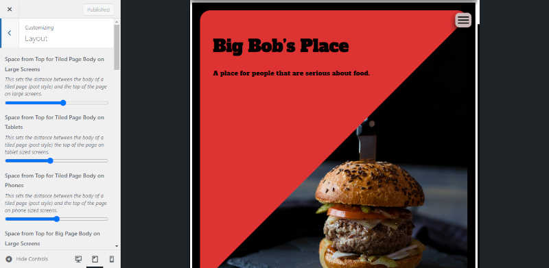
Determining Body Position when Adding a Sticky Navbar
The final step of building your sticky navbar is determining the position of your site’s body. You can do this in the Layout section of the customizer. You’ll have decide how to set your position on three different screen sizes (large screens, tablets, and phones). And if you decide to use big pages, then you will have to determine three more placements for your big pages. How you determine the placement is highly subjective. You will want to consider things like the size of your navbar, how much you want to expose the background, and what your personal preference for spacing is.
That’s it. If you have any questions, then please post them in the comments section.