Going from Linktree to a website may seem daunting. If you’re a freelancer, small business owner, entrepreneur, or solopreneur, then you may have built a solid social media presence, and you may still be using linktree as your pseudo-homepage. But if you want to take your business to the next level, then it may be time to start your own website.
Linktree to a Website: Why Bother?
When you own your own website, you have full control over what content you want distributed, and how you want people to see it. You can use social media. But you’re limited to the audience on your platform, and your competition is right up next to you. When you have your own website, your audience is the entire internet. And once people are on your website, they are looking at you, not your competitors.
Linktree to a Website: Take Your Time
Bookmark this page. You don’t have to build your website in a single sitting.
Linktree to a Website: Pick a Web Host
One of the simplest and cheapest ways to set up a website is to set up WordPress on a shared server through a web host that uses CPanel and Softaculous, then follow these instructions. Hostgator is one service provider that uses these services, but there are also others.
Linktree to a Website: Install the Big Chill Theme
Once you have WordPress set up, you can download the Big Chill theme directly through the admin center. Don’t worry about the default colors or the default fonts or even the default layout. You can change all of that. From your WordPress admin center just go to go to Appearance > Themes > “Add New”, then type “Big Chill” into the search bar, then select install, then select activate.
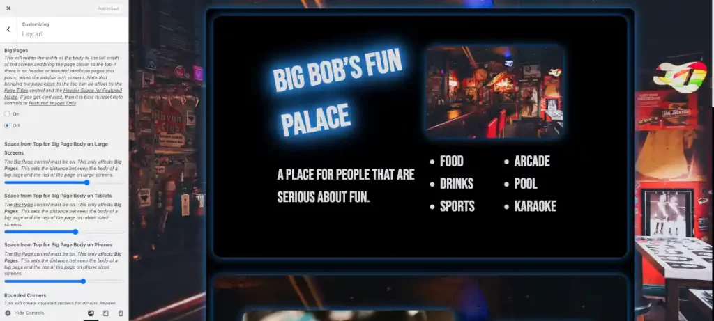
Set Up the Customizer Part 1
Before you add your content, you want to set up the basic layout of the Customizer. From the admin page left sidebar go to Appearance > Customize.
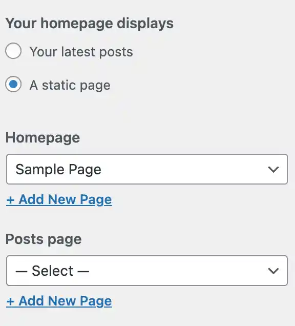
In Part 1 of setting up the customizer, we’re going to just get the layout correct. The first thing that you want to do is go to Homepage Settings. Then select “A static page”, then under the Homepage dropdown select “Sample Page”
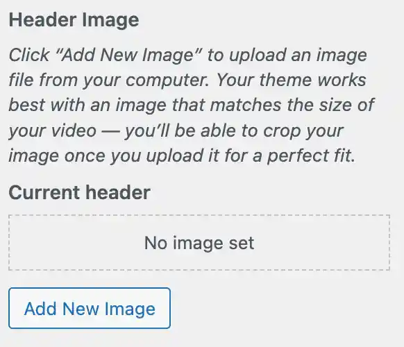
Then you’re going to want to go to back out of that section and into the “Homepage Header Image” section. Scroll to the bottom and under “Current header” click “Hide Image”. The sample content should move up the screen.
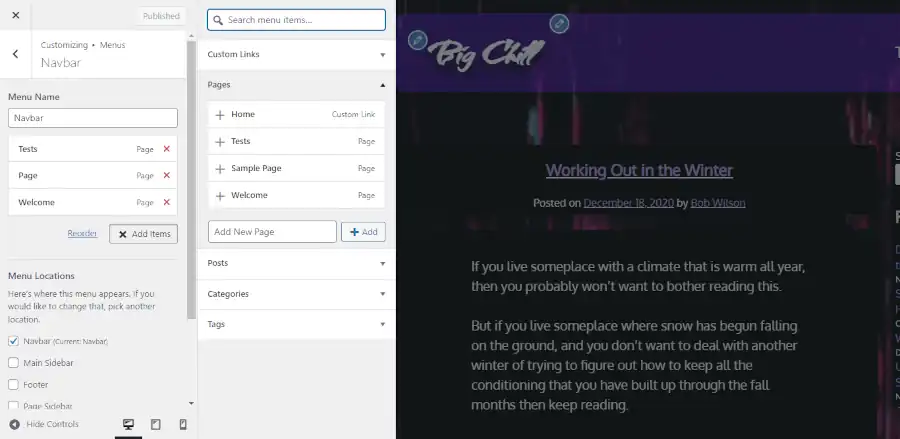
Next, you won’t need the navbar. So go into the Additional CSS section of the customizer and add the following code:
#site-navigation {
display: none;
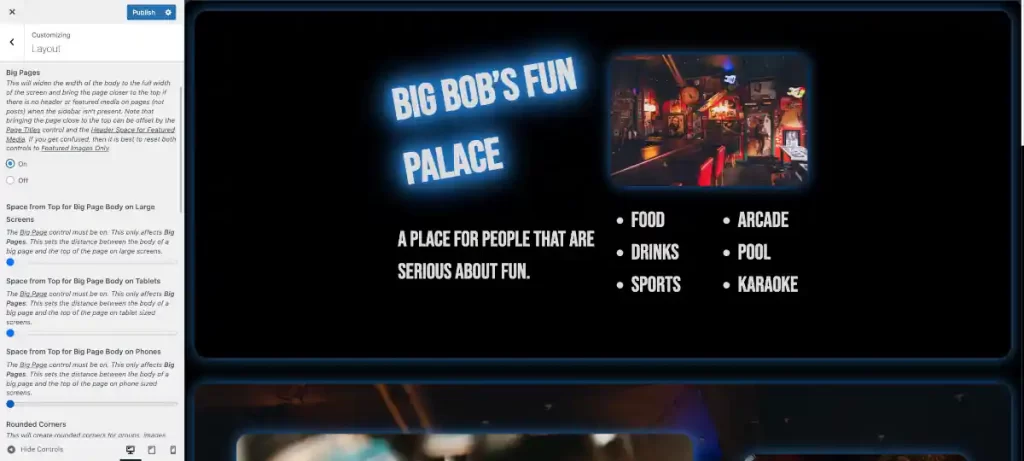
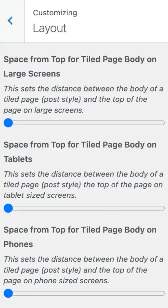
}Finally, go to the Layout section and move the first three “Space from Top” options all the way to the left.
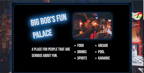
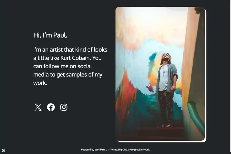
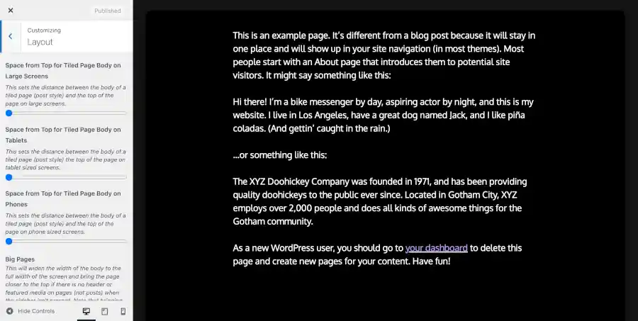
You should have a result similar to the following:
Now you can push publish and close out of the customizer for now.
Linktree to a Website: Get Your Content Ready
Hopefully, you have at least one image that you can use for your site. Any image will do. If the site is for yourself, then a picture of yourself is fine. Before you add the picture to the block editor, you’ll want to make your image website friendly. You should reset the width of your image down to 600px.
Linktree to a Website: Set Up Blocks
Next, you’ll want to add your content in the block editor. From the main admin page, go to Pages > “All Pages”, then select “Sample Page”. Change the title from “Sample Page” to “Homepage”. Then delete all of the text in the body of the page.
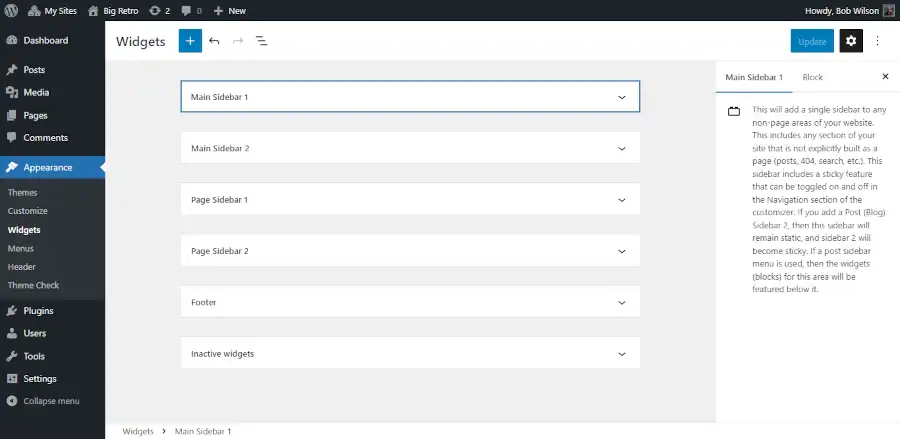
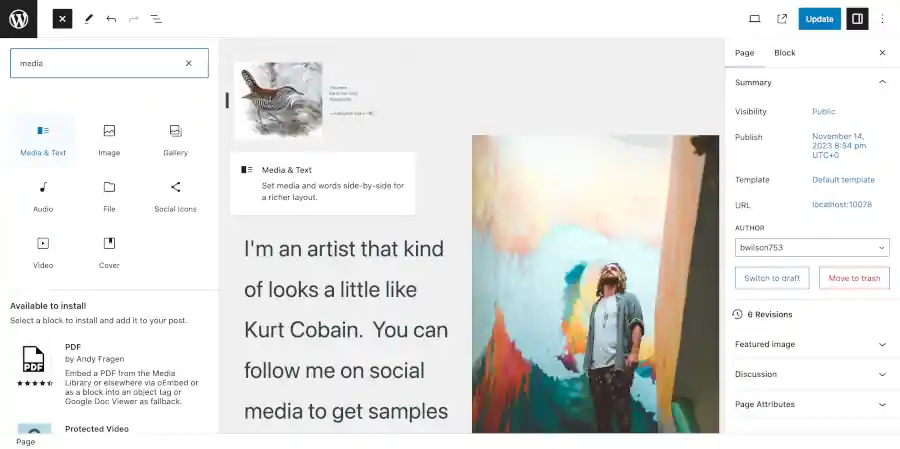
Next, you should add a media & text block. The picture below shows you how to add it.
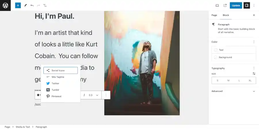
You can add text by adding text to a block in the text section. You can add a block by clicking in the section. If you want your text to be a heading, then type “/he” in the block and select the heading option. You can use the same technique used to add social icons referenced in the picture below.
Type in something about yourself. Then add that image that you made website friendly referenced in the previous section of the this blog post.
Add Your Social Icons
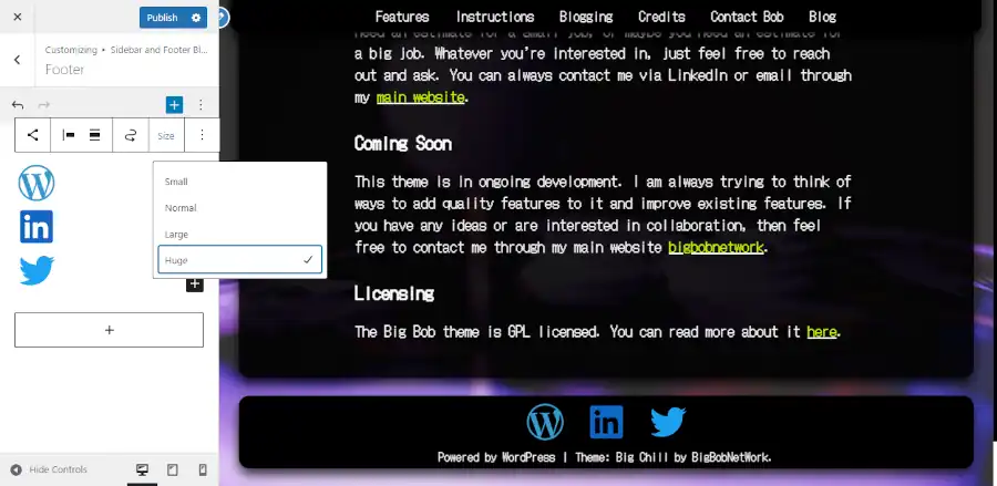
Next, you should open a new block and type “/soc”. You can select to add a social icons block. See the picture below:
Add the social icons block. Then select the entire social icons block (as opposed to an individual icon). You can click the icon to the left on the block bar above the block to select the outer block. Using the block bar that hovers above the block, you can change the size. I recommend the huge setting. And using the block tab on the right side of the screen, you can change the style to “Logos Only”. Then change the color to white. You can also change the size of the text above the social icon by clicking on the each respective text block and adjusting the size using the block tab on the right side of the screen.
If WordPress does not have all of your social media icons, then you can add a row of custom buttons in a new block below your social media block. You can get this started by using the technique featured in the picture above, but substitute the reference “/but”.
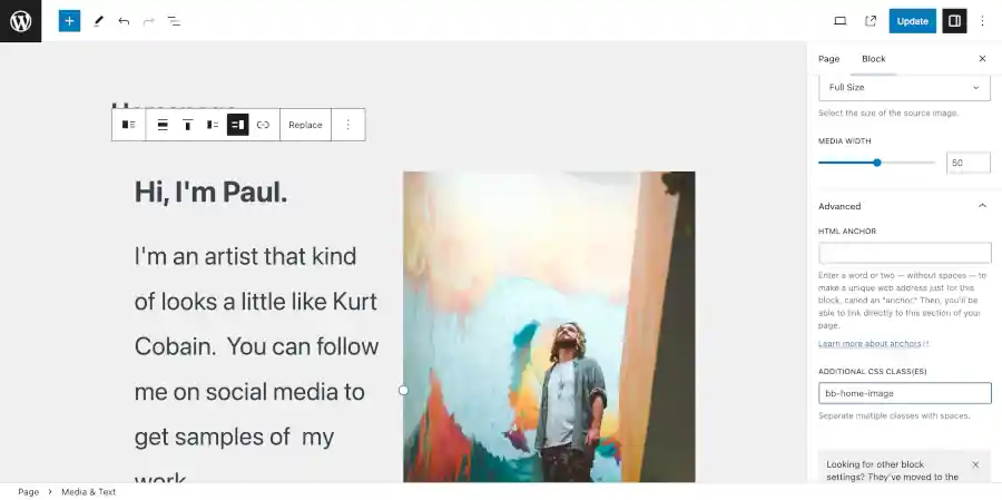
Add a Custom Class
Finally, you want to add a custom class that we’ll use later. Select the media and text block (not the contents inside). Then go to the block tab on the right side of the screen. Then go to advanced and add “bb-home-image” under the Additional CSS classes section. See the screenshot below:
Make sure that you save your work before you leave.
Delete Unused Pages
Since this is a one page site, you’re going to want to go back out to the main admin page and delete the “hello world” blog post. You can do this by going to posts, then find the “hello world” post and click “trash” underneath it.

Set Up the Customizer Part 2
Now that you have all of your content in place, you want to refine how your site looks even further. Go to Appearance > Customize.
Now is the time to change the way your colors look. You might think that it looks pretty dark. Go into the customizer section marked colors. Then update the colors to “212529” for “Navbar and Footer Foreground Color”, “Body and Sidebar Foreground Color”, and “Background Color”.
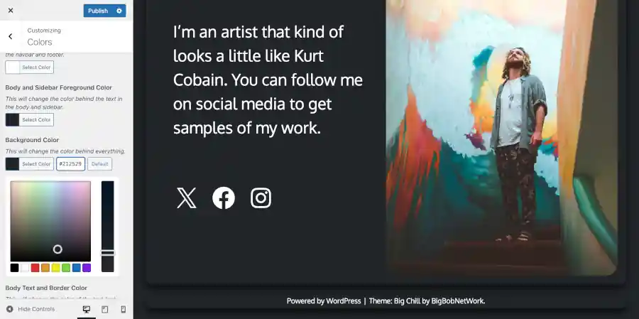
You may also want to turn off the “Shadow Halo and Link Color Backlight”. And you may want to switch “Body Link Color” and “Body Link Hover Color” to white.
Custom CSS
Next you may want to remove the back to top button since your page is so small. Just go to the Additonal CSS section and copy and paste the following:
#bb-back-to-top {
	display: none !important;
}
Next we’re going to use the home image class we added. Add the following to Additional CSS:
.bb-home-image img {
box-shadow: 10px 10px;
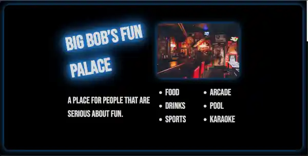
}The result should look similar to the following:
Now, you have a great foundation for your website. You’re ready to publish it and share it on social media. As you obtain more content that you wish to share, you can use the instructions below to add more stuff.