How to Build a Website for a Bar, Tavern, Pub, or Brewhouse

If you own a bar, then you need a website. You can’t make excuses that you don’t have the time, or a website isn’t important because you have social media. Unless your goal is to have a reputation for owning a dive bar that won’t last very long, then you need to set up a quality website that doesn’t look like it was hacked together in about an hour. So let’s learn how to build a website for a bar.

I realize that my previous paragraph has a bit of an attitude, but anecdotally, I have seen a lot of bars (not so much restaurants) that have some of the most consistently lousy websites that I have seen. Your website is the most accessible statement you have about the quality of your business. If your website is dumpy, many people will assume that your bar is dumpy, and they won’t want to show up. Like it or lump it, this is something that you will have to put some time into, and nobody will be sympathetic if the results turn out bad.

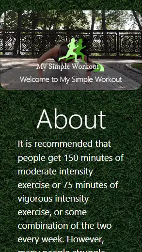
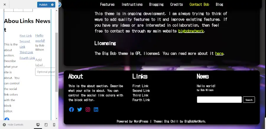
Keep It One Page and Simple

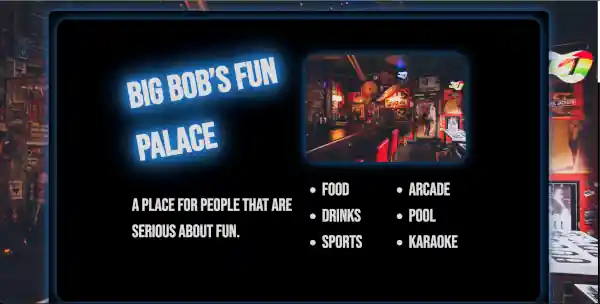
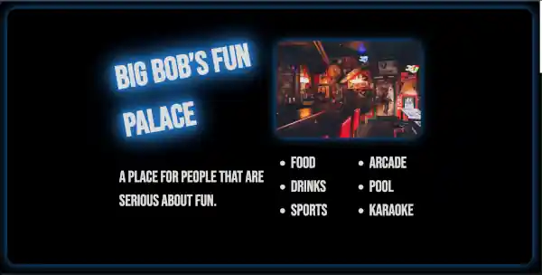
You need images of your bar displaying its ambiance. You need a little section explaining what makes your bar special. And you need to make it easy for people to figure out how to get to your bar.

The easiest way to get an idea of how your website ought to look is to view a couple of examples.

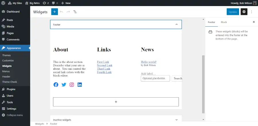
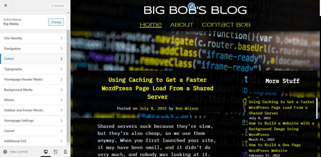
You can build a website like this using one of the Big Themes. If you don’t have time to deal with all of this, or you don’t consider yourself to be tech savvy, then consider hiring a pro.

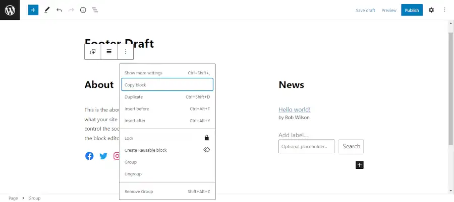
Don’t Embed a Map on a Website for a Bar

Embedding a map will slow down your webpage’s page load, and map embed’s frequently break and cause security vulnerabilities. Conversely, you can link to Google Maps and outsource all of your problems to your visitor’s browser or your visitor’s Google maps app.

Page Load Speed

Make sure that you page loads fast on mobile. If someone is on the road and looking for your bar, you want to make it easy for them to get a map to your bar with GPS. All you have to do is add a Google map link for your bar’s address. If this is difficult for you to figure out, then you should hire a pro.

No Need for a Navbar on a Website for a Bar

If your website is one page and short, then adding a navbar is unnecessarily complicated. Removing the navbar from one of the Big Themes is easy. If you decide you want to expand your site in the future, it’s easy to add the navbar back.

Use a Blog as an Optional Events Announcer.

The advantage of using a blog to announce events in addition to social media is people who don’t have accounts with any of your social media platforms will still be able to see the announcement.

Contact Section for a Website for a Bar

Contact information should just be an address, a phone number, social media links, and maybe email. Don’t waste your time with a contact form. They attract more spam then anything else, and even if they are maintained and updated properly, they can still serve as a security vulnerability.

Software Updates

Don’t forget to update your software every once in awhile. A simple website is easy to set and forget. But if you forget it for too long, then your website runs the risk of developing security vulnerabilities.

Questions?

Feel free to to post any questions that you may have in the comments area.

How to Add a Header Video to Your Website’s Homepage

A video can be a great way to make your homepage pop, but adding a video is a lot easier said than done. A lot of problems can come up when loading a video that can have a significant negative impact on your site’s performance. This tutorial will give you a step by step explanation of your different options for adding a header video to your site’s homepage, and it will explain a video’s potential and its limitations.

Assumptions

This tutorial gives instructions on how to properly load a video to a WordPress site, and it gives instructions on how to load a video to a basic custom HTML page. So you don’t need to use WordPress to follow this tutorial. If you choose the HTML route, then the expectation is that you are proficient in HTML and CSS. No explicit design instructions are given for a custom page, so if you need further help with an HTML page, then you should consider contacting a pro. If you are setting your video to a standard HTML page, then you can ignore any of this post’s references to page caching, however a CDN is still recommended. These concepts are explained in greater detail below.

If you need to learn fundamentals about building a website, then you can read this.

Cost-Benefit Analysis of the Difference Between a Custom Site and a WordPress Theme

You don’t need to hire someone to set a video into your website. If you use a WordPress theme, then you will have a better chance of building the site yourself, instead of having to hire a pro. However, you need to take the time to set your video up right. If you don’t, then you will have a high probability of having a frustrating experience that won’t produce the results that you are looking for.

Demos for this Tutorial

This tutorial will refer to three different demos. It will refer to the video at the top of this post which you can jump to by clicking the “back to top” button in the lower right hand corner, and it will will refer to a custom site and a WordPress site that will be explained in the next two sections.

A Demo of a Custom Page with a Header Video

The biggest advantage of a custom HTML page is that you can minimize how much you rely on resources. This makes it easier to load a video file that has a larger byte size and runs for a longer period of time. You can also be more deliberate about how you set the video to different window sizes. You can see samples of how a custom page looks by clicking on either of the images below.

Screenshot of a large screen video on a custom page
Screenshot of a mobile screen video on a custom page

At the time of the publication of this post, the video being shown in the custom site was 3.4 MB. This is pretty high. This wouldn’t perform well on a 3G phone loading in Mumbai, India. But it still should perform reasonably well on most well connected mobile devices.

A Demo of a WordPress Site with a Header Video

A WordPress site is a great way to add a video if you don’t know how to code. In particular, you can utilize any of the free Big Themes to serve your videos. They each have a number of options which will be discussed below. You can click on either of the images below to see a demonstration.

Screenshot of a large screen video using the free Big Bob theme.
Screenshot of a mobile screen video using the free Big Bob theme.

At the time of the publication of this post, the video being shown in the links just above this paragraph was 519 KB. You can use each demo to compare the difference in page speed for different video byte sizes. At the time of the original publication of this post, the video being shown at the top of this post was about 1.1 MB. I eventually reduced the size to 231 KB. A good trick that you can use for compressing your video is to upload your video to YouTube, then download it back onto your computer. YouTube will probably have compressed your video quite a bit.

Note that all three video demos also utilized background images in addition to the video when this post was originally published. This shows that even though each page is loading a video, the page can load reasonably fast on mobile even when other features using a significant byte size are utilized.

Update (5/29/23): The background image of the WordPress Test was removed and the theme was updated. The background image may be added back in the future.

Update (6/14/23): The background image for this blog was removed.

Page Load Performance when Adding a Header Video

The best way to get the fastest page load possible is to not use a video at all. The biggest problem that people have when adding a video is they are unprepared for how much a video has the potential to reduce page load speed. All videos will create at least a little deprecation in page load performance, but if you are careful then this performance depreciation can be trivial in comparison to the improvement in your visitor’s experience.

Finding a Good Video

An ideal video is one that you make yourself, however this may be something that is beyond your means. The following are three websites that you can obtain free open source stock video footage from right now:

  1. Pexels
  2. Pixabay
  3. Coverr

Another site worth mentioning is openverse. It doesn’t currently provide videos, but it is new, so it may be possible that this will change in the future.

You can also utilize YouTube videos with the free Big Themes. Make sure that you have made the necessary copyright considerations before you do this. Implementation will be discussed in greater detail later.

Use a Content Delivery Network (CDN)

If you are going to set a video into your site, then you will be dealing with media that has a large file size, so serving it through a CDN is pretty much mandatory. However, if you are unfamiliar with caching and CDN’s, then you should read about setting up the necessary caching software. When reading that tutorial, if you are not using WordPress, then you can skip over the sections about page caching and html caching.

Keep Your File Sizes Modest when Adding a Header Video

Even after you have set your website onto a CDN, you still need to keep your video’s file size reasonable. You want your video to load well across all devices, including mobile.

You should try to get your video’s file size as low as possible. How low should you go? You should try to get it low enough that it performs well on mobile. Ideally, you want the combined total byte size of your media (images, video, etc.) to be under 1 MB. If you have a good CDN, then you will probably be able to push your total file size a bit higher than 1 MB, but I wouldn’t push it any more than necessary. Later, I will also show you how you can set an alternative image for mobile which will allow you to use a larger video file size.

In addition to learning how to reduce your video’s file size, you should also learn how to reduce the file size of any other images that you may be using.

Editing Your Video to Make the File Size Smaller

Editing videos can be frustrating. Video editing will sometimes yield an unusable video. A video will just break after it loads for no obvious reason. But editing is necessary if you want your video to load well.

There are a number of different tools that are available for video editing, and it is impossible to write an exhaustive list. Today, I will show you how to use two different video editors:

  1. Window’s Video Editor: If you have a Windows operating system, then you probably have it already loaded on your computer.
  2. VLC: This is free open source software. It has fewer options than the Windows editor, but you can get your file sizes smaller. However, it seems to deliver more updated videos that break after being loaded onto websites.

Windows Video Editor

The Windows Video Editor is pretty intuitive, so I will spare you specific instructions. The most important things that you need to know are the two ways that you can reduce your file size:

  1. You can cut the total length of the video.
  2. You can reduce the dimensions of the video when you export it. However, you should keep in mind that a smaller export size can affect the performance of the video on larger screen sizes.

If you need more explicit instructions about using the Windows Video Editor, then please post your questions in the comments.

VLC

You can download VLC for free.

You can use VLC to cut the length of your video through a combination of recording and pausing. But I don’t recommend trying to figure this out because it is difficult to be precise.

Once you start playing around with VLC, you will probably set the features so that they are not to your liking, then you will forget the original settings. You can reset VLC to its default settings by going to Tools > Preferences > Reset Preferences (make sure simple is selected).

If you want to minimize page load speed, then your video’s image quality may need to be closer to standard definition than high definition. You can’t reduce byte size without compromising video quality.

Go to Media > Convert/Save > Add > Convert/Save > then go to Profile and continue scrolling down until find “Video for MPEG4 720p TV/device”.

If this does not adequately lower your video’s byte size, then you should try to lower the bit rate. You can lower the bit rate by going to Media > Convert/Save > Add > Convert/Save > then go to Profile and click on the wrench. This will open up a new window. You can click on the Video codec tab, then lower the bit rate until it produces a video with an adequate byte size.

Keep in mind that either of these actions can result in the video having performance problems after you load it onto your site, so you may need to use some trial and error. If you find that the mobile byte size requirements requires that you set a video that isn’t long enough, then you also have the option of hosting your video through YouTube or substituting your video for an image or a GIF on mobile. Both of these options will be discussed in greater detail below.

Mobile Compatibility when Adding a Header Video

You have to consider more than page load time when you consider mobile compatibility. You have to consider how the video will fit to the page.

Choosing the Right WordPress Theme for the Job

You can’t just pick any WordPress theme if you want your video to look good and load to your specifications. If you don’t already know of a theme that has adequate video options, then I recommend the Big Themes.

However, even the Big Themes have their limitations. Each theme has gone through a number of theme changes. This has resulted in a lot of new features being added, but it has also resulted in a couple of features being dropped. The earlier themes had the ability to add featured videos (window sized video headers for any page), and it had the ability to add background images for any page. In the latest themes, featured videos are no longer available because they had too many conflicts when WordPress added query loop blocks. And background images are removed in later themes whenever there is a homepage header image or a window fitted featured image to improve page loading speed.

If you are looking for an older style theme, like the one featured in the WordPress demo, then I would recommend using the Big Scene theme and reading its instructions.

What Kind of Video Are You Using?

Before taking the time to assess how to set your video, you should assess the nature of your video. Is your video something that is meant to sit in the background, or is the whole video screen meant to be watched and focused on. Is it valuable if you only see fragments of it? With the Big Themes, you can set your video using three primary methods:

  1. Set your video to fit the window like in the WordPress demo.
  2. Set the video to the top of the body like in this post. You can click the “back to top” in the lower right hand corner to review this video.
  3. Set the video into the background. This requires a video that is more abstract and looks good even if you only see small portions of it.

Setting Your Video to Fill the Screen

By default the Big Themes set your homepage header videos to fit the screen. If you’re setting your video based on the window size, then you have three options for dealing with the negative space:

  1. You can fill the background with an appropriate background color. Your background color can be updated in the Colors section of the customizer if you are using the Big Themes.
  2. You can fill the background with a background image if you are using one of the earlier Big Themes.
  3. You can add custom CSS to fill the video across the entire screen.

Adding Custom CSS to Fill the Video Across the Screen

I have already written about how to set your video to fill the screen if you are using the Big Themes in another post. The only thing that I’ll add to the discussion is that that tutorial is not comprehensive. There are a number of different scenarios and personal preferences that you may want to use to suit your circumstances. If you have trouble modifying the code to suit your needs, then please post a question in the comments section.

There’s also an argument to made for trying to write a video sizing algorithm using JavaScript. Using a generalized algorithm would make updating easier, but you should keep in mind that if you were to use this method, the script would have to be loaded at runtime which would increase the page load time after your website first appears on the screen. It would also make it more difficult to specify certain conditions. For example, you may want it to fit on wide screens and fill on mobile sized screens.

If you want your video always set to fit, then you don’t have to do anything. This is the default setting.

Using a YouTube Video

It is also possible to load a video through YouTube, which is a great way to load large videos fast, however YouTube has several drawbacks:

  1. You have to set the video size to fit the screen. The above CSS tutorial will not work. And any remaining negative space will always appear black.
  2. Some browsers will stop YouTube from auto playing. This makes setting the video into the background problematic.
  3. It always announces that it is a YouTube video. However, you can use the navbar to cover some of this up on certain window sizes.

To add a YouTube video with the Big Themes, all you have to do is add the video’s address into the homepage header media section.

Setting Your Navbar’s Opacity

Most of the Big Themes allow you to change your navbar’s opacity. Navbar opacity is a measure of how easy it is to see through your navbar. You will probably want to do this to make your video more visible. You can find the opacity controls in the Colors section of the customizer.

A Note on Mobile Browsers when Adding a Header Video

If you set your video size based on the window size, then you should expect it to load lower on the page on some mobile browsers because they will move the bottom of the video below the viewport to make room for the address bar. The address bar will then recede into the top of the screen when the visitor scrolls down the page.

Setting Your Video to the Top of Your Homepage Body

If you are building your page from scratch, then you can you be more liberal about how you set your video. See the custom page demo. But if you are using a WordPress theme, then you will have to choose between layout options.

Adding your video to the top of the page body has the advantage and disadvantage of keeping the dimensions of your video smaller. This is an advantage because videos with smaller dimensions have lower byte sizes, but it is a disadvantage because you can’t make the video as big without distortion.

If are using WordPress, then you can use a video block. You can see a demo of this by viewing the video at the top of this post by clicking the “back to top” button in the lower right hand corner. Using this option will also let you set your video in front of a background image on the most recent Big Themes. Once you have set your video, you can use the block options to set your video to autoplay like in the screenshot below:

This is how you set a video block to autoplay at the top of the page body.

Setting Your Navbar’s Position Relative to the Body

The latest Big Themes allow you to set the page’s body relative to the navbar. This is a subjective process that will be affected by your background image, and the content of your navbar, and the content at the top of your page body. These options are great for distinguishing your layout on different window sizes.

Substitute an Image on Mobile

If you are trying to load a total media byte count that is larger than 1 MB, then you may want to consider substituting an image on mobile. You can cut a video frame into an image by using Windows Video Editor. You can then use the cropping feature to update your video frame so that it better fits a mobile device.

This will actually increase the page load on large screens because the image will be loaded first, then the video will be loaded. But on mobile environments only the image will be loaded, so the total byte size will be smaller on mobile. This allows you to use a video with a byte size small enough to run well on a desktop or laptop, but too large to run well on a mobile device.

If you are using one of the Big Themes, then make sure that the “Show Header Video on Mobile” control is switched off. This control can be found in the Homepage Header Media section of the customizer.

Consider a GIF when Adding a Header Video

Videos tend to have smaller byte sizes than .gif files, and videos tend to look better. But if you use a GIF then you can manipulate it like an image.

You can add a .gif file the same way that you add an image, and you can substitute it for a video the same way that you substitute an image.

There are an epic number of free ways to make a GIF, and I actually don’t make them very often. So I doubt that I can provide you with a better tutorial then something you can locate with a minimal amount of research using a search engine.

Setting Your Image or GIF to Fill the Phone’s Viewport

The Big Themes all have scripts to size your images to your visitor’s phone’s viewport. If you want your image or GIF to fill the screen, then all you have to do is turn on the “Big Header Image” control in the Homepage Header Media section of the customizer.

Using a Preloader when Adding a Header Video

The latest Big Themes all turn on a preloader whenever an image needs to be sized to the window after the page loads. You can turn this off in the Site Identity section of the customizer, but turning it off is not recommended. However, you should be aware that the preloader may cut into the beginning of your video, but this is usually only a trivial amount of time if you have everything set up right.

Questions about Adding a Header Video?

This tutorial was pretty thorough, but I still might have missed something. If there is something else that you need to know, then please post your question in the comments area.

A Long Term Plan for Building and Maintaining a Website

Websites are dynamic. Building a GOOD website takes time, and maintaining and updating a website lasts indefinitely. So it can be helpful if you have an outline that you can keep coming back to so that you don’t lose track of what you are doing.

How to Read this Post

This is a blog post that you will probably want to come back to again and again. You can read it all at once, but you don’t have to. You should bookmark this post. Then you can come back to it after you have been distracted by non website building related work. This post contains lots of links that may take you through multiple days of work, so be patient and focus on improving your website one session at a time. If you take the time to put the work in, then you can make your website great.

It will probably be simplest if you follow each lesson in the order that it appears, but this isn’t mandatory. Even if you have already started your website, if you feel lost and confused, then this post can be helpful. It can show you how to overcome some fundamental problems that may have been nagging you for years.

Step 1: Organize the Information that You Need for Building and Maintaining a Website

If you have never built a website, and you don’t have any education in software development, then you are pretty much at the mercy of the internet, and the internet is really disorganized. This post will not tell you everything that you need to know, and it will not lead you to everything that you need to know. But it will help give you a great foundation that you can keep coming back to so that you don’t fly off onto a tangent in the wilderness of website development. If you ever feel overwhelmed and don’t know what to do, then reading this post from the beginning can be a great way to troubleshoot and find the solution to your problem.

Step 2: Determine Your Economy for Building and Maintaining a Website

You can’t bring a website into existence simply through the power of your imagination. You need resources. Before you take any action, you need to determine how much time and expense is necessary to build your website your way. Learn how to allocate fundamental resources for your site.

Step 3: Set Up Your Webhost and Foundational Software for Building and Maintaining Your Website

I never assume my customers will be running their website on a high quality managed webhost. I always assume that they are using something cheap and unmanaged, and they will need free support software to make sure that their sites load properly. If you are paying extra for managed hosting, then you may be able to skip some of these steps. However, there are five things that you will need to set up a site with unmanaged webhosting on a shared server. If all you have done is purchase a webhost, then you should give yourself a considerable amount of time to go through each of these steps. They will take awhile.

  1. Content Management Software: Learn about WordPress.
  2. Template Management Software: Learn about WordPress themes.
  3. Caching Software: Learn how to get your pages loading fast without an expensive managed webhosting plan.
  4. SEO Software: Learn to easiest ways to get your website noticed by search engines.
  5. Image Manipulation Software: Learn how to make your images look good without sacrificing page load speed.

Step 4: Set Up Your Website and Add Content

Now that you have all of the software that you need installed, you can get into the business of setting up your layout and adding content. It is usually simpler to work on your layout before you add your content, but building a website isn’t a perfect process, so don’t let yourself get frustrated if you can’t or don’t do things in the ideal order. Below is a list of steps for building or updating your site’s content and layout. You should expect getting though this entire list to take a significant amount of time.

  1. Update your theme. Updating your theme is usually difficult. But if your site isn’t doing what you want it to, then jamming another plugin into it probably isn’t the solution. If you want to make a real change, then you should probably take the time to change your theme. I highly recommend the Big Themes.
  2. Set the right colors and fonts. Your colors and fonts will have more influence over how your site looks than anything else. Keep experimenting with them until they match your site’s message.
  3. Set your main navbar properly. A great navbar will make your user’s experience easy, and it will make them want to continue using your site. But a bad navbar will make them want to leave your site. Your navbar will impact how the rest of your site works, so take the time to set it right.
  4. Learn how to build a footer. Not every site needs a footer, but too many people don’t bother with them because they don’t even know how to set one up. Most sites that have a significant amount of content ought to have a footer, so learn how to set one up.
  5. Learn how to build a sidebar. If you are blogging, then learning about sidebars is a must. But even if you are just building a regular website, sidebars can be very useful, especially for stuff like advertising.
  6. Build a one page site. If you don’t have a site set up yet, then you have probably grown frustrated with how long this process has taken. Building a one page site is a great way to start your website presence. You can grow your website into multiple pages as time and content becomes available.
  7. Add foundational content. If your site is still looking basic, then you can use simple features to add a lot of style. You can add images and video.
  8. Create more sophisticated content. There are lots of free tools available for styling and organizing content. You should learn how to use them if you want your website to be taken seriously.
  9. Get into the weeds. If you’re not a developer, then you should try to avoid coding as much as possible, but sometimes using a little coding is the only way to get something exactly the way you want it.
  10. Ask for help. Developing websites is a collaborative process. Nobody builds a website in pure isolation. People that are afraid to ask questions usually make avoidable mistakes.

Questions?

I would like this post to be a living document that I can update periodically. If you think that there is something that ought to be added, or there is something about it that you don’t understand, then please post it to the comments area.

How to Add a Footer to Your WordPress Site

It’s not unusual for people to avoid consideration of a footer when they first start building a website. The reality is that a lot of websites don’t need large footers. For smaller websites, a large footer can be superficial and unnecessarily complicated. But even if you are just using your footer as a simple attribution line to let people know that they have reached the bottom of the page, you should still learn how to add a footer to your WordPress site.

Assumptions

This tutorial assumes that you are basically familiar with WordPress and WordPress themes and building a website. It also assumes that you are familiar with layout concepts such as navbars, sidebars, and footers. You should also have a basic understanding of widgets.

Before You Add a Footer to Your WordPress Site

A footer’s primary value is it serves as a place to add links. However, before you decide to add links to your footer, you should first ask if the links that you intend to provide would be better placed in your main navbar or a sidebar. Your main navbar should serve as the primary mechanism for users to navigate your site. Ideally, it should include links to all of the major areas of your site. There’s nothing more annoying than expecting your users to scroll down a long page to find the site map because the primary navbar is under populated with links. However, as your site grows, it’s possible for your main navbar to run out out of room. One solution is to extend your navbar into your sidebar. However, this can be prohibitive if your are trying to create section level sidebars.

When is It Time to Learn How to Add a Footer to Your WordPress Site?

The time to add a footer to your website is when your site has become sufficiently large, and/or you have a supporting online presence (like social media) that is sufficiently large. Hopefully, your site is more than just a glorified business card with your social media links. It should at least provide basic information about whatever it is you’re doing online. One of the great things about using WordPress is it is a content management service. That means you can start with a small site and add content to it over time.

The Early Site Footer

In the beginning, you may only have enough content to justify a one page site. That’s fine. At this point the only thing that you will probably need in your footer is links to your social media pages. Given that your site is so small, you may wonder if adding social media icons into your main navbar is a good idea. Well, it might be. There’s an argument to be made that you are making them easy to find. But you also have to consider that when you are doing that, that you may be giving the impression that you are saying, “Hey, you just got here. Now leave because my site kind of sucks.”

Make sure your site is really good before you decide to put your social media links in your navbar. Consider putting them in your footer after people have scrolled through your site and been impressed by what they saw.

Footers are extremely theme dependent. The theme that you choose will have a high impact on how you will add a footer to your WordPress site. I suggest that you download one of the latest Big Themes, so that you can use it as you follow along with this tutorial.

If your site isn’t at least one page in length, then you should focus on developing the content within the body of the page before you start working on your footer. When you use the Big Themes, it automatically generates a footer for you, so as soon as your body content is ready, you can publish the first version of yours site.

Once you have at least one page of content, you can open up the customizer and begin adding your footer by going to the main admin page then selecting Appearance > Customize.

Once you are in the customizer click on the “Sidebar and Footer Blocks” tab, then click on the “Footer” tab, then scroll to the bottom of the page so that you can see your footer.

Screenshot of footer tools

Most of the blocks that you can add should be automatically centered, but if they are not, then you can use the block tools to center them. The blocks have a lot of different tools. If you can’t find what you are looking for then you may need to click on the left most icon on the block toolbar to move up a level (you can keep clicking it to move up more levels), or you may need to click on the right most icon (the three dots) to open up more settings.

Screenshot of footer with social icons.

I don’t want to get too deep into the weeds on how to use blocks. The blocks are powerful, but they have a bit of a learning curve. You need to be patient with learning how to use them. The more you use them, the more intuitive they become.

You can continue to stack single blocks in a single column until you have all of the information that you want to provide. If your site isn’t too large, or if it just doesn’t need many links, then this may be all of the content that you will ever need to put into your footer. But if your site gets significantly large and needs more links then you may need a multicolumn footer.

Creating a Multicolumn Footer

A good rule of thumb for starting a multicolumn footer is to wait until your footer has enough content to justify at least three columns. Whenever you add content, you want to consider overall content management. You want to minimize how frequently you have to make major updates like changing the number of columns in your footer. Two small columns will likely still look good as one column, and two large columns usually still looks good spread out over three columns. I also would avoid using a four column footer because you’ll have to spend a lot more time worrying about space and size issues than if you stick with three columns.

The easiest way to add a multicolumn footer into the customizer is to use a block pattern. Unfortunately, as of the publication of this post, there is no way to call block patterns directly from the customizer. Fortunately, block patterns are just blocks, so you can easily copy a block pattern into a block section of the customizer from the block editor.

The simplest way to do this is open up a draft page and call a footer pattern from the block editor, then add it to the draft page. It’s a good idea to keep one browser tab open for your block editor and another browser tab open for your customizer.

Screenshot of a footer pattern in the block editor.

You can work on most of your content while your in the block editor. However, I wouldn’t worry about the colors until you get into the customizer. Using a block pattern is a good way to figure out which kind of blocks ought to go where. However, you can completely add and remove blocks from the pattern as you see fit.

Once you have finished updating your blocks, keep clicking on the left most block icon until you reach the top group block. You can be certain that you have reached the outermost block when clicking on the icon produces a “TRANSFORM TO” option.

Screenshot of outer group block selected

Then copy the entire block pattern.

Screenshot of a block pattern being copied

Now that your pattern has been copied to your clipboard. You can paste it into the customizer. First, open up a new paragraph block in the footer section of the customizer.

Screenshot of opening a paragraph block in the customizer footer section
Screen shot of “Type / to choose a block”

Then click the section that reads “Type / to choose a block”. Then you can either right click and select paste or hit ctrl + v (command + v on a mac).

Screenshot of a three column footer in the customizer

Now you have a three column footer on your website. From here, you will probably be able to make updates to and from the customizer, but if the space is too small then you can just copy and paste your footer back into footer draft page and work on it in there.

Using the Widget Admin Section

If you don’t want to learn another WordPress screen, then you can skip this last section of the tutorial. You don’t need to use this feature. However, it is worth noting that your footer will also appear in the Widgets admin Section. To see the Widgets admin section go to the main admin page then go to Appearance > Widgets.

Screenshot of the Widgets admin area

There are two reason that you may want to use this area. First, you will have more space to work with. Second, if you need an area that has more space to work in, then this will save you the hassle of copying back and forth between the customizer and the block editor. You can update your footer directly from this area.

Questions About How to Add a Footer to Your WordPress Site?

If you have any questions, then please post them in the comments section.

Updating Colors and Fonts on Your WordPress Site

After content, colors and fonts have the highest impact on the look of your website. But you have probably noticed that updating your colors and fonts on your WordPress site is not as intuitive as you would like it to be. However, when you find the right tools, updating your colors and fonts on your WordPress site isn’t that difficult. The hardest part is finding the tools. This tutorial will show you how to obtain all of the tools you need to update your colors and fonts, and it will show you the most efficient way to update your colors and fonts once you have found those tools.

Picking the Right Theme

Not every theme makes updating colors and fonts on your WordPress site possible. And using plugins to update colors and fonts is usually convoluted.

Your theme is the thing that has the highest impact on how your colors and fonts are set. The whole reason that themes were created was to create a foundational mechanism for determining how your site looks. This is the reason that your theme ought to be the thing that determines your font and colors.

Most themes give you little control over your colors and fonts. But a few themes will give you a wide spectrum of choices. One such theme is the Big Media theme. The Big Media theme is a free theme and you can download it directly from your WordPress admin center by selecting Appearance > Themes > Add New. Then type “Big Media” into the search box.

Screenshot of the Big Media Customizer

Picking Your Page Layout Style and Foundational Content

Now that you have a great theme, you need to consider your layout and content before updating colors and fonts on your WordPress site.

You should ask yourself if you want your site to be page driven, blog driven, or a combination of both. In other words, do you want to build your site with pages, posts, or both? If your site is blog driven or blog supported, then I would suggest considering a background image, especially if you are using the Big Media theme. You can add a background image in the “Background Media” section of the customizer.

If you are using the Big Media theme and you like the blog look, but you don’t actually want to have all of the blog features that go with it, then you can go into the Layout section of the Customizer and switch the “Big Pages” control to off. When you do this, it will create more background space for a background image when you build your WordPress site with pages.

If you’re sure you don’t want a background image and you are using the Big Media theme, then you should also consider a homepage header image. You can add this in the “Homepage Header Media” section of the customizer.

The Best Way to add a Background Image or a Header Image

Don’t worry about whether your image is appropriate to the theme’s default colors and fonts. Just focus on finding an image that you think looks great and facilitates your site’s message. You’ll be able to manipulate your theme to fit your content later.

If you want your image to be a background image, then it will need a lot of versatility. A great background image is an image where you only need to see a little bit of the image for it to be valuable. If you have an image that you like that doesn’t work well as a background image, then consider using it as a homepage header image.

If you want to add a homepage header image, then you should make sure that the image looks good on any screen dimension. Try setting the “Big Header Image” control in the “Homepage Header Media” section to both on and off and see how it looks on different screen sizes.

If you don’t have your own image that serves this purpose, then you can get tons of great images using the following links:

You probably want to load the original copy of your image onto your WordPress site to see how it looks. If you have trouble loading your image, then you can use GIMP to compress its size:

Images can crush your loading time. WordPress has features that automatically reduce the size of your images, but sometimes they don’t work, and even when they do, the image byte size can be larger than necessary.

Background images need to have a larger than average file size, but I have found that you can keep them looking good at pretty small sizes. I find that I can keep a background image looking good at an average size of 500KB and an average width of 2560px.

GIMP is free software that you can use to amplify compression and convert file types.

GIMP is a beast and is not the most user friendly. It is a full service image editor that has capabilities that extend well beyond what you will probably need for WordPress. However, if you are just using it to compress your images, then it isn’t that difficult to use. Just follow these instructions:

  1. In Gimp, go to File > Open, then choose the file you want to open. Gimp can be slow.
  2. Go to Image > Scale Image. Then reduce the width to 2560. You may be able to reduce this even further if you set the “Big Header Image” control to off in the “Homepage Header Media” section of the customizer.
  3. Go to File > Export As
  4. If the file type reads .png then delete the .png and replace it with .jpg. You may also want to rename the file.
  5. Click export, then lower the image quality to 50 percent or whatever value you think is best. You can check the box that reads “Show preview in image window”, and it will tell you what the file size will be.
  6. Click Export.

Picking Your Colors

If you are using the Big Media theme, then you can update your colors in the colors section of the customizer.

Colors should be defined by content. This is why it is best to choose foundational media before you choose your colors, then use the media as a basis for color selection.

Basic colors can be a great choice. The best way to start the color experimentation process is by selecting from the eight basic color squares. If you don’t like the default look, then a good second foundation is to try a black foreground with white text. Black foregrounds also tend to do a better job of revealing images when you reduce foreground opacity.

If you decide to experiment beyond the eight basic colors, then keep in mind that some colors look different on mobile, so you’ll want to test for that by viewing your site on mobile technology.

Don’t pick more colors than you need. The Big Media theme has a lot of color options, but that doesn’t mean that you can’t use the same color more than once.

Pick Your Fonts

If you are using the Big Media theme, then you can add fonts in the Typography section of the customizer.

Colors can affect how your fonts look, so you want to make sure that you pick your colors first.

Try lots of fonts. The Big Media theme gives you access to the entire Google fonts library, so be patient and keep trying fonts until you get exactly what is right for you. But keep in mind that it’s okay to just use one or two fonts. Some fonts look good by themselves, but they don’t always look good juxtaposed against other good looking fonts.

You may also notice that some fonts fit better than others, so you may have to update menu font sizes. You can do this with the “Menu Size” control in the Navigation section of the customizer.

You may find that your default fonts don’t always look ideal in every place that they have been set. But you can use the Additional CSS section of the customizer to refine font selection. For example, this theme added the following update:

.entry-meta,
.entry-footer,
.nav-links,
.comment-metadata,
.reply{
	font-family: "IBM Plex Mono";
}

You can figure out which class names that you would want to update using this tutorial.

Got Questions About Updating Colors and Fonts on Your WordPress Site?

If you have any questions then feel free to post them below.