How to Add a Footer to Your WordPress Site

It’s not unusual for people to avoid consideration of a footer when they first start building a website. The reality is that a lot of websites don’t need large footers. For smaller websites, a large footer can be superficial and unnecessarily complicated. But even if you are just using your footer as a simple attribution line to let people know that they have reached the bottom of the page, you should still learn how to add a footer to your WordPress site.

Assumptions

This tutorial assumes that you are basically familiar with WordPress and WordPress themes and building a website. It also assumes that you are familiar with layout concepts such as navbars, sidebars, and footers. You should also have a basic understanding of widgets.

Before You Add a Footer to Your WordPress Site

A footer’s primary value is it serves as a place to add links. However, before you decide to add links to your footer, you should first ask if the links that you intend to provide would be better placed in your main navbar or a sidebar. Your main navbar should serve as the primary mechanism for users to navigate your site. Ideally, it should include links to all of the major areas of your site. There’s nothing more annoying than expecting your users to scroll down a long page to find the site map because the primary navbar is under populated with links. However, as your site grows, it’s possible for your main navbar to run out out of room. One solution is to extend your navbar into your sidebar. However, this can be prohibitive if your are trying to create section level sidebars.

When is It Time to Learn How to Add a Footer to Your WordPress Site?

The time to add a footer to your website is when your site has become sufficiently large, and/or you have a supporting online presence (like social media) that is sufficiently large. Hopefully, your site is more than just a glorified business card with your social media links. It should at least provide basic information about whatever it is you’re doing online. One of the great things about using WordPress is it is a content management service. That means you can start with a small site and add content to it over time.

The Early Site Footer

In the beginning, you may only have enough content to justify a one page site. That’s fine. At this point the only thing that you will probably need in your footer is links to your social media pages. Given that your site is so small, you may wonder if adding social media icons into your main navbar is a good idea. Well, it might be. There’s an argument to be made that you are making them easy to find. But you also have to consider that when you are doing that, that you may be giving the impression that you are saying, “Hey, you just got here. Now leave because my site kind of sucks.”

Make sure your site is really good before you decide to put your social media links in your navbar. Consider putting them in your footer after people have scrolled through your site and been impressed by what they saw.

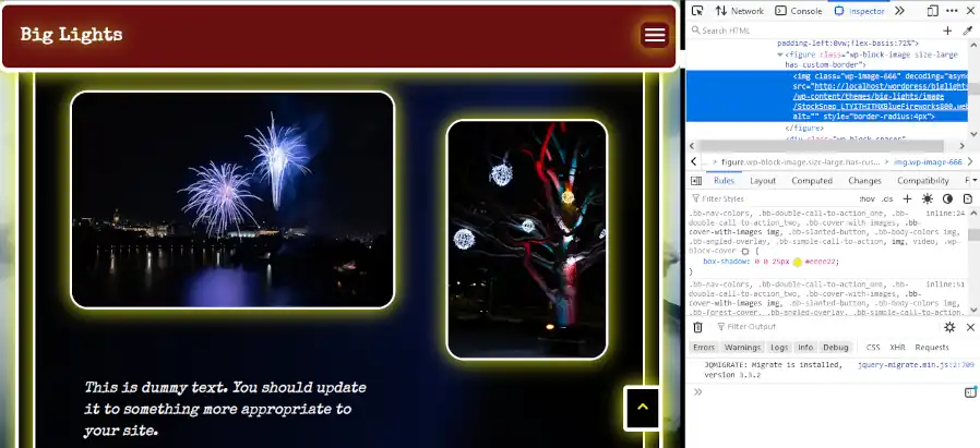
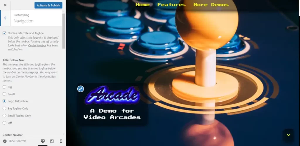
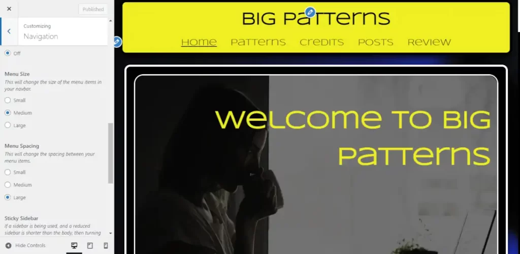
Footers are extremely theme dependent. The theme that you choose will have a high impact on how you will add a footer to your WordPress site. I suggest that you download one of the latest Big Themes, so that you can use it as you follow along with this tutorial.

If your site isn’t at least one page in length, then you should focus on developing the content within the body of the page before you start working on your footer. When you use the Big Themes, it automatically generates a footer for you, so as soon as your body content is ready, you can publish the first version of yours site.

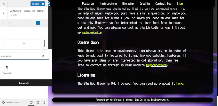
Once you have at least one page of content, you can open up the customizer and begin adding your footer by going to the main admin page then selecting Appearance > Customize.

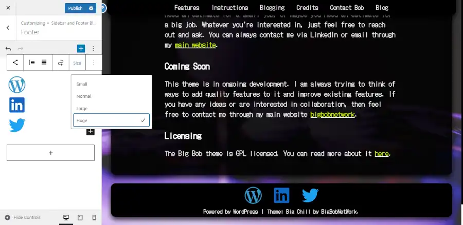
Once you are in the customizer click on the “Sidebar and Footer Blocks” tab, then click on the “Footer” tab, then scroll to the bottom of the page so that you can see your footer.

Screenshot of footer tools

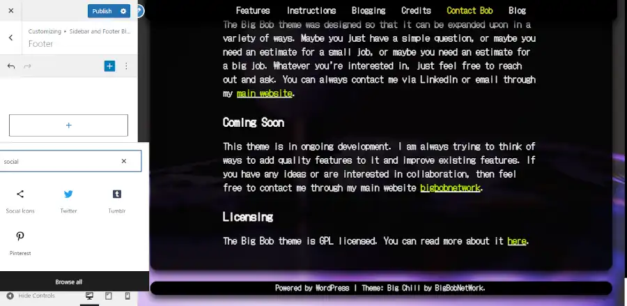
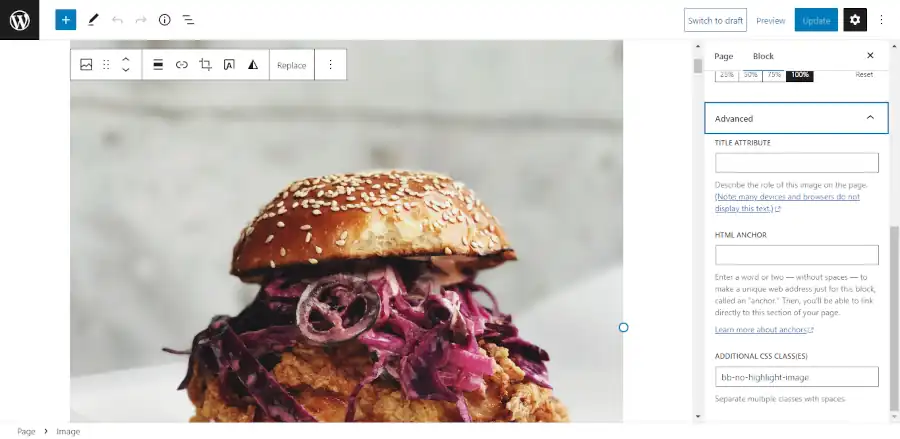
Most of the blocks that you can add should be automatically centered, but if they are not, then you can use the block tools to center them. The blocks have a lot of different tools. If you can’t find what you are looking for then you may need to click on the left most icon on the block toolbar to move up a level (you can keep clicking it to move up more levels), or you may need to click on the right most icon (the three dots) to open up more settings.

Screenshot of footer with social icons.

I don’t want to get too deep into the weeds on how to use blocks. The blocks are powerful, but they have a bit of a learning curve. You need to be patient with learning how to use them. The more you use them, the more intuitive they become.

You can continue to stack single blocks in a single column until you have all of the information that you want to provide. If your site isn’t too large, or if it just doesn’t need many links, then this may be all of the content that you will ever need to put into your footer. But if your site gets significantly large and needs more links then you may need a multicolumn footer.

Creating a Multicolumn Footer

A good rule of thumb for starting a multicolumn footer is to wait until your footer has enough content to justify at least three columns. Whenever you add content, you want to consider overall content management. You want to minimize how frequently you have to make major updates like changing the number of columns in your footer. Two small columns will likely still look good as one column, and two large columns usually still looks good spread out over three columns. I also would avoid using a four column footer because you’ll have to spend a lot more time worrying about space and size issues than if you stick with three columns.

The easiest way to add a multicolumn footer into the customizer is to use a block pattern. Unfortunately, as of the publication of this post, there is no way to call block patterns directly from the customizer. Fortunately, block patterns are just blocks, so you can easily copy a block pattern into a block section of the customizer from the block editor.

The simplest way to do this is open up a draft page and call a footer pattern from the block editor, then add it to the draft page. It’s a good idea to keep one browser tab open for your block editor and another browser tab open for your customizer.

Screenshot of a footer pattern in the block editor.

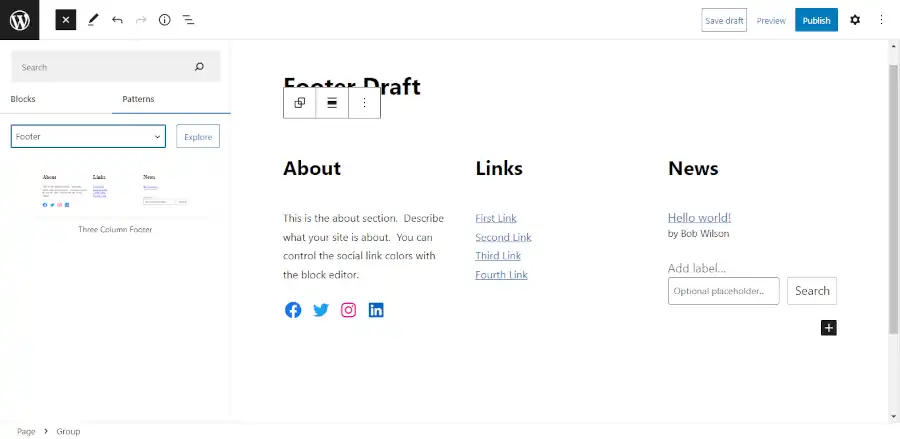
You can work on most of your content while your in the block editor. However, I wouldn’t worry about the colors until you get into the customizer. Using a block pattern is a good way to figure out which kind of blocks ought to go where. However, you can completely add and remove blocks from the pattern as you see fit.

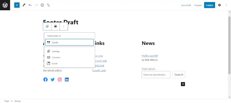
Once you have finished updating your blocks, keep clicking on the left most block icon until you reach the top group block. You can be certain that you have reached the outermost block when clicking on the icon produces a “TRANSFORM TO” option.

Screenshot of outer group block selected

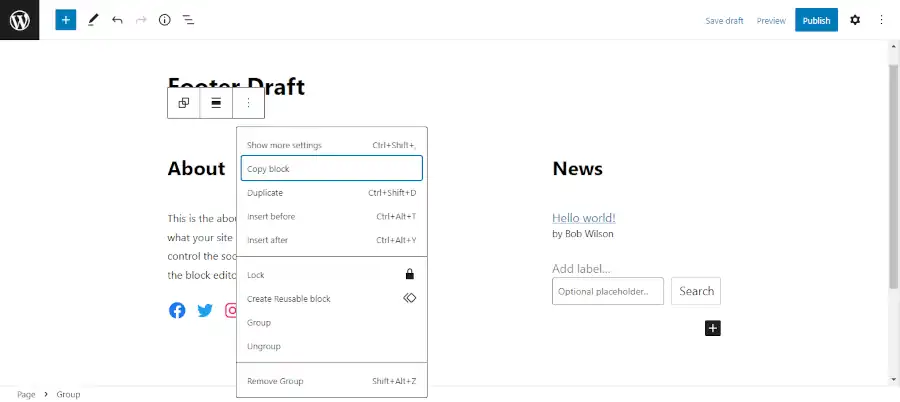
Then copy the entire block pattern.

Screenshot of a block pattern being copied

Now that your pattern has been copied to your clipboard. You can paste it into the customizer. First, open up a new paragraph block in the footer section of the customizer.

Screenshot of opening a paragraph block in the customizer footer section
Screen shot of “Type / to choose a block”

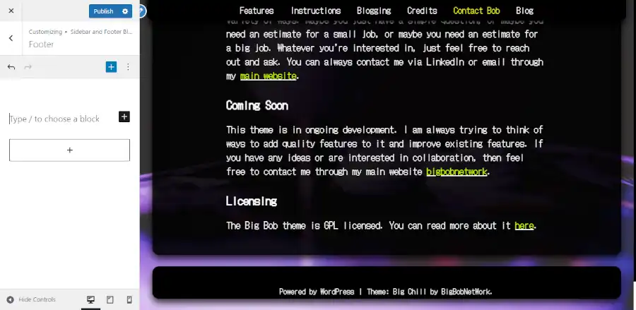
Then click the section that reads “Type / to choose a block”. Then you can either right click and select paste or hit ctrl + v (command + v on a mac).

Screenshot of a three column footer in the customizer

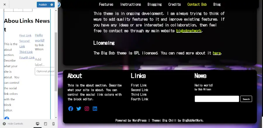
Now you have a three column footer on your website. From here, you will probably be able to make updates to and from the customizer, but if the space is too small then you can just copy and paste your footer back into footer draft page and work on it in there.

Using the Widget Admin Section

If you don’t want to learn another WordPress screen, then you can skip this last section of the tutorial. You don’t need to use this feature. However, it is worth noting that your footer will also appear in the Widgets admin Section. To see the Widgets admin section go to the main admin page then go to Appearance > Widgets.

Screenshot of the Widgets admin area

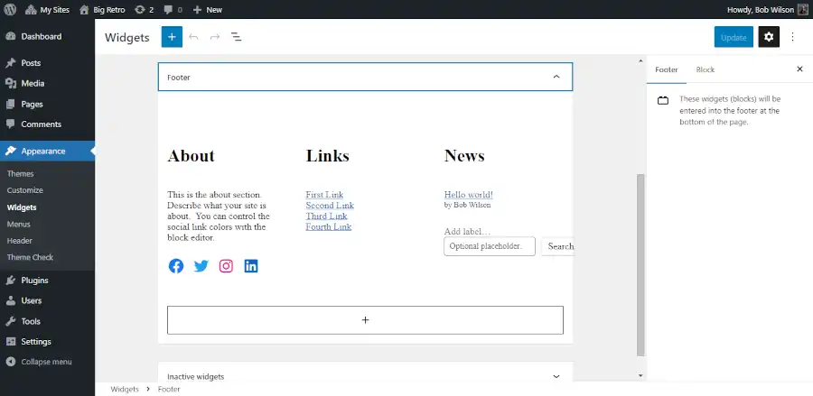
There are two reason that you may want to use this area. First, you will have more space to work with. Second, if you need an area that has more space to work in, then this will save you the hassle of copying back and forth between the customizer and the block editor. You can update your footer directly from this area.

Questions About How to Add a Footer to Your WordPress Site?

If you have any questions, then please post them in the comments section.

Adding a Custom Class to Your WordPress Page

You pick a WordPress theme because you want most of the design to be taken care of for you. However, you may have something that you want to be an exception to your design within a particular page. The solution to your problem is adding a custom class to your WordPress page.

Why Add a Custom Class to Your WordPress Page?

You can make small modifications to your site’s CSS when you add your own custom classes. WordPress offers a lot of controls in its user interface that allow you to make changes to specific blocks, and theme developers will often add custom styling to enhance those options. But it is inevitable that you will eventually want something that is not provided for you by the user interface options.

Assumptions

This tutorial assumes that you already know how to set up a WordPress site, and install a WordPress theme, and you are familiar with the block editor.

Understanding Basic CSS

Nobody knows everything that there is to know about CSS. There are entire websites and books that are devoted to teaching people the subject. Fortunately, you don’t need to learn most of what there is to know about CSS to use it. You don’t need a computer science degree, and you don’t need to be a full on hardcore developer.

How to Determine Existing CSS

If you want to update existing CSS, then you first need to learn how to use your browser’s developer tools. If you want to follow along with what I am doing you can open up a copy of the Big Lights theme, then add some block patterns. Once you have added something with images, you can open up a preview page or a published page, then right click on one of the images and select inspect. It should produce a screen that looks something like this:

Screenshot of the developer tools.

Highlight the img tag the same way as it is shown in the image above, then click on the checkmark next to the attribute that reads “box-shadow.” Do you see how the lights surrounding the images disappear? You can use this technique to see how different attributes are assigned to different classes. So you can add your own classes and write your own updates.

Adding a Custom Class

Next go into the block editor and add a new image, then add a new class name by selecting a block, then open up the settings panel, then select the block tab, then go into advanced and add a new class name:

Adding a new class name in the block editor

Finally, you want to go into the customizer and add your custom CSS to make your update:

.bb-no-highlight-image img {
	box-shadow: none;
}
Lights out for the chicken sandwich

You can now add this same class to other images if you want them to share the update.

It’s okay if you don’t know what the exact syntax is to make the update. It isn’t something that most people try to memorize. If you need to look something up, you can find pretty much everything that you might need need at W3 Schools.

Less is More

You should use the tools provided to you by WordPress and your theme developer. Get familiar with all the existing controls before you start adding custom classes. Some people will use this new found knowledge to try to completely overhaul their site. If you are reading this tutorial, then it is expected that you are not an experienced web developer, so I would discourage you from trying this. I’ve seen a few people try it, and they always end up ruining their site. However, it’s pretty safe to do this for single blocks because the area that you are updating is small, and you can always remove the CSS if you don’t like it.

Questions?

If you have any questions, then feel free to leave them in the comments section.

Adding a Sticky Navbar to Your WordPress Site

Sticky navbars can be tricky to implement, maintain, and update. This is why that although they have tremendous practical and visual value, many sites don’t bother to include them. The best way to implement a sticky navbar is to utilize a theme that provides a sticky navbar feature because, as you will learn in this tutorial, sticky navbars will change the layout of your entire webpage.

Pick the Right Theme for Adding a Sticky Navbar

I’m going to show you how to implement a sticky navbar using the Big Lights theme. You can download Big Lights by going into to your WordPress admin center, then select Appearance > Themes > Add New, then type “Big Lights” into the search box. You can also use the Big Chill theme to build your sticky navbar. The Big Chill theme is similar to the Big Lights theme except the Big Chill theme has different default settings and more features. The instructions below should work for either theme.

Assumptions

This tutorial assumes that you have already established the bulk of your content. If you haven’t determined what content will be presented in your site, then you should determine that before you begin this process. Once you have determined what content you want to use, then you should get a good idea of how to present your content using block patterns. You can read a recent tutorial that I wrote about how to do this here. After you have established what content will go into different pages, you can determine how many page links you will need in your navbar which will serve as the foundation of your site’s sitemap. In addition to determining content, you should also determine your site’s fonts and colors which you can learn about here.

Starting Your Navbar

Now that you have determined an at least approximate layout of your site’s sitemap, you can begin adding content to your site’s navbar. From your admin center, you can either build your menu by going to either Appearance > Menus, or you can go to Appearance > Customize > Menus. Feel free to use whichever user interface is the most intuitive to you.

Don’t worry too much about how well your menu items fit. Just figure out everything that you want to be in there. The only limitations that you want to keep in mind is that you should make sure that you don’t have so many menu items that they become squished on small screens, and if you use a logo, then you want to make sure that it fits properly. Make sure that you use the cropping feature.

Adding a Sticky Navbar to Your WordPress Site (Screenshot of cropping demo)
Screenshot of cropping a logo

Choose Whether or Not Your Navbar Content Should be Centered

After you have decided what your navbar’s content will be, you should have an idea of how much space you have to work with. If your menu is long, then you should choose the default centered navbar. You can also decide if you want to set the title below the navbar on the homepage, which will leave just the menu items in the navbar.

Adding a Sticky Navbar to Your WordPress Site (Screenshot of title below nav)
Screenshot of title below nav

If you are electing to choose a centered menu, then all you have left to do in the Navigation section is choose your menu size and determine if you want to add a tagline.

Adding a Sticky Navbar to Your WordPress Site (screenshot of menu sizing)
screenshot of menu sizing

You can skip ahead to the determining the body position section of this tutorial if you have decided on a centered navbar. But if you want to try for a more space efficient navbar, then keep reading.

Using a Smaller Navbar

If you don’t have that many menu items, then you should consider floating you title or logo to the left and floating your menu to right. To do this, you will find a Center Navbar control in the Navigation section. Turn it off. Once you have turned it off, you will want to make sure that your menu items fit on smaller screens. If they don’t, then you can use the menu sizing controls referenced above to give yourself more room.

If you can’t achieve enough room, then you should switch to a centered navbar. If you have enough room then you should decide if you want your tagline in your menu with the “Add Tagline When Title is in Navbar” control. Once you have done this, then you should determine the menu’s position, as well as the menu button’s position for mobile browsing. You will need to determine the position under five circumstances:

  1. At the top of large screens.
  2. After it has scrolled down large screens.
  3. The top of tablets.
  4. Scrolled down tablets.
  5. Phones
Adding a Sticky Navbar to Your WordPress Site (Screenshot of menu positioning)
Screenshot of menu positioning

You can switch between different screen sizes by using the three display controls in the lower right corner of the controls window on the left side of the screen.

Determining Body Position when Adding a Sticky Navbar

The final step of building your sticky navbar is determining the position of your site’s body. You can do this in the Layout section of the customizer. You’ll have decide how to set your position on three different screen sizes (large screens, tablets, and phones). And if you decide to use big pages, then you will have to determine three more placements for your big pages. How you determine the placement is highly subjective. You will want to consider things like the size of your navbar, how much you want to expose the background, and what your personal preference for spacing is.

(Screenshot of spacing body from top)
Screenshot of spacing body from top

That’s it. If you have any questions, then please post them in the comments section.