You pick a WordPress theme because you want most of the design to be taken care of for you. However, you may have something that you want to be an exception to your design within a particular page. The solution to your problem is adding a custom class to your WordPress page.
Why Add a Custom Class to Your WordPress Page?
You can make small modifications to your site’s CSS when you add your own custom classes. WordPress offers a lot of controls in its user interface that allow you to make changes to specific blocks, and theme developers will often add custom styling to enhance those options. But it is inevitable that you will eventually want something that is not provided for you by the user interface options.
Assumptions
This tutorial assumes that you already know how to set up a WordPress site, and install a WordPress theme, and you are familiar with the block editor.
Understanding Basic CSS
Nobody knows everything that there is to know about CSS. There are entire websites and books that are devoted to teaching people the subject. Fortunately, you don’t need to learn most of what there is to know about CSS to use it. You don’t need a computer science degree, and you don’t need to be a full on hardcore developer.
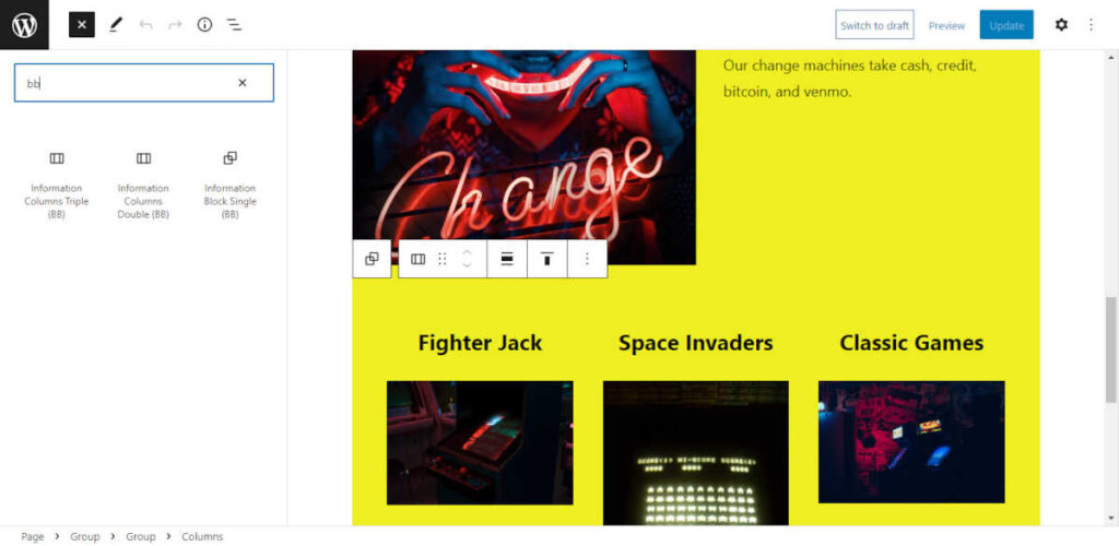
How to Determine Existing CSS
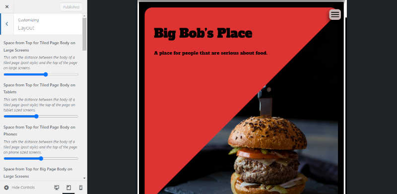
If you want to update existing CSS, then you first need to learn how to use your browser’s developer tools. If you want to follow along with what I am doing you can open up a copy of the Big Lights theme, then add some block patterns. Once you have added something with images, you can open up a preview page or a published page, then right click on one of the images and select inspect. It should produce a screen that looks something like this:
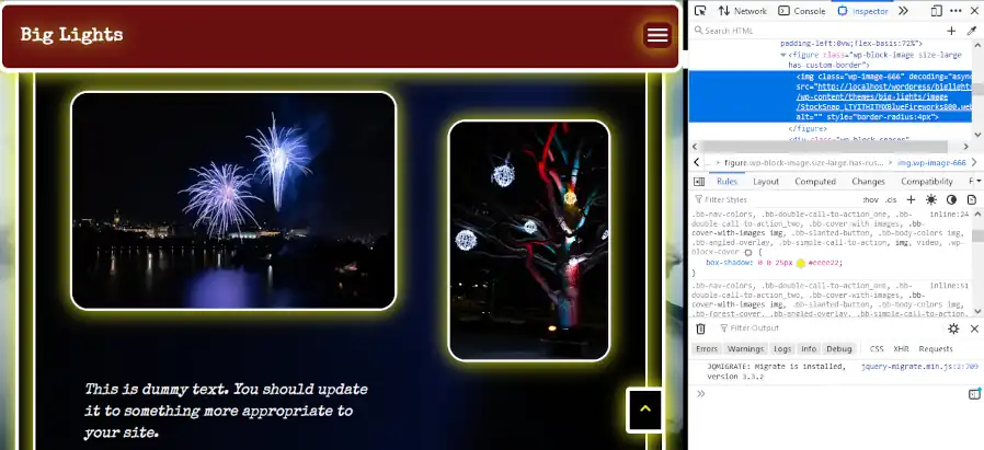
Highlight the img tag the same way as it is shown in the image above, then click on the checkmark next to the attribute that reads “box-shadow.” Do you see how the lights surrounding the images disappear? You can use this technique to see how different attributes are assigned to different classes. So you can add your own classes and write your own updates.
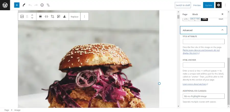
Adding a Custom Class
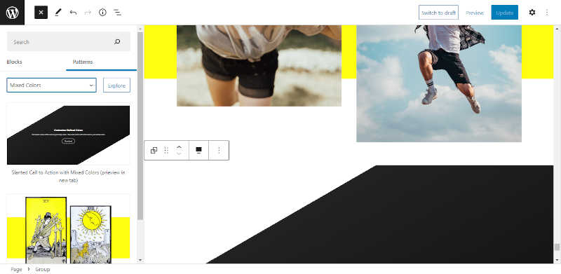
Next go into the block editor and add a new image, then add a new class name by selecting a block, then open up the settings panel, then select the block tab, then go into advanced and add a new class name:
Finally, you want to go into the customizer and add your custom CSS to make your update:
.bb-no-highlight-image img {
	box-shadow: none;
}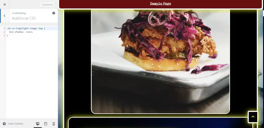
You can now add this same class to other images if you want them to share the update.
It’s okay if you don’t know what the exact syntax is to make the update. It isn’t something that most people try to memorize. If you need to look something up, you can find pretty much everything that you might need need at W3 Schools.
Less is More
You should use the tools provided to you by WordPress and your theme developer. Get familiar with all the existing controls before you start adding custom classes. Some people will use this new found knowledge to try to completely overhaul their site. If you are reading this tutorial, then it is expected that you are not an experienced web developer, so I would discourage you from trying this. I’ve seen a few people try it, and they always end up ruining their site. However, it’s pretty safe to do this for single blocks because the area that you are updating is small, and you can always remove the CSS if you don’t like it.
Questions?
If you have any questions, then feel free to leave them in the comments section.