How to Make a Full Screen Image Mobile Compatible

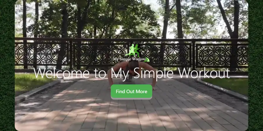
A full screen image is a great way to make a landing page look great. And there have never been more options to set one up. Unfortunately, full screen images are tricky. And there are a lot of ways that you can add one that causes your web page to screw up.

The Dilemma of Full Screen Images

Full screen images have to satisfy very large screens and very small screens. Further, mobile devices interpret how images are printed to the screen different than laptops and desktops. Mobile devices interpret code differently. This causes changes in performance. Mobile devices tend to load pages slower than laptops and desktops. This slow load can be made even slower depending on how you set your images.

A full screen image
An example of a full screen image

Full Screen Image File Size

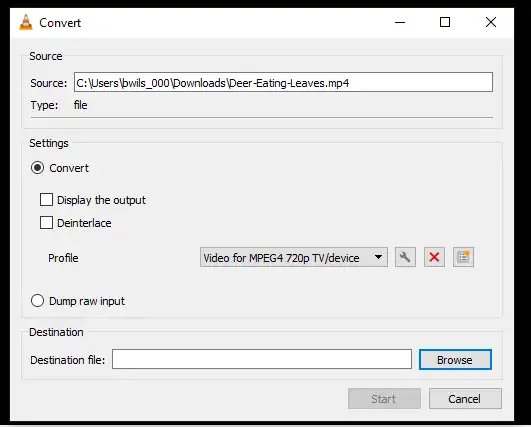
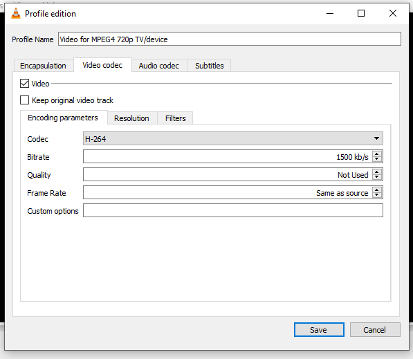
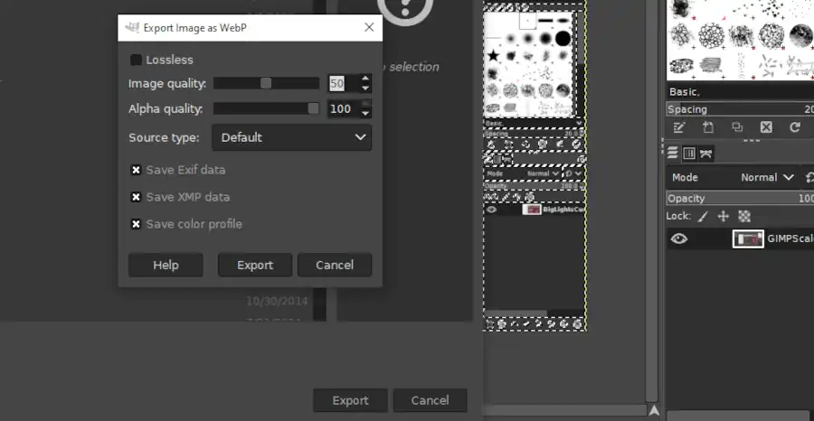
Like any image, you need to set your full screen image file size properly. You should convert your image to webp, then use trial and error to reduce your image’s file size to as small as possible without distorting the image’s quality.

Full Screen Image Dimensions

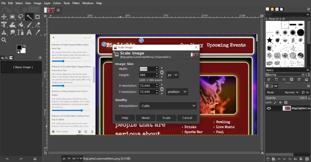
You’ll want your full screen image dimensions to be large enough to support large desktop screens. If you set the width to 2560 px that ought to be a large enough width. You will also want a second smaller file size of 600 px width for mobile devices.

Mobile Compatibility with Static HTML or Bootstrap

Mobile compatibility with custom static HTML written pages require more responsibility than a CMS driven website like WordPress. However, they also offer more flexibility than a CMS driven website. Static HTML pages also don’t require the use of PHP which puts less stress on your server and allows faster output.

Although CMS sites deal with a lot of redundant page load problems using automation, CMS sites will almost always overlook certain conditions that can be more easily handled using a static HTML driven webpage.

Using Fixed Images on Mobile Devices

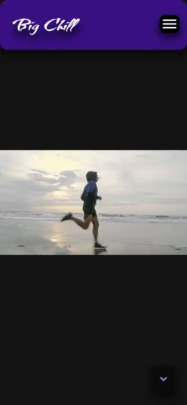
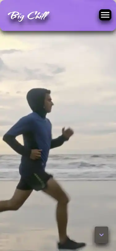
Fixed images are images that stay in the same place when the screen moves. These kinds of images have special considerations on mobile devices. You should not make the assumption that setting an image to fixed using CSS will have the same result on both desktops and mobile devices. In fact, it is nearly certain that there will be a difference.

What makes matters even worse is that different mobile devices will produce different results. On IOS the image will be switched from fixed to static then stretched to fit the screen, and on Android the image will be fixed, but it will make a choppy adjustment to the screen size as the address bar is added and removed.

One solution is to avoid using fixed images, then set multiple image sizes for multiple screen sizes. However, if you want to use fixed images on mobile, I’ll show you the best methods later in this article.

Running a Full Screen Image on Android

Although Android tends to be more flexible than IOS, it tends to load webpages slower if you push it too hard. Nevertheless, Android is the most used smartphone operating system. The consequence is that whenever you have a smartphone sized screen, it behooves you to assume that it is being run on an Android operating system and you should minimize or avoid using fixed images.

Full Screen Image Sizing for Tablets

IPads tend to load fast, but you have to keep in mind that they run on an IOS operating system which has special considerations when delivering images. Having said that, IPads tend to outperform Androids if you know how to load the image properly. The main thing that you have to consider is fixed images. Fortunately you can use the Big Themes to solve that problem for you. I’ll cover that solution later in this article.

Managing Full Screen Image Sizes with Bootstrap

Bootstrap is a mobile first design, so it behooves you to use your smallest images as your default images. That means when you are writing your CSS, you should load the mobile size image first, then tell the browser that if the screen is sufficiently large, then it should load a larger image. For example, you could use something like:

header.masthead {
  background: url("../img/SmallImage.webp");
}
@media (min-width: 600px ) {
  header.masthead {
    background: url("../img/LargeImage.webp");
  }
}

This above code is a good primer for a full screen image that moves with scrolling.

Using WordPress and the Big Themes to Manage Fixed Images

The Big Themes all come with built in scripts that will adjust your images so that they are compatible with your mobile devices. There’s a lot that goes into trying to write a browser side script that is platform independent. So you can save yourself a lot of time and effort if you run a WordPress theme that does this for you. The Big Themes can help you with this.

How Many Image Sizes Do You Need?

You can always make an argument to make another image size. But if your goal is to simply have a good mobile page speed score than usually two different page sizes are sufficient. Your primary consideration needs to be a large screen phone with an Android operating system.

Using the Big Themes

The Big Themes have multiple options for setting full screen images. To learn about setting up the Big Themes, you can head over to the instructions page.

Once you have set up your theme, you can make your full screen images more mobile compatible using the customizer. Then you can use the Additional CSS section of the customizer to make your image more mobile friendly. For example, you could try adding the following:

@media screen and (min-width: 600px) {
	.home .wp-custom-header img {
           content: url("LargeImage.webp");
        }
}
@media screen and (max-width: 599px) {
	.home .wp-custom-header img {
          display: none;
	}
	.home .wp-custom-header {
	   background-image: url('smallImage.webp') !important; 
           background-position: center center;
           background-size: cover;
        }
}

Need Help Writing the Code?

Some people are better at writing CSS than others. Hiring a professional can be a great way to make sure that you are doing things correctly.

How to Add a Header Video to Your Website’s Homepage

A video can be a great way to make your homepage pop, but adding a video is a lot easier said than done. A lot of problems can come up when loading a video that can have a significant negative impact on your site’s performance. This tutorial will give you a step by step explanation of your different options for adding a header video to your site’s homepage, and it will explain a video’s potential and its limitations.

Assumptions

This tutorial gives instructions on how to properly load a video to a WordPress site, and it gives instructions on how to load a video to a basic custom HTML page. So you don’t need to use WordPress to follow this tutorial. If you choose the HTML route, then the expectation is that you are proficient in HTML and CSS. No explicit design instructions are given for a custom page, so if you need further help with an HTML page, then you should consider contacting a pro. If you are setting your video to a standard HTML page, then you can ignore any of this post’s references to page caching, however a CDN is still recommended. These concepts are explained in greater detail below.

If you need to learn fundamentals about building a website, then you can read this.

Cost-Benefit Analysis of the Difference Between a Custom Site and a WordPress Theme

You don’t need to hire someone to set a video into your website. If you use a WordPress theme, then you will have a better chance of building the site yourself, instead of having to hire a pro. However, you need to take the time to set your video up right. If you don’t, then you will have a high probability of having a frustrating experience that won’t produce the results that you are looking for.

Demos for this Tutorial

This tutorial will refer to three different demos. It will refer to the video at the top of this post which you can jump to by clicking the “back to top” button in the lower right hand corner, and it will will refer to a custom site and a WordPress site that will be explained in the next two sections.

A Demo of a Custom Page with a Header Video

The biggest advantage of a custom HTML page is that you can minimize how much you rely on resources. This makes it easier to load a video file that has a larger byte size and runs for a longer period of time. You can also be more deliberate about how you set the video to different window sizes. You can see samples of how a custom page looks by clicking on either of the images below.

Screenshot of a large screen video on a custom page
Screenshot of a mobile screen video on a custom page

At the time of the publication of this post, the video being shown in the custom site was 3.4 MB. This is pretty high. This wouldn’t perform well on a 3G phone loading in Mumbai, India. But it still should perform reasonably well on most well connected mobile devices.

A Demo of a WordPress Site with a Header Video

A WordPress site is a great way to add a video if you don’t know how to code. In particular, you can utilize any of the free Big Themes to serve your videos. They each have a number of options which will be discussed below. You can click on either of the images below to see a demonstration.

Screenshot of a large screen video using the free Big Bob theme.
Screenshot of a mobile screen video using the free Big Bob theme.

At the time of the publication of this post, the video being shown in the links just above this paragraph was 519 KB. You can use each demo to compare the difference in page speed for different video byte sizes. At the time of the original publication of this post, the video being shown at the top of this post was about 1.1 MB. I eventually reduced the size to 231 KB. A good trick that you can use for compressing your video is to upload your video to YouTube, then download it back onto your computer. YouTube will probably have compressed your video quite a bit.

Note that all three video demos also utilized background images in addition to the video when this post was originally published. This shows that even though each page is loading a video, the page can load reasonably fast on mobile even when other features using a significant byte size are utilized.

Update (5/29/23): The background image of the WordPress Test was removed and the theme was updated. The background image may be added back in the future.

Update (6/14/23): The background image for this blog was removed.

Page Load Performance when Adding a Header Video

The best way to get the fastest page load possible is to not use a video at all. The biggest problem that people have when adding a video is they are unprepared for how much a video has the potential to reduce page load speed. All videos will create at least a little deprecation in page load performance, but if you are careful then this performance depreciation can be trivial in comparison to the improvement in your visitor’s experience.

Finding a Good Video

An ideal video is one that you make yourself, however this may be something that is beyond your means. The following are three websites that you can obtain free open source stock video footage from right now:

  1. Pexels
  2. Pixabay
  3. Coverr

Another site worth mentioning is openverse. It doesn’t currently provide videos, but it is new, so it may be possible that this will change in the future.

You can also utilize YouTube videos with the free Big Themes. Make sure that you have made the necessary copyright considerations before you do this. Implementation will be discussed in greater detail later.

Use a Content Delivery Network (CDN)

If you are going to set a video into your site, then you will be dealing with media that has a large file size, so serving it through a CDN is pretty much mandatory. However, if you are unfamiliar with caching and CDN’s, then you should read about setting up the necessary caching software. When reading that tutorial, if you are not using WordPress, then you can skip over the sections about page caching and html caching.

Keep Your File Sizes Modest when Adding a Header Video

Even after you have set your website onto a CDN, you still need to keep your video’s file size reasonable. You want your video to load well across all devices, including mobile.

You should try to get your video’s file size as low as possible. How low should you go? You should try to get it low enough that it performs well on mobile. Ideally, you want the combined total byte size of your media (images, video, etc.) to be under 1 MB. If you have a good CDN, then you will probably be able to push your total file size a bit higher than 1 MB, but I wouldn’t push it any more than necessary. Later, I will also show you how you can set an alternative image for mobile which will allow you to use a larger video file size.

In addition to learning how to reduce your video’s file size, you should also learn how to reduce the file size of any other images that you may be using.

Editing Your Video to Make the File Size Smaller

Editing videos can be frustrating. Video editing will sometimes yield an unusable video. A video will just break after it loads for no obvious reason. But editing is necessary if you want your video to load well.

There are a number of different tools that are available for video editing, and it is impossible to write an exhaustive list. Today, I will show you how to use two different video editors:

  1. Window’s Video Editor: If you have a Windows operating system, then you probably have it already loaded on your computer.
  2. VLC: This is free open source software. It has fewer options than the Windows editor, but you can get your file sizes smaller. However, it seems to deliver more updated videos that break after being loaded onto websites.

Windows Video Editor

The Windows Video Editor is pretty intuitive, so I will spare you specific instructions. The most important things that you need to know are the two ways that you can reduce your file size:

  1. You can cut the total length of the video.
  2. You can reduce the dimensions of the video when you export it. However, you should keep in mind that a smaller export size can affect the performance of the video on larger screen sizes.

If you need more explicit instructions about using the Windows Video Editor, then please post your questions in the comments.

VLC

You can download VLC for free.

You can use VLC to cut the length of your video through a combination of recording and pausing. But I don’t recommend trying to figure this out because it is difficult to be precise.

Once you start playing around with VLC, you will probably set the features so that they are not to your liking, then you will forget the original settings. You can reset VLC to its default settings by going to Tools > Preferences > Reset Preferences (make sure simple is selected).

If you want to minimize page load speed, then your video’s image quality may need to be closer to standard definition than high definition. You can’t reduce byte size without compromising video quality.

Go to Media > Convert/Save > Add > Convert/Save > then go to Profile and continue scrolling down until find “Video for MPEG4 720p TV/device”.

If this does not adequately lower your video’s byte size, then you should try to lower the bit rate. You can lower the bit rate by going to Media > Convert/Save > Add > Convert/Save > then go to Profile and click on the wrench. This will open up a new window. You can click on the Video codec tab, then lower the bit rate until it produces a video with an adequate byte size.

Keep in mind that either of these actions can result in the video having performance problems after you load it onto your site, so you may need to use some trial and error. If you find that the mobile byte size requirements requires that you set a video that isn’t long enough, then you also have the option of hosting your video through YouTube or substituting your video for an image or a GIF on mobile. Both of these options will be discussed in greater detail below.

Mobile Compatibility when Adding a Header Video

You have to consider more than page load time when you consider mobile compatibility. You have to consider how the video will fit to the page.

Choosing the Right WordPress Theme for the Job

You can’t just pick any WordPress theme if you want your video to look good and load to your specifications. If you don’t already know of a theme that has adequate video options, then I recommend the Big Themes.

However, even the Big Themes have their limitations. Each theme has gone through a number of theme changes. This has resulted in a lot of new features being added, but it has also resulted in a couple of features being dropped. The earlier themes had the ability to add featured videos (window sized video headers for any page), and it had the ability to add background images for any page. In the latest themes, featured videos are no longer available because they had too many conflicts when WordPress added query loop blocks. And background images are removed in later themes whenever there is a homepage header image or a window fitted featured image to improve page loading speed.

If you are looking for an older style theme, like the one featured in the WordPress demo, then I would recommend using the Big Scene theme and reading its instructions.

What Kind of Video Are You Using?

Before taking the time to assess how to set your video, you should assess the nature of your video. Is your video something that is meant to sit in the background, or is the whole video screen meant to be watched and focused on. Is it valuable if you only see fragments of it? With the Big Themes, you can set your video using three primary methods:

  1. Set your video to fit the window like in the WordPress demo.
  2. Set the video to the top of the body like in this post. You can click the “back to top” in the lower right hand corner to review this video.
  3. Set the video into the background. This requires a video that is more abstract and looks good even if you only see small portions of it.

Setting Your Video to Fill the Screen

By default the Big Themes set your homepage header videos to fit the screen. If you’re setting your video based on the window size, then you have three options for dealing with the negative space:

  1. You can fill the background with an appropriate background color. Your background color can be updated in the Colors section of the customizer if you are using the Big Themes.
  2. You can fill the background with a background image if you are using one of the earlier Big Themes.
  3. You can add custom CSS to fill the video across the entire screen.

Adding Custom CSS to Fill the Video Across the Screen

I have already written about how to set your video to fill the screen if you are using the Big Themes in another post. The only thing that I’ll add to the discussion is that that tutorial is not comprehensive. There are a number of different scenarios and personal preferences that you may want to use to suit your circumstances. If you have trouble modifying the code to suit your needs, then please post a question in the comments section.

There’s also an argument to made for trying to write a video sizing algorithm using JavaScript. Using a generalized algorithm would make updating easier, but you should keep in mind that if you were to use this method, the script would have to be loaded at runtime which would increase the page load time after your website first appears on the screen. It would also make it more difficult to specify certain conditions. For example, you may want it to fit on wide screens and fill on mobile sized screens.

If you want your video always set to fit, then you don’t have to do anything. This is the default setting.

Using a YouTube Video

It is also possible to load a video through YouTube, which is a great way to load large videos fast, however YouTube has several drawbacks:

  1. You have to set the video size to fit the screen. The above CSS tutorial will not work. And any remaining negative space will always appear black.
  2. Some browsers will stop YouTube from auto playing. This makes setting the video into the background problematic.
  3. It always announces that it is a YouTube video. However, you can use the navbar to cover some of this up on certain window sizes.

To add a YouTube video with the Big Themes, all you have to do is add the video’s address into the homepage header media section.

Setting Your Navbar’s Opacity

Most of the Big Themes allow you to change your navbar’s opacity. Navbar opacity is a measure of how easy it is to see through your navbar. You will probably want to do this to make your video more visible. You can find the opacity controls in the Colors section of the customizer.

A Note on Mobile Browsers when Adding a Header Video

If you set your video size based on the window size, then you should expect it to load lower on the page on some mobile browsers because they will move the bottom of the video below the viewport to make room for the address bar. The address bar will then recede into the top of the screen when the visitor scrolls down the page.

Setting Your Video to the Top of Your Homepage Body

If you are building your page from scratch, then you can you be more liberal about how you set your video. See the custom page demo. But if you are using a WordPress theme, then you will have to choose between layout options.

Adding your video to the top of the page body has the advantage and disadvantage of keeping the dimensions of your video smaller. This is an advantage because videos with smaller dimensions have lower byte sizes, but it is a disadvantage because you can’t make the video as big without distortion.

If are using WordPress, then you can use a video block. You can see a demo of this by viewing the video at the top of this post by clicking the “back to top” button in the lower right hand corner. Using this option will also let you set your video in front of a background image on the most recent Big Themes. Once you have set your video, you can use the block options to set your video to autoplay like in the screenshot below:

This is how you set a video block to autoplay at the top of the page body.

Setting Your Navbar’s Position Relative to the Body

The latest Big Themes allow you to set the page’s body relative to the navbar. This is a subjective process that will be affected by your background image, and the content of your navbar, and the content at the top of your page body. These options are great for distinguishing your layout on different window sizes.

Substitute an Image on Mobile

If you are trying to load a total media byte count that is larger than 1 MB, then you may want to consider substituting an image on mobile. You can cut a video frame into an image by using Windows Video Editor. You can then use the cropping feature to update your video frame so that it better fits a mobile device.

This will actually increase the page load on large screens because the image will be loaded first, then the video will be loaded. But on mobile environments only the image will be loaded, so the total byte size will be smaller on mobile. This allows you to use a video with a byte size small enough to run well on a desktop or laptop, but too large to run well on a mobile device.

If you are using one of the Big Themes, then make sure that the “Show Header Video on Mobile” control is switched off. This control can be found in the Homepage Header Media section of the customizer.

Consider a GIF when Adding a Header Video

Videos tend to have smaller byte sizes than .gif files, and videos tend to look better. But if you use a GIF then you can manipulate it like an image.

You can add a .gif file the same way that you add an image, and you can substitute it for a video the same way that you substitute an image.

There are an epic number of free ways to make a GIF, and I actually don’t make them very often. So I doubt that I can provide you with a better tutorial then something you can locate with a minimal amount of research using a search engine.

Setting Your Image or GIF to Fill the Phone’s Viewport

The Big Themes all have scripts to size your images to your visitor’s phone’s viewport. If you want your image or GIF to fill the screen, then all you have to do is turn on the “Big Header Image” control in the Homepage Header Media section of the customizer.

Using a Preloader when Adding a Header Video

The latest Big Themes all turn on a preloader whenever an image needs to be sized to the window after the page loads. You can turn this off in the Site Identity section of the customizer, but turning it off is not recommended. However, you should be aware that the preloader may cut into the beginning of your video, but this is usually only a trivial amount of time if you have everything set up right.

Questions about Adding a Header Video?

This tutorial was pretty thorough, but I still might have missed something. If there is something else that you need to know, then please post your question in the comments area.

A Long Term Plan for Building and Maintaining a Website

Websites are dynamic. Building a GOOD website takes time, and maintaining and updating a website lasts indefinitely. So it can be helpful if you have an outline that you can keep coming back to so that you don’t lose track of what you are doing.

How to Read this Post

This is a blog post that you will probably want to come back to again and again. You can read it all at once, but you don’t have to. You should bookmark this post. Then you can come back to it after you have been distracted by non website building related work. This post contains lots of links that may take you through multiple days of work, so be patient and focus on improving your website one session at a time. If you take the time to put the work in, then you can make your website great.

It will probably be simplest if you follow each lesson in the order that it appears, but this isn’t mandatory. Even if you have already started your website, if you feel lost and confused, then this post can be helpful. It can show you how to overcome some fundamental problems that may have been nagging you for years.

Step 1: Organize the Information that You Need for Building and Maintaining a Website

If you have never built a website, and you don’t have any education in software development, then you are pretty much at the mercy of the internet, and the internet is really disorganized. This post will not tell you everything that you need to know, and it will not lead you to everything that you need to know. But it will help give you a great foundation that you can keep coming back to so that you don’t fly off onto a tangent in the wilderness of website development. If you ever feel overwhelmed and don’t know what to do, then reading this post from the beginning can be a great way to troubleshoot and find the solution to your problem.

Step 2: Determine Your Economy for Building and Maintaining a Website

You can’t bring a website into existence simply through the power of your imagination. You need resources. Before you take any action, you need to determine how much time and expense is necessary to build your website your way. Learn how to allocate fundamental resources for your site.

Step 3: Set Up Your Webhost and Foundational Software for Building and Maintaining Your Website

I never assume my customers will be running their website on a high quality managed webhost. I always assume that they are using something cheap and unmanaged, and they will need free support software to make sure that their sites load properly. If you are paying extra for managed hosting, then you may be able to skip some of these steps. However, there are five things that you will need to set up a site with unmanaged webhosting on a shared server. If all you have done is purchase a webhost, then you should give yourself a considerable amount of time to go through each of these steps. They will take awhile.

  1. Content Management Software: Learn about WordPress.
  2. Template Management Software: Learn about WordPress themes.
  3. Caching Software: Learn how to get your pages loading fast without an expensive managed webhosting plan.
  4. SEO Software: Learn to easiest ways to get your website noticed by search engines.
  5. Image Manipulation Software: Learn how to make your images look good without sacrificing page load speed.

Step 4: Set Up Your Website and Add Content

Now that you have all of the software that you need installed, you can get into the business of setting up your layout and adding content. It is usually simpler to work on your layout before you add your content, but building a website isn’t a perfect process, so don’t let yourself get frustrated if you can’t or don’t do things in the ideal order. Below is a list of steps for building or updating your site’s content and layout. You should expect getting though this entire list to take a significant amount of time.

  1. Update your theme. Updating your theme is usually difficult. But if your site isn’t doing what you want it to, then jamming another plugin into it probably isn’t the solution. If you want to make a real change, then you should probably take the time to change your theme. I highly recommend the Big Themes.
  2. Set the right colors and fonts. Your colors and fonts will have more influence over how your site looks than anything else. Keep experimenting with them until they match your site’s message.
  3. Set your main navbar properly. A great navbar will make your user’s experience easy, and it will make them want to continue using your site. But a bad navbar will make them want to leave your site. Your navbar will impact how the rest of your site works, so take the time to set it right.
  4. Learn how to build a footer. Not every site needs a footer, but too many people don’t bother with them because they don’t even know how to set one up. Most sites that have a significant amount of content ought to have a footer, so learn how to set one up.
  5. Learn how to build a sidebar. If you are blogging, then learning about sidebars is a must. But even if you are just building a regular website, sidebars can be very useful, especially for stuff like advertising.
  6. Build a one page site. If you don’t have a site set up yet, then you have probably grown frustrated with how long this process has taken. Building a one page site is a great way to start your website presence. You can grow your website into multiple pages as time and content becomes available.
  7. Add foundational content. If your site is still looking basic, then you can use simple features to add a lot of style. You can add images and video.
  8. Create more sophisticated content. There are lots of free tools available for styling and organizing content. You should learn how to use them if you want your website to be taken seriously.
  9. Get into the weeds. If you’re not a developer, then you should try to avoid coding as much as possible, but sometimes using a little coding is the only way to get something exactly the way you want it.
  10. Ask for help. Developing websites is a collaborative process. Nobody builds a website in pure isolation. People that are afraid to ask questions usually make avoidable mistakes.

Questions?

I would like this post to be a living document that I can update periodically. If you think that there is something that ought to be added, or there is something about it that you don’t understand, then please post it to the comments area.

Convert Your Images to WebP

The WebP image file type is a way for you to set higher quality images onto your website. WebP images look better at smaller file sizes than other image file types. This means that your images will look better and load faster when you convert them to WebP. WebP was actually invented by Google over a decade ago. But it took quite a while for it to catch on because it needed time for browsers to become WebP compatible.

How Important is it to Convert Your Images to WebP?

If you have already been doing a good job of setting web friendly images, and your site contains a lot of images, then I wouldn’t go through every image and convert each one to WebP. However, you should consider converting all of your new images to WebP. However, if your site is running slow, and you have already done a good job of caching your site, then you may find that reducing the dimensions of your images and converting them to WebP may improve your loading times.

WebP and WordPress Compatibility

This tutorial will reference WordPress, however it will show you how to convert your images to WebP without using WordPress tools.

WebP has been compatible with WordPress since version 5.8. So if you don’t have WordPress 5.8 or higher then you will need to update if you want to use WebP images.

In addition to WordPress version compatibility, you should also consider WordPress theme compatibility. Some themes do a better job of managing image sizes than others. You want to pick a theme like one of the latest Big Themes that sets clear limits on how big an image can be. That way you can set your image to a maximum size that you know won’t get so large that it becomes distorted.

Update Your Images to WebP with GIMP

GIMP is free software that you can use to amplify compression and convert file types.

GIMP is a full service image editor that has capabilities that extend well beyond what you will probably need for WordPress. But if you are just using GIMP to compress your images, then it isn’t that difficult to use. Just follow these instructions:

  1. Download GIMP if you haven’t already.
  2. In Gimp, go to File > Open, then choose the file you want to open.
  3. Go to Image > Scale Image. A good rule of thumb is if you are using one of the Big Themes, then set the width of your images to one of the following sizes:
    • 900 for images half the body or smaller.
    • 1200 if you are using a standard page width and you have an image that traverses the entire body width.
    • 1800 for full body width when using Big Pages.
    • 2560 if you are using a background image, a header image, or a featured image.
Using image scaling to convert your images to WebP
Screenshot of image scaling
  1. Once you have set your image width, go to File > Export As.
  2. Replace the current image file extension (probably .jpg or .png) with .webp. You may also want to rename the file so that it includes a reference to the width.
  3. Click export, then lower the image quality to 50 percent. You can experiment with even lower image quality if you think the image’s appearance won’t suffer too much.
  4. Click Export.
convert your images to WebP
Screenshot of exporting to WebP

That’s it. If you have any questions, then feel free to post them to the comments section.