Website Security Basics

Where there’s a will, there’s a way. If somebody really wants to hack into your website, if they put enough time and effort into it, then they can probably make it happen. But most hackers aren’t looking for hard targets. They’re looking for easy targets. So here are some simple and highly effective ways that you can improve the security of your website.

Website Security Basics: Only Use Well Managed Input Boxes

An input box is one of the most direct paths to your website’s host server. The best way to keep your input boxes secure is to not create any in the first place. However, if you absolutely need one, you should make sure that you use extra caution.

A lot of people like to use contact forms. Many people consider contact forms to be standard operating procedure. If you have a business that you are sure would benefit from a contact form, then my recommendation is that you set it up through a well managed plugin that gets regular updates. Or have it built into to your page by a developer that will run regular updates. But the safest bet is to not use one.

Website Security Basics: Hide Your Passwords in a Private Directory

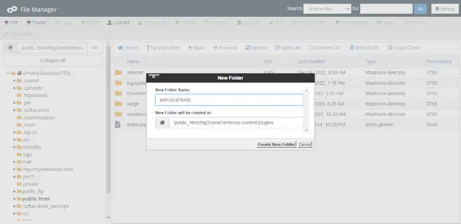
When you first set up your WordPress site it is not as secure as it could be out of the box. There are a bunch of passwords within your main WordPress directory. Put those passwords into a private directory. If you don’t know how to do this, then you should hire a developer to do it. If you do it wrong, then you’ll mess up your site. But if you don’t do it at all, then you’ll increase your chances of people being able to discover your passwords. Anytime you use passwords, make sure that you move them out of public directory paths.

Website Security Basics: Use a CDN like Cloudflare

CDNs don’t just make your website faster, they also create a checkpoint that your visitors have to pass through. Even free CDN versions will usually provide some kind of bot management. Setting up Cloudflare is free. So there really isn’t a good reason not to use it.

Website Security Basics: Download Your Software from Reputable Sources

Open source software often has little to no restriction on republication. Make sure that you download all of your open source software from legitimate download sources. It is common for people to take other people’s software, then repurpose it under their own brand and add malware to it. For example, if you want to download the Big Themes, then you should download them from wordpress.org or through the WordPress admin center.

Minimize the use of Third Party Inline JavaScript Services

Doing things like embedding interactive maps and third party videos can be a great way to improve the functionality of your site as long as you perform regular maintenance. However, hackers love to exploit these well known security vulnerabilities. A good rule of thumb is if you don’t regularly update these features, the you shouldn’t use them. Not using them will make your website more secure, and it will make your pages load faster, especially on mobile devices.

Frequently Update Your Support Software

People become timid about updating their support software because they worry that it will cause breaking changes. But not updating it can open up security vulnerabilities. If you use services like WordPress, you don’t have to necessarily update to the latest version as soon as it becomes available, but after the new version of WordPress receives a security update or two, you should probably update to the latest version.

Website Security Basics: Avoid Obscure Poorly Maintained Plugins

Some plugins don’t get updated for years and work great. So it can be difficult to determine the difference between a plugin that you can depend on and one that you can’t. You should do your research on any plugin that you use. And check on it on a regular basis to make sure that it doesn’t have any problems. If you’re not sure about the quality of a plugin, then you should contact a pro to review your site.

Website Security Basics: Avoid Hot New Underdeveloped Software

Open source software is often pushed out to the public with many bugs and problems undetected, including security vulnerabilities. And it can be difficult to tell when to adopt something new. New versions of existing software tend to be more reliable than totally new kinds of software, but that isn’t always true. Do your research or consult with a professional. Don’t be afraid to wait. But don’t be so timid that you fall behind.

Website Security Basics: Be Wary of Outdated Software

Some software works great long after it has reached its end of life and no new features are being added. Other old software becomes a place where hackers can find vulnerabilities that they know won’t be repaired. Using older software can be a great way to maintain site stability. But you have to make sure that it is still safe to use.

Have a Professional Review Your Website on a Regular Basis

Having a professional perform a routine checkup on your website is like seeing your physician once a year. Sometimes it seems like a waste of time because there is nothing wrong. And sometimes you find out things that you don’t want to learn. But you should do it anyway if you want avoid more serious problems.

Page Caching PHP to HTML and the Latest Versions of WordPress

It used to be that if you were using even moderately sophisticated PHP programs, then you wold want to convert your PHP pages to HTML on your local server so that users wouldn’t need to wait for your pages to be processed. But is that still necessary? Anecdotally, I have been removing local page caching plugins from many sites, and whenever I have done it with the latest version of PHP (8.2 as of this post) and WordPress (6.3 as of the post), I have noticed that the page speed performance has improved with the version updates, even though I had removed a caching plugin. In fact, I have seen some caching plugins that have actually caused the page speed to slow down.

How Do These Plugins Work?

Caching plugins can do a lot of things. The particular plugins that I am referencing are plugins that create a folder, then they run the PHP program that creates the page for your visitor, then they store that page as an HTML file in the folder so that your users don’t have to wait for your PHP program to be run when they request the page. It is also possible for a plugin to use hashing, but the principle is still the same.

WordPress and PHP Processing Speed

When WordPress and PHP are capable of processing your programs faster, storing a ready copy as HTML can have an undetectable influence. However, other factors can make PHP to HTML caching useful.

Server Impact of Caching PHP to HTML

It is also important to realize that the server that your site is being hosted on will also have an impact on how fast your PHP programs are processed. Higher quality servers can process information faster than lower quality servers. Think of how much your PC improved the last time that you got a new laptop. The same principle is true for servers and their operating software.

WordPress Theme and Plugins Impact

How your WordPress theme is written is another factor that will affect how fast your PHP is processed. The quantity and quality of your plugins will also have an impact. However, you may find that themes and plugins that used to be a little bit slow will now load about as fast as a lot of the so called “lightweight” themes if they have been updated to the latest versions of WordPress and PHP.

Traffic Impact of Caching PHP to HTML

The number of people that are using your site will also have an impact on how fast your page is loading. If you are on a shared server, then other websites that are being hosted on your site will also present an impact.

The Advantages of Not Caching PHP to HTML

The primary advantage of not caching your HTML locally is you have less to manage. Anytime you add a plugin to your WordPress site, you make it more complicated to manage. You need to make sure that the plugin is set up properly, and it is actually working. And you need to make sure that the HTML files are not out of date. So you may be required to manually refresh the cache after updating content.

Don’t Neglect the Use of a CDN

It’s important to realize the impact of not caching HTML pages on a local server is distinct from other forms of caching. Eliminating local HTML caching will not offset the need to use a CDN. It is also worth noting that if you know how to cache your HTML into a CDN, that may still cause a detectable performance enhancement.

Try It and Test It

Do you want to know if you can ditch your page caching plugin? All you have to do is try it and test it. First run your web page and see what page speed score you get. Then disable your page caching plugin and run the test again. Try this on at least several pages of your site. If the performance of your page is as good or better than before you disabled the plugin, it probably means that you don’t need a local page caching plugin anymore.

My Experience

My experience has been pretty consistent. WordPress websites that run on traffic appropriate servers don’t seem to benefit from local PHP to HTML page caching anymore. However, I have noticed that there is still a slight benefit from caching the HTML into a CDN. It should be noted that most of my testing has been done using the Big Themes. It is also worth noting that WordPress 6.4 is currently being advertised as being even faster than WordPress 6.3.

Questions?

If you have any questions, then feel free to post them in the comments sections below.

Google Fonts CDN Versus the Cloudflare CDN

You probably have realized that serving your fonts through Google’s Font CDN is faster than serving your fonts locally, but if you’re like me you may be wondering if Google’s CDN is the fastest CDN available. So I decided to test the Google Fonts CDN versus the Cloudflare CDN.

TL:DR
My personal experience is that after using seven different series of fonts, the Cloudflare CDN is consistently faster on a 4G mobile network by about a second, but the difference on laptops or desktops with a good connection is less noticeable.

Assumptions of Knowledge

You will need to understand how a content delivery network and caching works if you want to understand this post.

The Kinds Of Pages That I Tested

I used both Bootstrap based and WordPress based pages. And each page had different kinds of content.

The Local Server I Tested On

I used a HostGator shared server to run every font series that I tested. This is hardly the world’s greatest server, but it isn’t terrible either. So it is a good local server to test on if you’re trying to determine average results.

The Tools I Tested With

I primarily relied on Google Page Speed Insights to test the performance of my different pages.

The Work Necessary to Perform the Updates

I wouldn’t say that performing the updates was complicated, but it was tedious and time consuming. It required a lot of attention to detail. Ordinarily, this is part of the fun of coding, but when you’re doing something as monotonous and repetitive as this, your mind might fight to wander off into more entertaining territory.

My method was to hard code the results when I used Bootstrap pages. And for my WordPress pages, I used a simple plugin that served primarily as a code template that resulted in mostly hard coding.

There are other WordPress plugins that don’t require you to write code, but they have inefficient coding, so I would be concerned that they would not be ideal for improving page speed. The plugins are only designed to host your fonts locally. So if they don’t process the results fast, then they will contradict the speed enhancement of being served through Cloudflare. The plugin that I used was designed so that each time you must rewrite it to host exact fonts for an exact page, so there is no processing waste needed to be performed for generalization.

The Results of the Google Fonts CDN Versus the Cloudflare CDN

Perfect 100 score on a smart phone utilizing a 4G Network. The loaded visible screen includes a full screen image, a typing feature, and an animated button.

I don’t want to be too presumptuous as to why the performance was faster; I only want to note that the performance was consistent. I don’t remember how many tests I performed, but after considering standard deviation, it was safe to say that the tests resulted in about a second faster in page speed on a 4G mobile network. However, desktops that already loaded fast didn’t load much faster.

Is It Worth the Time and Effort?

I don’t have a great answer to that question. Taking the time to do this isn’t something that I would encourage every website owner to perform. But if you get a lot of mobile traffic, and your visitors don’t have a lot of patience, then I would certainly consider it.

If you’re not a developer or you are not unusually tech savvy, then you may find this operation to be pretty difficult. There are a lot of different ways to make mistakes, so almost anybody that tries this is likely to make one. And if you don’t know how to troubleshoot, then you’ll probably get stuck. So if this is important to you, and you don’t have the means to do it yourself, then you should probably hire a pro.

Build Your Own Local Fonts WordPress Plugin

Building a WordPress plugin may seem daunting. But building your own local fonts plugin is actually pretty easy. The great thing about having your own plugin is your fonts will stay with you if you ever decide to change your WordPress theme. There are lots of different plugins that will allow you to set your fonts locally. But most of them feature a lot more overhead than is necessary. Most of what makes loading fonts locally complicated is understanding the font file path and assigning the font families.

This tutorial will be using the Big Themes as an example, but you should be able to use your new plugin with almost any theme that allows you to add custom CSS.

Assumptions

This is an advanced tutorial. You should understand the distinctions between hosting fonts with a third party CDN, hosting fonts locally, and using web safe fonts. You should also understand the basics of setting up a website.

Why Would You Bother Adding Your Fonts Locally?

Hosting fonts locally has become popular among many circles. But I generally don’t advocate for hosting fonts locally if it is unnecessary. Hosting fonts locally introduces a number of new problems that can be avoided when calling fonts from a third party CDN or using web safe fonts. But if it is done properly, then hosting fonts locally can be competitive with a third party CDN, but it probably will not outperform it with any consistency or significance.

In many cases, hosting fonts locally isn’t worth the time and effort. However, there are some reasons that you may want to do it. This tutorial assumes that you understand why you want to host your fonts locally and you have considered your other options such as using the Google CDN or using web safe fonts. It also assumes that you are using your own CDN to host your fonts. If you don’t have your own CDN, then hosting fonts locally will almost certainly slow down your site’s page load speed.

GitHub Template

I have created a plugin template called add-local-fonts that you can download and add to your WordPress plugins folder. It isn’t mandatory that you use this template because I will explain how to build your plugin one file at a time. But using this plugin may be helpful because you can use it to get something loaded and working fast, then you can modify it to serve your purposes.

Using CPanel

This demo will show you how to add a new plugin using CPanel. Most major webhosts use CPanel, so there is a good chance that you have access to this feature. If your webhost doesn’t use CPanel, then you will have to access your files using some other resource. If your webhost doesn’t have any kind of file access software, then you will need to set up a file transfer service like FileZilla.

Even if you have CPanel, I recommend using FileZilla to transfer the plugin template. Setting up FileZilla goes beyond the scope of this tutorial. But if you have it set up, then all you have to do is download my plugin, then unzip it, then transfer the file inside of it labeled “add-local-fonts” to your plugins directory.

Building the Plugin Using CPanel

Go to CPanel, then go to File Manager, then find your plugins directory by clicking through the file path “The name of your home WordPress folder” > wp-content > plugins.

Next, click on the button “+ folder”, then create the folder add-local-fonts.

local fonts
Adding a new plugins folder with CPanel.

Adding the Local Fonts Main Plugin File

Next, double click your new “add-local-fonts” folder, then click on “+ file” button, then add a blank file named “add-local-fonts.php”.

Then right click the new file and choose edit, then add the following code and save it.

<?php
/**
 * Plugin Name:       Add Local Fonts
 * Plugin URI:        https://bigbobnetwork.com/
 * Description:       Loads fonts locally.
 * Version:           0.1
 * Requires at least: 5.9
 * Requires PHP:      7.4
 * Author:            Bob Wilson
 * Author URI:        https://bigbobnetwork.com/
 * License:           GPL v2 or later
 * License URI:       https://www.gnu.org/licenses/gpl-2.0.html
 */

function big_bob_add_font_scripts() {
    wp_enqueue_style( 'bb-add-fonts', plugin_dir_url( __FILE__ ) . '/bb-add-fonts.css?v=0.1', array() );
}
add_action( 'wp_enqueue_scripts', 'big_bob_add_font_scripts' );

All the main plugin file does is add another file, so now we’ll add that file.

Adding the Local Fonts CSS file

Using the same process, you want to add a file named “bb-add-fonts.css”, then add the following code to the file.

@font-face {
	font-family: Abel-Regular;
	src: url(Abel/Abel-Regular.ttf);
}

@font-face {
	font-family: RobotoCondensed-Bold;
	src: url(Roboto_Condensed/RobotoCondensed-Bold.ttf);
}

@font-face {
	font-family: RobotoCondensed-Regular;
	src: url(Roboto_Condensed/RobotoCondensed-Regular.ttf);
}

@font-face {
	font-family: SpecialElite-Regular;
	src: url(Special_Elite/SpecialElite-Regular.ttf);
}

This is just a template. You want to pay special attention to each file and how it is named and called and formatted relative to the directory path. You will use the same syntax and formatting when you add your fonts. The directory path (the part labeled src) will make more sense once you have added the font files to the plugin.

Choosing Your Local Fonts

This tutorial will show you how to add fonts from fonts.google.com. You can look up the fonts being used in this demonstration on their site and download them from there, or you can take them out of the plugin file in my GitHub repository. However, if you are using Google fonts, you can also let Google host them for you.

But you don’t have to download fonts from the Google fonts website. You can use any fonts that you have a license for. Not having a third party CDN to host your fonts is probably the best reason that I can think of to host your fonts locally.

Add Your Local Fonts Files

When you add files via CPanel, you can’t transfer folders, you will have to create the folder using the instructions above. This is one reason that file transfer software like FileZilla is preferable. All of the folders will have to match the paths defined in the above CSS file. This will be discussed in more detail below.

You can upload files by clicking the upload button. Then you can drag and drop each file into the appropriate folder. Or you can double click the folder you want to add it to and add it directly. You can restructure your folders as you see fit. Or you can put all of the font files in the main folder. However, you decide to structure it, you need to make sure that the paths in the CSS file are consistent with the location of your font files in the plugin.

For example, you could restructure your files like this:

local fonts
The various file path possibilities for font files

Then update your CSS file to this:

@font-face {
	font-family: Abel-Regular;
	src: url(Abel/Abel-Regular.ttf);
}

@font-face {
	font-family: RobotoCondensed-Bold;
	src: url(fonts/Roboto_Condensed/RobotoCondensed-Bold.ttf);
}

@font-face {
	font-family: RobotoCondensed-Regular;
	src: url(fonts/Roboto_Condensed/RobotoCondensed-Regular.ttf);
}

@font-face {
	font-family: SpecialElite-Regular;
	src: url(SpecialElite-Regular.ttf);
}

Add Additional CSS to the customizer

At this point, if you’re logged into to your WordPress admin center, then your file paths may not be saved and/or cached properly to your WordPress admin center. Before you go any further, you probably want to either completely close down your browser, or open your wp-admin in a new incognito (in private) browser, or use a different browser.

It can also be helpful to update the version number in your PHP file. This means you can change the demo from:

bb-add-fonts.css?v=0.1

to:

bb-add-fonts.css?v=0.2

Once you are in your WordPress admin center go to Appearance > Customize > Additonal CSS.

If you are using any of the Big Themes, and you are still using the demo fonts, then you should be able to add the following code to the Additional CSS section and notice an immediate change in your fonts. But if you don’t see a change, then try an incognito window or a different browser. You can also try changing the version number in the PHP file using the method referenced earlier.

/*Title Fonts*/
.site-title, .bb-site-title-top,
.bb-forest-cover h1,
.bb-forest-cover h2,
.bb-forest-cover h3 {
	font-family: RobotoCondensed-Bold  !important;
}

/*Heading Fonts*/
h1, h2, h3, h4, h5, h6, .site-description, .bb-site-description-top {
	font-family: RobotoCondensed-Regular !important;
}

/*Paragraph Fonts*/
body,
p, pre, textarea, .comment-author, .entry-content li, .wp-block-latest-posts,
.entry-meta,
.entry-footer,
.nav-links,
.comment-metadata,
.reply,
input,
select,
optgroup,
.bb-sideStick li,
#bb-sideSlide li {
	font-family: Abel-Regular!important;
}

/*Menu fonts*/
#primary-menu li,
#bb-sidebar-menu li {
	font-family: SpecialElite-Regular !important;
}

If you aren’t using the Big Themes, then you’ll need to determine your font classes by inspecting them in your browser.

Remove All Calls to the Google CDN

You should remove any calls you have to the Google CDN since you are no longer using those fonts.

It’s easy to remove calls to the Google CDN if you are using the Big Themes. Just go to the Typography section of the Customizer and delete everything from the input boxes including white space.

If you aren’t using one of the Big Themes, then you will have to consult your theme’s documentation to determine what to do.

Confirm that the Google CDN Calls Have Been Removed

You can confirm that your site is no longer making calls to the Google CDN by opening up your browser’s developer tools. Once you have done this, look into the HTML section and try to find any reference to “fonts.google”. If you can’t find any references, then you know that the Google CDN calls have been removed.

Make Sure That Your Site is Redirecting to Your SSL Page

If you are using an SSL certificate, then it is always a good idea to make sure that visitors are always being redirected to it, but it’s significance can be more apparent when hosting fonts locally.

If a site visitor doesn’t go onto to your https version of your site, then the wrong fonts will probably be delivered if you are hosting locally. When you add your fonts locally, you are defining their location through a relative path. This is something that you don’t have to worry about if you are using web safe fonts or the Google CDN.

What should you do if your site isn’t redirecting properly?

If your WordPress site is your homepage, then usually all you have to do is go to Settings > General then make sure that WordPress Address and Site Address both start with https.

If your homepage isn’t part of WordPress, then you can update your .htaccess file using CPanel by adding the following to the top of the file.

RewriteEngine On   
RewriteCond %{HTTPS} !=on   
RewriteRule ^ https://%{HTTP_HOST}%{REQUEST_URI} [L,R=301]  

RewriteOptions inherit   
RewriteEngine on   
Header set content-Security-Policy: upgrade-insecure-requests   

Questions About Adding Local Fonts?

If you have any questions, then feel free to post them in the comments section.

How to Add a Header Video to Your Website’s Homepage

A video can be a great way to make your homepage pop, but adding a video is a lot easier said than done. A lot of problems can come up when loading a video that can have a significant negative impact on your site’s performance. This tutorial will give you a step by step explanation of your different options for adding a header video to your site’s homepage, and it will explain a video’s potential and its limitations.

Assumptions

This tutorial gives instructions on how to properly load a video to a WordPress site, and it gives instructions on how to load a video to a basic custom HTML page. So you don’t need to use WordPress to follow this tutorial. If you choose the HTML route, then the expectation is that you are proficient in HTML and CSS. No explicit design instructions are given for a custom page, so if you need further help with an HTML page, then you should consider contacting a pro. If you are setting your video to a standard HTML page, then you can ignore any of this post’s references to page caching, however a CDN is still recommended. These concepts are explained in greater detail below.

If you need to learn fundamentals about building a website, then you can read this.

Cost-Benefit Analysis of the Difference Between a Custom Site and a WordPress Theme

You don’t need to hire someone to set a video into your website. If you use a WordPress theme, then you will have a better chance of building the site yourself, instead of having to hire a pro. However, you need to take the time to set your video up right. If you don’t, then you will have a high probability of having a frustrating experience that won’t produce the results that you are looking for.

Demos for this Tutorial

This tutorial will refer to three different demos. It will refer to the video at the top of this post which you can jump to by clicking the “back to top” button in the lower right hand corner, and it will will refer to a custom site and a WordPress site that will be explained in the next two sections.

A Demo of a Custom Page with a Header Video

The biggest advantage of a custom HTML page is that you can minimize how much you rely on resources. This makes it easier to load a video file that has a larger byte size and runs for a longer period of time. You can also be more deliberate about how you set the video to different window sizes. You can see samples of how a custom page looks by clicking on either of the images below.

Screenshot of a large screen video on a custom page
Screenshot of a mobile screen video on a custom page

At the time of the publication of this post, the video being shown in the custom site was 3.4 MB. This is pretty high. This wouldn’t perform well on a 3G phone loading in Mumbai, India. But it still should perform reasonably well on most well connected mobile devices.

A Demo of a WordPress Site with a Header Video

A WordPress site is a great way to add a video if you don’t know how to code. In particular, you can utilize any of the free Big Themes to serve your videos. They each have a number of options which will be discussed below. You can click on either of the images below to see a demonstration.

Screenshot of a large screen video using the free Big Bob theme.
Screenshot of a mobile screen video using the free Big Bob theme.

At the time of the publication of this post, the video being shown in the links just above this paragraph was 519 KB. You can use each demo to compare the difference in page speed for different video byte sizes. At the time of the original publication of this post, the video being shown at the top of this post was about 1.1 MB. I eventually reduced the size to 231 KB. A good trick that you can use for compressing your video is to upload your video to YouTube, then download it back onto your computer. YouTube will probably have compressed your video quite a bit.

Note that all three video demos also utilized background images in addition to the video when this post was originally published. This shows that even though each page is loading a video, the page can load reasonably fast on mobile even when other features using a significant byte size are utilized.

Update (5/29/23): The background image of the WordPress Test was removed and the theme was updated. The background image may be added back in the future.

Update (6/14/23): The background image for this blog was removed.

Page Load Performance when Adding a Header Video

The best way to get the fastest page load possible is to not use a video at all. The biggest problem that people have when adding a video is they are unprepared for how much a video has the potential to reduce page load speed. All videos will create at least a little deprecation in page load performance, but if you are careful then this performance depreciation can be trivial in comparison to the improvement in your visitor’s experience.

Finding a Good Video

An ideal video is one that you make yourself, however this may be something that is beyond your means. The following are three websites that you can obtain free open source stock video footage from right now:

  1. Pexels
  2. Pixabay
  3. Coverr

Another site worth mentioning is openverse. It doesn’t currently provide videos, but it is new, so it may be possible that this will change in the future.

You can also utilize YouTube videos with the free Big Themes. Make sure that you have made the necessary copyright considerations before you do this. Implementation will be discussed in greater detail later.

Use a Content Delivery Network (CDN)

If you are going to set a video into your site, then you will be dealing with media that has a large file size, so serving it through a CDN is pretty much mandatory. However, if you are unfamiliar with caching and CDN’s, then you should read about setting up the necessary caching software. When reading that tutorial, if you are not using WordPress, then you can skip over the sections about page caching and html caching.

Keep Your File Sizes Modest when Adding a Header Video

Even after you have set your website onto a CDN, you still need to keep your video’s file size reasonable. You want your video to load well across all devices, including mobile.

You should try to get your video’s file size as low as possible. How low should you go? You should try to get it low enough that it performs well on mobile. Ideally, you want the combined total byte size of your media (images, video, etc.) to be under 1 MB. If you have a good CDN, then you will probably be able to push your total file size a bit higher than 1 MB, but I wouldn’t push it any more than necessary. Later, I will also show you how you can set an alternative image for mobile which will allow you to use a larger video file size.

In addition to learning how to reduce your video’s file size, you should also learn how to reduce the file size of any other images that you may be using.

Editing Your Video to Make the File Size Smaller

Editing videos can be frustrating. Video editing will sometimes yield an unusable video. A video will just break after it loads for no obvious reason. But editing is necessary if you want your video to load well.

There are a number of different tools that are available for video editing, and it is impossible to write an exhaustive list. Today, I will show you how to use two different video editors:

  1. Window’s Video Editor: If you have a Windows operating system, then you probably have it already loaded on your computer.
  2. VLC: This is free open source software. It has fewer options than the Windows editor, but you can get your file sizes smaller. However, it seems to deliver more updated videos that break after being loaded onto websites.

Windows Video Editor

The Windows Video Editor is pretty intuitive, so I will spare you specific instructions. The most important things that you need to know are the two ways that you can reduce your file size:

  1. You can cut the total length of the video.
  2. You can reduce the dimensions of the video when you export it. However, you should keep in mind that a smaller export size can affect the performance of the video on larger screen sizes.

If you need more explicit instructions about using the Windows Video Editor, then please post your questions in the comments.

VLC

You can download VLC for free.

You can use VLC to cut the length of your video through a combination of recording and pausing. But I don’t recommend trying to figure this out because it is difficult to be precise.

Once you start playing around with VLC, you will probably set the features so that they are not to your liking, then you will forget the original settings. You can reset VLC to its default settings by going to Tools > Preferences > Reset Preferences (make sure simple is selected).

If you want to minimize page load speed, then your video’s image quality may need to be closer to standard definition than high definition. You can’t reduce byte size without compromising video quality.

Go to Media > Convert/Save > Add > Convert/Save > then go to Profile and continue scrolling down until find “Video for MPEG4 720p TV/device”.

If this does not adequately lower your video’s byte size, then you should try to lower the bit rate. You can lower the bit rate by going to Media > Convert/Save > Add > Convert/Save > then go to Profile and click on the wrench. This will open up a new window. You can click on the Video codec tab, then lower the bit rate until it produces a video with an adequate byte size.

Keep in mind that either of these actions can result in the video having performance problems after you load it onto your site, so you may need to use some trial and error. If you find that the mobile byte size requirements requires that you set a video that isn’t long enough, then you also have the option of hosting your video through YouTube or substituting your video for an image or a GIF on mobile. Both of these options will be discussed in greater detail below.

Mobile Compatibility when Adding a Header Video

You have to consider more than page load time when you consider mobile compatibility. You have to consider how the video will fit to the page.

Choosing the Right WordPress Theme for the Job

You can’t just pick any WordPress theme if you want your video to look good and load to your specifications. If you don’t already know of a theme that has adequate video options, then I recommend the Big Themes.

However, even the Big Themes have their limitations. Each theme has gone through a number of theme changes. This has resulted in a lot of new features being added, but it has also resulted in a couple of features being dropped. The earlier themes had the ability to add featured videos (window sized video headers for any page), and it had the ability to add background images for any page. In the latest themes, featured videos are no longer available because they had too many conflicts when WordPress added query loop blocks. And background images are removed in later themes whenever there is a homepage header image or a window fitted featured image to improve page loading speed.

If you are looking for an older style theme, like the one featured in the WordPress demo, then I would recommend using the Big Scene theme and reading its instructions.

What Kind of Video Are You Using?

Before taking the time to assess how to set your video, you should assess the nature of your video. Is your video something that is meant to sit in the background, or is the whole video screen meant to be watched and focused on. Is it valuable if you only see fragments of it? With the Big Themes, you can set your video using three primary methods:

  1. Set your video to fit the window like in the WordPress demo.
  2. Set the video to the top of the body like in this post. You can click the “back to top” in the lower right hand corner to review this video.
  3. Set the video into the background. This requires a video that is more abstract and looks good even if you only see small portions of it.

Setting Your Video to Fill the Screen

By default the Big Themes set your homepage header videos to fit the screen. If you’re setting your video based on the window size, then you have three options for dealing with the negative space:

  1. You can fill the background with an appropriate background color. Your background color can be updated in the Colors section of the customizer if you are using the Big Themes.
  2. You can fill the background with a background image if you are using one of the earlier Big Themes.
  3. You can add custom CSS to fill the video across the entire screen.

Adding Custom CSS to Fill the Video Across the Screen

I have already written about how to set your video to fill the screen if you are using the Big Themes in another post. The only thing that I’ll add to the discussion is that that tutorial is not comprehensive. There are a number of different scenarios and personal preferences that you may want to use to suit your circumstances. If you have trouble modifying the code to suit your needs, then please post a question in the comments section.

There’s also an argument to made for trying to write a video sizing algorithm using JavaScript. Using a generalized algorithm would make updating easier, but you should keep in mind that if you were to use this method, the script would have to be loaded at runtime which would increase the page load time after your website first appears on the screen. It would also make it more difficult to specify certain conditions. For example, you may want it to fit on wide screens and fill on mobile sized screens.

If you want your video always set to fit, then you don’t have to do anything. This is the default setting.

Using a YouTube Video

It is also possible to load a video through YouTube, which is a great way to load large videos fast, however YouTube has several drawbacks:

  1. You have to set the video size to fit the screen. The above CSS tutorial will not work. And any remaining negative space will always appear black.
  2. Some browsers will stop YouTube from auto playing. This makes setting the video into the background problematic.
  3. It always announces that it is a YouTube video. However, you can use the navbar to cover some of this up on certain window sizes.

To add a YouTube video with the Big Themes, all you have to do is add the video’s address into the homepage header media section.

Setting Your Navbar’s Opacity

Most of the Big Themes allow you to change your navbar’s opacity. Navbar opacity is a measure of how easy it is to see through your navbar. You will probably want to do this to make your video more visible. You can find the opacity controls in the Colors section of the customizer.

A Note on Mobile Browsers when Adding a Header Video

If you set your video size based on the window size, then you should expect it to load lower on the page on some mobile browsers because they will move the bottom of the video below the viewport to make room for the address bar. The address bar will then recede into the top of the screen when the visitor scrolls down the page.

Setting Your Video to the Top of Your Homepage Body

If you are building your page from scratch, then you can you be more liberal about how you set your video. See the custom page demo. But if you are using a WordPress theme, then you will have to choose between layout options.

Adding your video to the top of the page body has the advantage and disadvantage of keeping the dimensions of your video smaller. This is an advantage because videos with smaller dimensions have lower byte sizes, but it is a disadvantage because you can’t make the video as big without distortion.

If are using WordPress, then you can use a video block. You can see a demo of this by viewing the video at the top of this post by clicking the “back to top” button in the lower right hand corner. Using this option will also let you set your video in front of a background image on the most recent Big Themes. Once you have set your video, you can use the block options to set your video to autoplay like in the screenshot below:

This is how you set a video block to autoplay at the top of the page body.

Setting Your Navbar’s Position Relative to the Body

The latest Big Themes allow you to set the page’s body relative to the navbar. This is a subjective process that will be affected by your background image, and the content of your navbar, and the content at the top of your page body. These options are great for distinguishing your layout on different window sizes.

Substitute an Image on Mobile

If you are trying to load a total media byte count that is larger than 1 MB, then you may want to consider substituting an image on mobile. You can cut a video frame into an image by using Windows Video Editor. You can then use the cropping feature to update your video frame so that it better fits a mobile device.

This will actually increase the page load on large screens because the image will be loaded first, then the video will be loaded. But on mobile environments only the image will be loaded, so the total byte size will be smaller on mobile. This allows you to use a video with a byte size small enough to run well on a desktop or laptop, but too large to run well on a mobile device.

If you are using one of the Big Themes, then make sure that the “Show Header Video on Mobile” control is switched off. This control can be found in the Homepage Header Media section of the customizer.

Consider a GIF when Adding a Header Video

Videos tend to have smaller byte sizes than .gif files, and videos tend to look better. But if you use a GIF then you can manipulate it like an image.

You can add a .gif file the same way that you add an image, and you can substitute it for a video the same way that you substitute an image.

There are an epic number of free ways to make a GIF, and I actually don’t make them very often. So I doubt that I can provide you with a better tutorial then something you can locate with a minimal amount of research using a search engine.

Setting Your Image or GIF to Fill the Phone’s Viewport

The Big Themes all have scripts to size your images to your visitor’s phone’s viewport. If you want your image or GIF to fill the screen, then all you have to do is turn on the “Big Header Image” control in the Homepage Header Media section of the customizer.

Using a Preloader when Adding a Header Video

The latest Big Themes all turn on a preloader whenever an image needs to be sized to the window after the page loads. You can turn this off in the Site Identity section of the customizer, but turning it off is not recommended. However, you should be aware that the preloader may cut into the beginning of your video, but this is usually only a trivial amount of time if you have everything set up right.

Questions about Adding a Header Video?

This tutorial was pretty thorough, but I still might have missed something. If there is something else that you need to know, then please post your question in the comments area.