
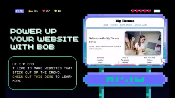
Instructions
Welcome to the Big Themes instructions page. You can use this page to find all of the Big series features. Most of the controls in the Big Themes are pretty intuitive, and most of the controls in the customizer have instructions written directly into them. If you have any questions, then please post them in the forum.
If you are new to building a website, then you may want to start by learning some foundational website building skills.
Download a Theme from the Big Themes Series
You can download the themes directly from wordpress.org, or you can go to your main admin page then go to Appearance > Themes > “Add New”, then type in the name of the theme you want into the search bar, then select install, then select activate.
Customizer Controls for the Big Themes Series
These are the controls for the Big Media theme. Older controls will be similar. To access the customizer from the main admin page. Go to Appearance > Customize.
The following options are available in the customizer:
- Site Identity
- Navigation
- Colors
- Typography
- Homepage Header Media
- Background Media
- Menus (You can also access menus from the main admin page)
- Sidebar and Footer Blocks
- Homepage Settings
- Layout
- Additional CSS
Page and Post Controls for the Big Themes Series
You can access the page controls from the main admin page by selecting Pages (or Posts) > Add New (or open an existing page or post).
The Big Themes have two kinds of block extensions. They contains additional blocks called block variations, and they have additional block styles for existing blocks.
Block Variations
Block variations are available starting with the Big Breeze theme.
To find a list of the block variations, you need to click on the “+” in the upper right hand corner of the screen, then type “bb” into the search bar.
Block Styles
Block styles are available starting with Big Scene theme.
To find the additional block styles, you need to add a block with an existing block style, then if the right panel isn’t already open then click on the settings gear in the upper right hand corner then make sure the block tab is open. You will find the custom styles under the styles section. The following blocks contain extra styles.
- Featured Images
- Videos
- Images
Block Patterns
Block Patterns are available in all themes, but the first theme to directly coordinate patterns with its theme and customizer is the Big Patterns theme. You can set a new block pattern by setting a paragraph block in the block editor in the location where you want to add the pattern. Don’t add any text. It should read “Type / to choose a block”. Next, hit the “+” button in the upper left hand corner, then select the patterns tab. Consider using spacer blocks to add space between patterns.
Note that if you want to use a block pattern in the footer, the easiest way is to open up a block editor page in one tab and a customizer page in another tab. You can create the block pattern in the block editor, then copy the pattern from the block editor (make sure you select the entire pattern), then add a new block area to the footer in the customizer in the same manner described in the previous paragraph, then paste the pattern into the new area. It is usually easiest to build the block pattern in a block editor draft page while keeping a customizer tab open and pasting and deleting the entire pattern until it looks the way you want it to. Keep in mind that the styling is distinct in the footer as compared to the body. So you probably want to avoid testing your footer in the body of the preview page.
Templates
Templates are available in all themes except Big Bob and Big Scene.
You can access the “No Sidebar” page template when you are using a page (not a post). If the right panel isn’t already open then click on the settings gear in the upper right hand corner then make sure the page tab is open. Open the template tab and you can use the dropdown menu to change the template. You may need to push publish to see the update. This has been problem with the WordPress Core and templates for quite some time. See the WordPress 2020 theme.
Featured Images
Featured images are available in all themes.
You don’t need to use a featured image block to add a featured image. If the right panel isn’t already open then click on the settings gear in the upper right hand corner then make sure the page tab is open. You can add your featured image under the featured image tab.
Troubleshooting the Big Themes Series
If the solutions below do not resolve your problem, then please post your issue in the forum.
Header Space
Many of you have asked about improved header space control. If you are using one of the older themes, then you can read in the forum below about how to change the header space using the Custom CSS section of the customizer. However, if you are using the Big Patterns theme or later, then you can update the header space in the Layout section of the customizer.
Previews
Most of the problems that arise involve the page preview and the customizer. The final layout should always work. But sometimes it is not visible in the preview. Unfortunately, the WordPress API isn’t perfect.
If you make an update and you don’t see a change, or the change seems wrong, the simplest solution (if you’re in the customizer) is to switch another control or temporarily revert a control back to its original position until you see the update take place. You could also try clicking from one page to another then click back to the page that you were working on. The customizer sometimes does not refresh the page enough. The second option is to actually publish the change.
Logos
The new Big Chill theme is designed to make logos easier to install. However, if you are using a older theme, then you can use the following instructions:
Sometimes users find that their logo isn’t properly sized in the navbar. Your logo should completely disappear when it is in the navbar and you have scrolled down the page. You should add your logo through the site identity section of the customizer. Make sure that you crop your logo.
You can also size your logo to fit into the navbar by going to the main admin section, then select your logo from the media section, then resize the height of your logo to 88.
Hi there,
I am using Big Scene and am looking for a way to change the Logo height from 88 to 100
How can I do this?
Hi Ron,
The reason that the default height is set to 88 is so that it properly fits in the navbar. I don’t recommend that you change the default height, but if you really want to you could remove your logo from the customizer then add it back as a block somewhere on your page then remove the block. This will cause your logo to be loaded at the height that you set it at in the Media section of your admin. But I would only recommend doing this if you don’t intend to use your logo in your navbar.
I’m using Big Media, which won out over a lot of competitors, so thank you for that. Is there a way to tighten the gap a bit between the main content block and the navbar? I’m running a really simple site, so the gap is very noticeable, especially on my phone, where vertically it takes up almost a third of the page.
Thank you! Peter
Hi Peter,
Thanks for your feedback. There are no dedicated controls in the customizer, but you can update the gap by adding CSS to the Additional CSS section of the customizer. When you don’t have a sidebar and are on a page, the gap is controlled by a class called bb-topPageSpace. So you could add the following code:
.bb-topPageSpace {margin: 0px;
}
You can adjust the margin value to increase or decrease the gap. If you want to segregate the control to a specific page, you can change the code to the following:
.page-id-368 .bb-topPageSpace {margin: 0px;
}
You can find the page number in the address bar of the block editor. If you want to segregate to a specific screen size, then you can also add:
@media screen and (max-width: 1250px) {.page-id-368 .bb-topPageSpace {
margin: 0px;
}
}
If you want to change the space on any other pages, then you can replace bb-topPageSpace with bb-top-padding. For example,
@media screen and (min-width: 1250px) {.postid-368 .bb-top-padding {
margin: 0px;
}
}
Note that if you want to segregate to a post instead of a page, then you will need to switch page-id with postid. Feel free to let me know if you have any other questions.
Thank you so much for the detailed reply! I truly don’t mean to be a pain, but I may not have expressed myself correctly. Adjusting the margin moves the text down the page *within* the box (or up if I enter a negative number), but I’d like to tighten the gap between the bottom border of the navbar and the top border of the content box. This is the site, still under construction and being played with, but I’d like to minimize what is currently the blue area above the text. https://moebiustheatre.org Thanks!
Okay, so on that particular page, since it is your homepage, you should try something like:
.home .bb-top-padding {margin: -180px;
}
Or if you don’t see a change, then you may want to try adding an !important tag
.home .bb-top-padding {margin: -180px !important;
}
I should also point out that since this is custom css, you may notice inconsistencies with the customizer, the preview pages, and the final product. In particular, I believe on the homepage, there is space for custom header media presented in the customizer even if it is unused. These are all things that I would consider dealing with in the creation of a new theme.
Also, I should point out that the reason that this space exists by default is so that it enhances the effect of background media, so you may want to consider seeing what adding background media might look like.
I am having trouble with my header on mobile, I am using the big scene theme and there is lots of space around the top and bottom of the header, but it looks fine on desktop.
I have tried a number of fixes but none have worked yet
I think that my response to Peter might help with your question, but I’ll also add our email correspondence:
“Hello, I’m currently using your Big Scene theme and loving how it works!
I am having one issue though and thought maybe you would be able to assist.
The home page header has massive space above and below when viewing on mobile and I have not been able to tighten it up.
Any help would be greatly appreciated
Thanks!
-Brendan
Hi Brendan,
Thanks for reaching out.
Yes. The Big Scene theme was designed with the expectation that users would use Home header media. If you don’t want to use this feature then you should upgrade to the Big Breeze theme or the Big Media theme. Homepage header media is an option in both of those themes, but the space is not standardized.
I recommend the Big Media theme because it has a few more options, but feel free to try both themes if you have the time.
Please keep in mind that you can set your font and colors so that they are the same as the Big Scene theme. In general, you can use newer Big themes to recreate most of the options in the older themes, but there are a lot of options in newer themes that aren’t available in older themes.
If you have any further questions, then please feel free to post them to the forum:
https://bigbobnetwork.com/BigMedia/instructions/#comments
Thanks,
Bob”
For those of you who are considering what to do with extra space that is sometimes at the top of a page, the purpose of this space is to display featured images, homepage header media, or background media. So you should try adding some and see if you like how it looks.
For those of you that are interested in a theme that provides more control over header space with the customizer, check out my latest post.
Hi I am using Big Scene theme, is there a way to remove the animated menu, when I scroll down the page, the menu, will have a move animated. I want a sticky navigation bar but without the little motion inside the navigation bar. Thank you
Hi Sandra,
Thanks for using my theme, and thanks for your feedback.
When someone scrolls down the screen, the Big Scene’s script file makes a number of small adjustments to shrink the navbar to create more room for the body. You could hypothetically offset these adjustments with the Additional CSS section of the customizer by strategically adding an “!important” tag, but your adjustments would have to be tailored to your navbar settings. Without knowing your settings, I unfortunately can not provide a generalized prescription. I might be able to help you more once you have settled on your layout, but until then, I recommend this article.
I have published a new post about this issue.
Hello, I am using the latest Big Lights Theme for our Parkinson’s charity. We really like the theme thank you. My question is how remove the image highlighting / border in some Page instances.
We have a Page in where we need just the plain image with no effects, just the image without the glow / shadow / border or whatever. I have tried every available GUI option.
I assume I will have to call a piece of custom css. Can you help?
Thanks for your question.
If you want to switch off the image highlight at the global level, then you can go into the Colors section of the customizer and switch the “Shadow Halo and Link Color Backlight” control to off.
However, if you want to switch off the highlight for a single image, then you will need to go into the block editor, then select the image, then make sure that settings are open in the right sidebar (you can click on the settings gear if they are not), then select the block tab, then open up the advanced panel, then add a custom class name (like “bb-no-highlight-image”) in the ADDITIONAL CSS CLASS(ES) input box, then save the page, then open or refresh the customizer and add the following code to the Additional CSS section:
.bb-no-highlight-image img {

   box-shadow: none;

}
This should remove the highlight for just that image.
Thanks again, for your feedback. Please let me know if you have any other questions.
Perfect thank you! I added border:none; as well.
Thanks again for such a great theme and support.
i am using big lights. when the menu goes to the mobile version, it lists the pages twice. i have turned on and off as many options as i can find in the customize section. not sure why i cannot rid this and keep it at one list. thanks.
Thanks for your feedback.
I checked the link that you sent me. It looks like you are using the Big Bob theme and not the Big Lights theme. However, it seems that you would have the same result that you described regardless of the theme that you chose. Your site seems to be operating correctly. The issue is how your site is laid out.
It appears that you have a duplicate of your menu in your sidebar. When your screen reaches a width that is too narrow for the sidebar to fit, the sidebar is repositioned under the menu in the side panel that is opened with the menu button.
The solution to your problem is to update your sidebar so that it no longer contains the duplicate menu. You can access your sidebar and your menus in the customizer.
Here is an article that I wrote about working with sidebars.
Please let me know it you have any other questions.
Hey there,
I really love the Big Lights theme and in particular the box shadow around pics… BUT… when I insert a Google Map for location purposes the individual tiled map segments produced by Google Maps have the box-shadow so the map is filled with multiple shadowed segments. How can I stop the box-shadow just in the Maps?
Hey Ron,
Thanks for staying loyal to my themes.
It is difficult to give you an exact answer. But you should be able to use your browser’s developer tools to determine the class name that is being given the box shadow, then you can use the Additonal CSS section of the customizer to update the specific Google Maps class name with the attribute “box-shadow: none;”. Let me know if you get stuck.
I had installed the Big Patterns theme on my website and while the desktop version worked fine and it looked good, it would not load on any IOS mobile devices at all. I had to revert back to my previous theme. Not sure what issues/settings may have caused this.
Hi DP. Thanks for your feedback. All of the Big Themes, including Big Patterns, have been tested for compatibility with IOS mobile. It could be that there is a bug in the Big Patterns theme. But it also may be that the bug is based on a compatibility issue with a plugin that you may be using. You should try using the Big Chill theme and see if the bug is still present. If the bug is still present, then try removing any plugins that you may using, especially if they are related to your website’s appearance. Also, if you could give a more specific description of your site’s symptoms on IOS mobile that would help me be able track down the exact cause of the problem.
Okay, I have found one bug. It looks like when you are using WordPress 6.2 with the Big Patterns theme and you have a site description in the navbar, there seems to be a distortion in the navbar when you scroll back to the top on IOS mobile. There also appears to be four ways for you to resolve this problem:
1) You can upgrade to the Big Chill theme. This is the recommended solution.
2) You can remove the site description from the navbar.
3) You can wait for me to find a solution and update the theme. However, I have to warn you that this bug is a pretty extreme edge case, so it may take a while for me to formulate a safe solution. Please keep in mind that I need to create a solution that minimizes the chances that I will damage any existing websites. This makes an inherently difficult problem even more difficult.
4) You can try to formulate your own solution using additional CSS in the customizer. I’d recommend trying to manipulate the #bb-site-description-top id.
Thanks again for your feedback. Please let me know if you have any more questions.
A helpful technique for Option 4 is to turn off the text transition on all mobile sized screens. This will cover the overwhelming majority of IOS devices. You can add the following to the Additional CSS section of the customizer:
@media screen and (max-width: 1064px) {

	.custom-logo,

	#bb-site-title-top,

	#bb-site-description-top {

		transition: none !important;

	}

	#site-navigation ul {

		transition: none !important;

	}

	.nav-menu {

		transition: none !important;

	}

}
You may also prefer to increase the speed of the transition on larger screens:
@media screen and (min-width: 1065px) {

	#site-navigation.bb-scrolled .custom-logo-link,

	#bb-toggle,

	.custom-logo,

	#site-navigation,

	#site-naigation.bb-scrolled,

	#bb-site-title-top,

	#bb-site-description-top,

	#site-navigation ul,

	#site-navigation.bb-scrolled ul,

		#site-navigation.bb-scrolled .custom-logo-link,

		#site-navigation .custom-logo-link,

	.nav-menu {

		transition: 300ms ease !important;

	}

}
The speed that you choose may work better moving faster or slower depending on how you set up your navbar. This ought to give you everything that you need. Please let me know if you have any questions.
Dear Bob, I really like the BIG BOB Theme but like Sandra (4.) I want to get rid of the animation of the menu. Completely transparent, without a shadow and no animation would work best for me. Can I do this with an additional code? Hope you can help with this…thanks a lot!!!
Hi Klara,
I’m not sure about the feasibility of what you’re requesting. It may be able to be done without additional JS, but you would definitely have to write some code, and at the very least, you would need some CSS. I might try to write a blog post about the animated text size when I get some more time, but it wouldn’t cover anything else that you just requested. Although a lot of what you requested can get handled without code if you switch to the Big Chill Theme. If you decide to change themes, I would suggest either trying your own hand at Additional CSS to keep the font sizes static, or you can check out my pro services. Thanks for your feedback.
I have published a new post about this issue.
Hi Big Bob,
I have been quickly scrolling through this forums messages and most questions seemed quite specific about something not fitting right and what not. So you might have answered this question already and for this i want to apologize upfront.
My question is if there is a simple way by adding a piece of cutom style so that ALL featured images in either posts or pages behave the same as the image set for the home page header in the customizer with the Big Header Image Fills the header image across the entire screen set to “ON”
In that way all my featured mages can be fullscreen which i would really like.
Anyways thank you sincerely for your effort on these nice themes,
Dirk
Thanks for your question. You can’t set the featured images to fill the screen by default. But you can set them to fill the screen individually. Most of what you need to know can be found here. You can also add a featured image as a block, then select the “Fit Top” option.