Linktree to a Website: Switching from Linktree to Your First Website

screenshot

Going from Linktree to a website may seem daunting. If you’re a freelancer, small business owner, entrepreneur, or solopreneur, then you may have built a solid social media presence, and you may still be using linktree as your pseudo-homepage. But if you want to take your business to the next level, then it may be time to start your own website.

Linktree to a Website: Why Bother?

When you own your own website, you have full control over what content you want distributed, and how you want people to see it. You can use social media. But you’re limited to the audience on your platform, and your competition is right up next to you. When you have your own website, your audience is the entire internet. And once people are on your website, they are looking at you, not your competitors.

Linktree to a Website: Take Your Time

Bookmark this page. You don’t have to build your website in a single sitting.

Linktree to a Website: Pick a Web Host

One of the simplest and cheapest ways to set up a website is to set up WordPress on a shared server through a web host that uses CPanel and Softaculous, then follow these instructions. Hostgator is one service provider that uses these services, but there are also others.

Linktree to a Website: Install the Big Chill Theme

Once you have WordPress set up, you can download the Big Chill theme directly through the admin center. Don’t worry about the default colors or the default fonts or even the default layout. You can change all of that. From your WordPress admin center just go to go to Appearance > Themes > “Add New”, then type “Big Chill” into the search bar, then select install, then select activate.

Set Up the Customizer Part 1

Before you add your content, you want to set up the basic layout of the Customizer. From the admin page left sidebar go to Appearance > Customize.

In Part 1 of setting up the customizer, we’re going to just get the layout correct. The first thing that you want to do is go to Homepage Settings. Then select “A static page”, then under the Homepage dropdown select “Sample Page”
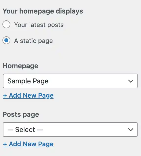
Linktree to a Website screenshot
Result of Update

Then you’re going to want to go to back out of that section and into the “Homepage Header Image” section. Scroll to the bottom and under “Current header” click “Hide Image”. The sample content should move up the screen.
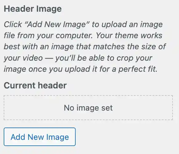
screenshot
Result of Update

Next, you won’t need the navbar. So go into the Additional CSS section of the customizer and add the following code:

#site-navigation {
	display: none;
}

Finally, go to the Layout section and move the first three “Space from Top” options all the way to the left.
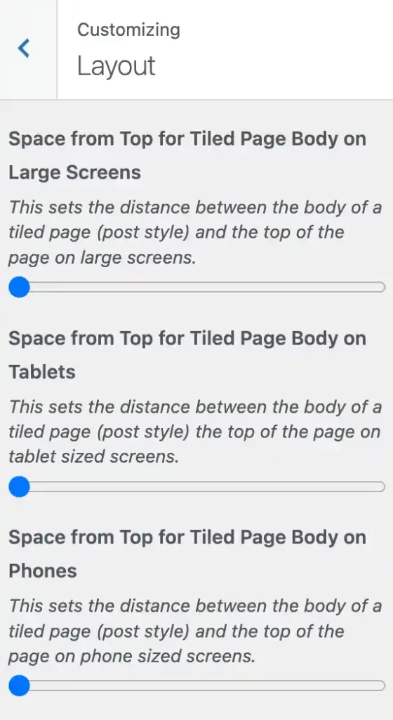
Linktree to a Website screenshot

You should have a result similar to the following:
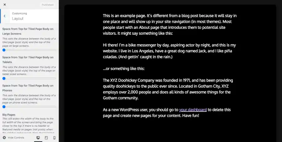
screenshot

Now you can push publish and close out of the customizer for now.

Linktree to a Website: Get Your Content Ready

Hopefully, you have at least one image that you can use for your site. Any image will do. If the site is for yourself, then a picture of yourself is fine. Before you add the picture to the block editor, you’ll want to make your image website friendly. You should reset the width of your image down to 600px.

Linktree to a Website: Set Up Blocks

Next, you’ll want to add your content in the block editor. From the main admin page, go to Pages > “All Pages”, then select “Sample Page”. Change the title from “Sample Page” to “Homepage”. Then delete all of the text in the body of the page.

Next, you should add a media & text block. The picture below shows you how to add it.
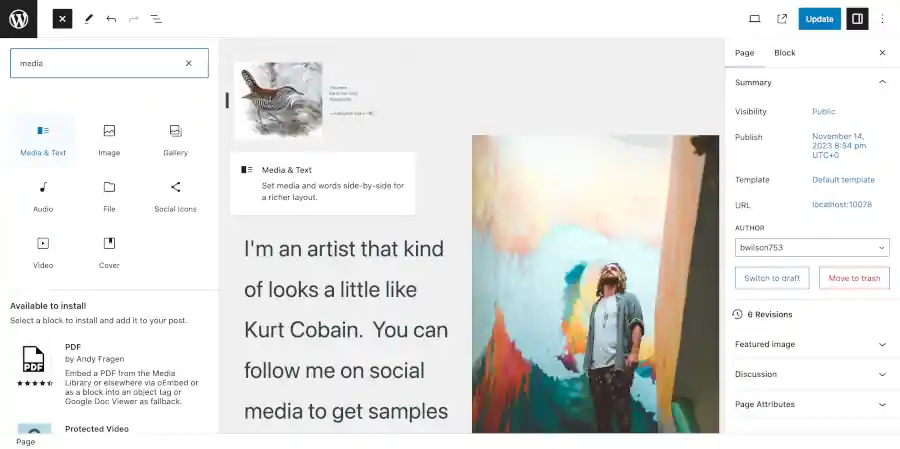
Linktree to a Website screenshot

You can add text by adding text to a block in the text section. You can add a block by clicking in the section. If you want your text to be a heading, then type “/he” in the block and select the heading option. You can use the same technique used to add social icons referenced in the picture below.

Type in something about yourself. Then add that image that you made website friendly referenced in the previous section of the this blog post.

Add Your Social Icons

Next, you should open a new block and type “/soc”. You can select to add a social icons block. See the picture below:
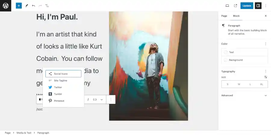
screenshot

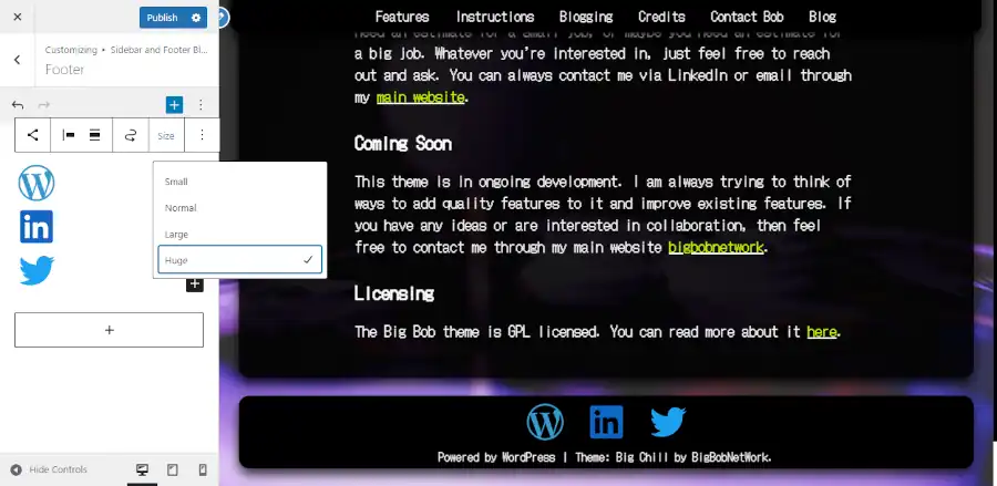
Add the social icons block. Then select the entire social icons block (as opposed to an individual icon). You can click the icon to the left on the block bar above the block to select the outer block. Using the block bar that hovers above the block, you can change the size. I recommend the huge setting. And using the block tab on the right side of the screen, you can change the style to “Logos Only”. Then change the color to white. You can also change the size of the text above the social icon by clicking on the each respective text block and adjusting the size using the block tab on the right side of the screen.

If WordPress does not have all of your social media icons, then you can add a row of custom buttons in a new block below your social media block. You can get this started by using the technique featured in the picture above, but substitute the reference “/but”.

Add a Custom Class

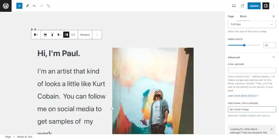
Finally, you want to add a custom class that we’ll use later. Select the media and text block (not the contents inside). Then go to the block tab on the right side of the screen. Then go to advanced and add “bb-home-image” under the Additional CSS classes section. See the screenshot below:
Linktree to a Website screenshot

Make sure that you save your work before you leave.

Delete Unused Pages

Since this is a one page site, you’re going to want to go back out to the main admin page and delete the “hello world” blog post. You can do this by going to posts, then find the “hello world” post and click “trash” underneath it.

Linktree to a Website screenshot

Set Up the Customizer Part 2

Now that you have all of your content in place, you want to refine how your site looks even further. Go to Appearance > Customize.

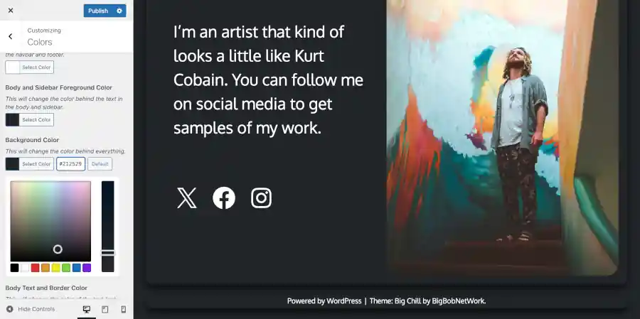
Now is the time to change the way your colors look. You might think that it looks pretty dark. Go into the customizer section marked colors. Then update the colors to “212529” for “Navbar and Footer Foreground Color”, “Body and Sidebar Foreground Color”, and “Background Color”.
Linktree to a Website screenshot

You may also want to turn off the “Shadow Halo and Link Color Backlight”. And you may want to switch “Body Link Color” and “Body Link Hover Color” to white.

Custom CSS

Next you may want to remove the back to top button since your page is so small. Just go to the Additonal CSS section and copy and paste the following:

#bb-back-to-top {
	display: none !important;
}

Next we’re going to use the home image class we added. Add the following to Additional CSS:

.bb-home-image img {
	box-shadow: 10px 10px;
}

The result should look similar to the following:

Linktree to a Website screenshot

Now, you have a great foundation for your website. You’re ready to publish it and share it on social media. As you obtain more content that you wish to share, you can use the instructions below to add more stuff.
Advanced Options

Profile Website: How and Why You Should Build One

Do you have a job? Do you use the internet? If the answer to both of these questions is yes, then you can benefit from a profile website. This is especially true if you work for yourself.

How People Use the Internet

If you’re a human being that performs almost any kind of service imaginable, then you have a reasonable justification for building a profile website to promote yourself. As of the publication of this post, the number one used website on the internet is the Google search engine. It is number one by a large margin, and number two is it’s sister company YouTube.

After those two websites, you would have to add together several of the next most popular websites to achieve the same number of visits for the visit count of either of the top two websites. That means all of your other social media websites combined may only account for a fraction of the traffic running through Google Search, and that fraction would become a fraction of a fraction if you combined it with the influence of YouTube.

The Results of the Hard Math

Yes, people can still search for your social media accounts through Google. But if they do that, are they really searching for you? If they land on your social media page, how long does it take for the social media site to give a list of your competitors.

If you had your own website, then people could be coming to you directly. You could be taking full control of the narrative. If you don’t do this, then the narrative will always be framed by somebody else and juxtaposed against a sea of competitors ready to replace you. The hard math is that each one of us is just one of eight billion. And the internet is the foundational media mechanism for the entire world. If you don’t even have your own website, how special can you expect to appear to be?

Future Proofing Your Identity

What if one of the social media services that you use changes it’s policies in a way that causes your profile to be irrelevant? Even worse, what if the social media company shuts down your profile, or the social media company collapses? You and all your media could go out of business overnight.

Having your own profile website means you will maintain your online presence even if your other media platforms become unreliable.

What Does a Profile Website Need to Look Like?

You shouldn’t think of a profile website as a mechanism to necessarily replace your social media. You should think of your profile website as a mechanism to serve at the very least as a landing page for your social media. If your social media pages have vehicles for your business that are superior to what your website can easily facilitate, then you should keep using social media.

Owning Your Profile Website

It’s important that you don’t simply use a service that provides a series of links to your social media accounts. These services have a bad reputation among social media companies and have been banned and regarded as spam websites. Even if you can get away with using one, you still risk having your reputation hurt by being affiliated with one.

When you own your website, you have maximum control over the content. Even if your website starts out as nothing more than an about section and a list of your social media links, it still serves as a foundation to becoming something much bigger.

Should You Use a CMS?

I would recommend that the foundation of your website should either be Bootstrap or WordPress. Bootstrap is fast and more flexible than WordPress, but Bootstrap is also more complicated to use and content creation and updates tend to take longer to develop. If you choose Bootstrap and you’re not a developer, then you should probably hire a professional to work with.

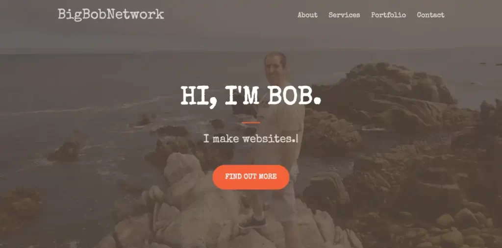
First you can take a look at an example of my profile using Bootstrap:

Full Screen Profile Image
Click on the image to see the page.

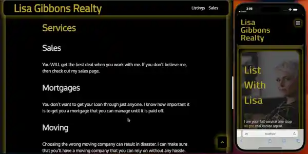
Next you can take a look at an example of a real estate agent’s profile using WordPress:

Real Estate Agent Profile
Click on the image to open a video demo in YouTube

When you consider which type of profile website you want to build, you should consider that you can extend a Bootstrap site with a WordPress site.

Profile Website Potential

The biggest benefit of having a profile website is your visitors don’t need an account to access your information. Also, a profile website can be used to do things that social media doesn’t do as well.

A profile website can be used to blog.

And a blog can be used to list upcoming events.

A profile website can act as a sample of your social media for people that don’t currently have accounts to your social media. You can explain how your different social media accounts integrate with each other, or how they integrate with your business.

Landing Page (Using the WordPress Media and Text Block)

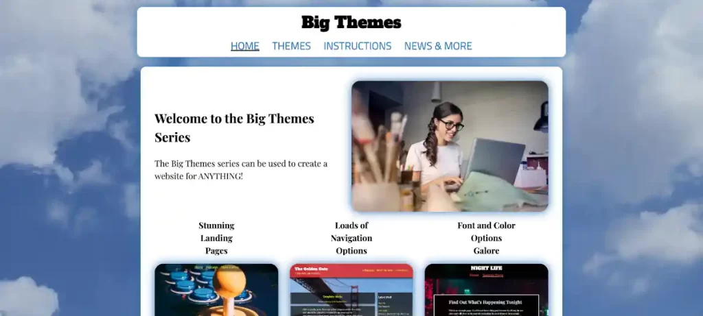
Below you can see an example from my Big Themes subdirectory. It uses the media and text block at the top of the page. This is one of the simplest and most effective ways to build a landing page. It looks good, it responds well to different screens, and it is relatively easy to make it mobile friendly.

Media and Text with a Background Image that can be used as a profile template
Click the image to see the live page.

Using a Background Image on Your Profile Website

If you use a media and text block, then you will be left with a fair amount of negative space on large screens. You can see an example of this in the screenshot above. A background image is a great way to take that negative space and fill it in with something more colorful.

You can manage your page width to make the background image stand out.

Using a Navbar on Your Profile Website

If your profile website contains multiple pages, then you will need to use a navbar. However, if your profile website only has one page, and it only contains a few sections of content all of which are short, then you may decide that you don’t need a navbar at all.

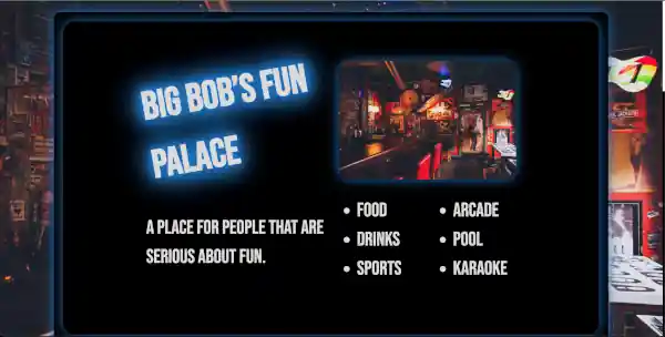
Below is an example of a website for a bar. Although it does not technically constitute a profile website, the layout could easily be repurposed to service one.

website used to promote a bar that could be used as a profile website
Click on the image to open a video demo in YouTube

Repurposing Content Patterns on Your Profile Website

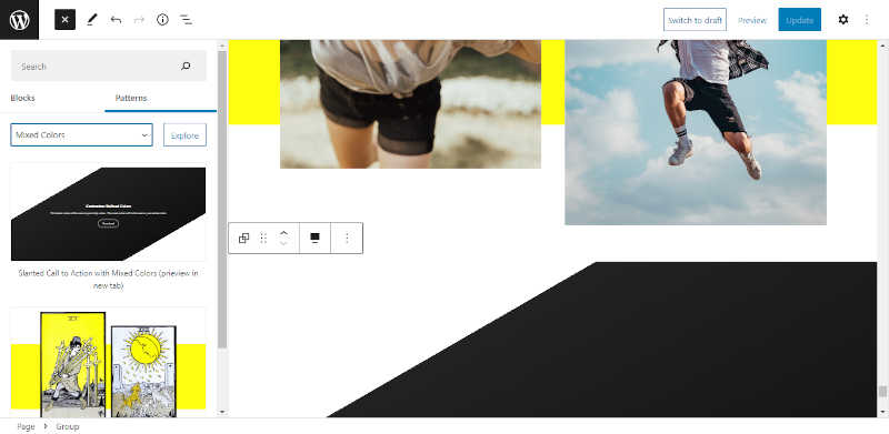
It is best to not try to reinvent the wheel when you are building your profile website. You can use all of the examples in this article to repurpose existing content patterns to facilitate your content. If you are using WordPress, then this can be done with block patterns.

Working With a Professional on Your Profile Website

You may have avoided building your own profile website because you like working by yourself. And that’s a great attitude to have if you want to own your profile website. But if you want your profile website to be profitable, sometimes you have to spend a little money to make a lot of money. If you work with a professional, then you will make sure that your profile website is set up right. You won’t have to worry about making a bunch of rookie mistakes that you might not notice, but your customers do. Once a professional has your profile website set up properly, then you can take over. If you read this blog, then you’ll have the resources you need if you run into a problem. And if you already have a professional as a resource, then you’ll have somebody that you can contact if you’re in a jam that you can’t get out of.

WordPress Definitions Update

WordPress definitions have made a lot of fundamental changes over the last few years, and there is a lot of new terminology. Making matters worse, a lot of new terminology sounds similar to older terminology and terms can be easily confused. Also, there is a lot of older terminology that is used in coordination with new technology even though the old terminology was used to describe old technology, so the old terms are misleading. Confused? I’ll bet you are. Your solution to confusion is to keep reading.

It should be noted that this is not meant to be an exhaustive glossary of WordPress terminology. It is meant to serve as a reference for commonly used new terms and old terms that have new definitions. This post was first published shortly after the release of WordPress 6.4.

WordPress Definitions: Blocks

WordPress blocks are a user interface used to develop content with WordPress. There are a number of different ways to add content with WordPress such as the customizer, the classic editor, and third party page builders. However WordPress blocks are currently the primary content development technology for WordPress.

Blocks can be created using the block editor, widget areas, and the site editor. Those definitions are explained below.

WordPress Definitions: Gutenberg

Gutenberg is a plugin that serves as the cutting edge for WordPress block development. It provides the latest features of the block editor before they are integrated into the WordPress core. You are not required to install Gutenberg to run WordPress.

WordPress Definitions: Block Editor

The block editor is not to be confused with the site editor. I’ll explain about the site editor later. The block editor has become the primary way to add most of your content in WordPress. It automatically opens up whenever you start or edit a new page or post.

Screenshot of the block editor

The block editor is used to manipulate content inside of WordPress pages. It offers controls that refine or override updates performed by the customizer or the site editor. You can read about the customizer and the site editor below.

Most of the block editor’s features are written by the WordPress core team, but parts of it may be extended by the WordPress theme that you have chosen.

The block editor replaced the classic editor as the primary way to add content through the WordPress core. The block editor has a higher learning curve than the classic editor, but the block editor is also more powerful.

WordPress Definitions: Customizer

The customizer is what you use to set up the layout and overall look of your website. It controls primary content containers for your site such as headers, footers, and sidebars. And it controls how your site is divided into different sections. The customizer is driven by a theme such as one of the Big Themes. Different themes have different looks and different customizer controls to manage the theme.

Screenshot of the customizer

You must have a theme that supports the customizer if you wish to access the customizer. You can access the customizer through the admin center by selecting Appearance > Customize.

WordPress Definitions: Widgets Areas

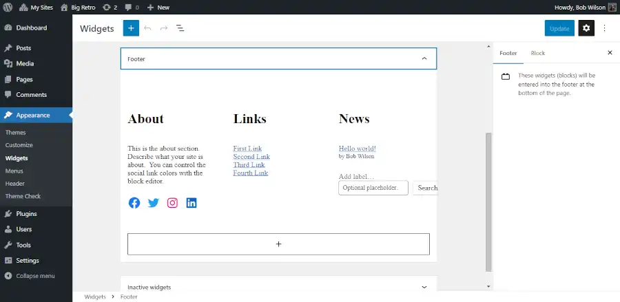
Widget areas are one type of control used by the customizer to add content into your website in areas that are shown in certain reoccurring sections of your website or every page of your website. Widget areas are called widget areas because they used to be controlled by a user interface known as widgets. Today they still can be controlled by classic widgets. But the primary way to add content to widget areas is using blocks. Essentially you can inject the block editor ad hoc into the customizer.

Screenshot of a widget area from the admin center

You can add content to widget areas using the WordPress admin center or the customizer.

WordPress Definitions: Site Editor

The site editor is the newest method for managing the overall look of your WordPress website. The site editor refers to full site editing. I explain the complete definition of full site editing in the next section.

Unlike the customizer, the site editor manipulates content exclusively through blocks. Like the customizer, the site editor is controlled by WordPress themes. That means that unless you have a theme that supports the site editor, you won’t be able to find the site editor in your admin center.

The site editor has struggled to gain popularity. Only 2 percent of theme downloads comes from themes tagged with full site editing. Users don’t like the site editor because of its high learning curve, and developers tend to dislike it because of its underdeveloped API. In other words, it can be more difficult to use the site editor than the customizer, and it offers less power than the customizer.

It is also important to note that the site editor does not replace the need to use the block editor. However, the block editor and the site editor can perform redundant functions, and they have a similar user interface, so it can be easy to confuse what is the most appropriate control choice.

Full Site Editing

Full Site Editing is a bit of a misnomer because it implies that your WordPress website can not be fully edited without the full site editor. This isn’t true. Full site editing also implies that site editing is the most powerful way to edit a WordPress website. This is also not true. The term full site editing is generally regarded as a mistake, however since it proliferated into areas where it is now hard to remove, it is still referenced for legacy purposes.

Block Based Themes

“Block based themes” is a really misleading term because it doesn’t refer to any theme that uses blocks. If a theme is supported by the customizer (which is the majority of themes that use blocks), then it is still not considered a block based theme. Block based themes are only themes that use the site editor.

The Classic Editor and Page Builders

The classic editor and page builders are no longer necessary for building a WordPress site since the introduction of the block editor. However, many people are familiar and comfortable with them, so they are still used. They are all plugins, so you don’t need to learn how to use them if you are unfamiliar with them, however I did write a little bit more about those subjects in an older article.

Questions?

Hopefully if you are either new to WordPress, or if you have been relying on older versions of it, then this article has brought you up to speed. If you have any questions, then please feel to write them into the comments area.

Creating a Maximum Page Width for Your Web Pages

Computer screens keep getting larger. This can create awkward and convoluted compromises if you’re trying to create a mobile first web design. Add to that problem the need to push out new content fast, and you may come to realize that adding a maximum page width to your web pages is the solution to solid design with efficient productivity.

Can’t Somebody Else Deal With This?

If you don’t have the time or patience to dive down the DIY rabbit hole, and you would rather have somebody solve this problem fot you, then feel free to contact me about my professional services.

The Fundamental Dilemma of Modern Web Page Dynamics

Picture the screen of your smart phone. Now picture one of those great big curved gaming screens that take up the top of a whole desk. Next try to picture the web page that looks good on both of those screens. Finally picture adding lots of new content to those sites over a short period of time. Can you see how if you don’t manage this properly, it can become difficult to deal with?

Understanding Mobile First Design

Purist mobile first designers will tell you that you should literally design the mobile layout first, then figure everything else out after. Sometimes that works. But often that isn’t the most realistic or exciting way to design a website. So an alternative design method is warranted. Another way to view mobile first design is to recognize that in every instance of page design, you must prioritize a way to get your web page looking good on the smallest mobile application that it may be featured on.

Mobile First Design and Maximum Page Width

Now that we have a standard for mobile first design, we have to consider how a site will feature a page on the largest screen imaginable. Keep in mind that a layout that loads well on a mobile screen can leave too much negative space on a large screen, and an layout on a large screen can run out of room if it is not repositioned on a small screen. So what do you do?

Using a WordPress Theme to Manage Page Width

In this article, I am going to show you how to use one of the Big Themes to manage width. The particular theme that I am going to use is the Big Chill theme. It is free through the wordpress.org repo.

Foreground Page Width Limits

A simple way to set a page width limit is to create a foreground that holds all of your content, then set a maximum width for that foreground.

Hypothetically, a foreground page width limit can be any value. However, I would consider two values in particular. The 1200px width limit is a conservative limit that is great if you want to be able to add content quickly without spending a lot of time making adjustments for edge cases, while still leaving yourself a lot of room for page design. The 1800px width limit is also a good limit that requires more management than the 1200px limit. But it is a good choice if you think that you will spend a lot of time serving your website to large screens. You can move beyond this limit. But ultimately you will want some kind of absolute limit because on a large enough screen almost any section of content will start to look awkward no matter how it is sized.

How to Set the Limits with the Big Chill Theme

You can download the Big Chill theme directly from wordpress.org, or you can go to your main admin page then go to Appearance > Themes > “Add New”, then type “Big Chill” into the search bar, then select install, then select activate.

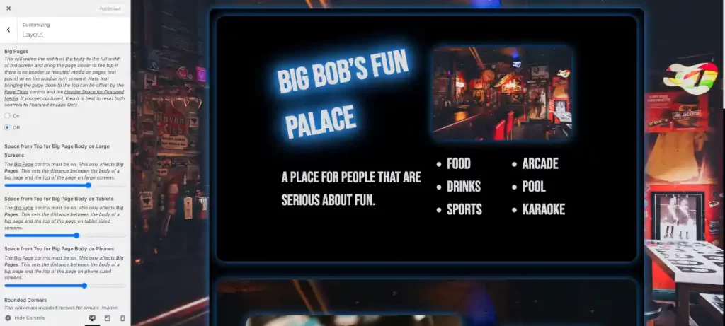
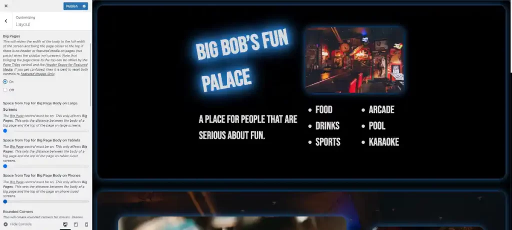
To access the customizer from the main admin page. Go to Appearance > Customize. Page limits can easily be updated using the Big Chill Customizer. Find the Layout section, then scroll down to the control titled “Big Pages”.

1200px width limit

Once you are in the customizer, you can set the “Big Pages” control to on or off. The default setting is off. When the default setting is off, the page limit will not exceed 1200px, and margins will always be present surrounding the foreground. If the “Big Pages” control is turned on, then the foreground page width will only show margins when the page width exceeds 1800px.

1800px width limit

You’ll also want to set the top of your foreground body based on how you set your navbar. You should note that if “Big Pages” is off, you’ll use the top space controls above the “Big Pages” control. If “Big Pages” is on, then you will use the controls below, except on your blogging pages (posts). You will always use the top controls to define the blog pages. This allows you to create different page width standards based on the kind of content that you are publishing for a given page type.

Managing Negative Space in the Background

You can use a background image or even just a quality background color to fill in the remaining negative space on a large screen. The 1200px limit is the ideal limit for a background image.

1200px foreground width limit on a 2000px wide screen

Managing a Background Image

If you are going to use a background image, then you need to consider page load speed with particular attention being paid to your page’s load time in a mobile environment. Converting your images to webp is a great way to start to improve page load speed.

Managing Page Width With Columns

If you have a lot of content, and you need to serve a lot of links, a sidebar is a great way to solve both of those problems with one layout decision. Adding a sidebar using the Big Chill theme will set your total content maximum width to 1800px. This total content width includes the sidebar. So your main content width will never get too large. This works great for blogging environments.

Managing Page Width at the Section or Block Level

Theme developers will often design content to spread from one screen to the other by using a percentage value for content items. However, this can introduce a lot of problems. If you are considering future proofing your web page, you need to consider that a page screen has limits as to how small it can be before it becomes unusable, so you know that screen sizes are unlikely to get smaller than they are. However, there is hypothetically no limit to how large screens might become. Think of the side of a wall. A prudent web page ought to serve a layout that is ready to handle a visitor using a screen that is excessively large.

If you don’t use page width limits, then you will need to create custom section width limits using class names. And if you create custom content, then you may need to do this even if you are using page width limits.

Page Width Limits Allow Reduced Content Width Limits

It behooves you to always set some kind of width limit for every piece of content. This increases load speed, especially on mobile. Dealing with a background image is a good example of how to manage this problem. You should set your image background width to about 2560px. And it is also probably a good idea to not display the background image on mobile devices since it will be barely seen anyway, so it only serves to slow down the page load. You can make this update using Additional CSS.

For example, you could try the following with the Big Chill theme:

@media screen and (max-width: 600px) {
	#bb-back-image img,
	#bb-preloader {
		display: none;
	}
}
#bb-preloader{
	z-index: -999;
}
#bb-preloader:before {
	content: none;
}

A background image requires an inherently large file size that causes loading slow down on smaller screens. Now imagine having to deal with that problem for every image that you load.

When you use maximum page widths you know your image widths will not exceed certain sizes. You can then set image width at that size, and if the image size is mobile friendly, then there is nothing else to worry about.

The other major benefit of content width limits is it allows you to avoid creating too much negative space or rely on inappropriate font sizes.

Further Fine Tuning With Additional CSS

Everything above will give you what you need to know to get your page publication ready. But you can also explore page width management even further using Additional CSS with the Big Themes.

Questions?

If you have any questions, then please feel free to post them in the comments area. If you would prefer to have somebody build this kind of site for you, then feel free to contact me about my professional services.

Understanding WordPress Widget and Menu Areas

Widget areas and menu areas in WordPress are features that have been around for a long time. And in the age of blocks, you might have the impression that they are no longer relevant. But that isn’t true. If you don’t understand WordPress widget and menu areas, then you are missing out on features that have a huge impact on your site.

Assumptions Before Reading About WordPress Widget and Menu Areas

You should understand the basics about setting up a website and using WordPress before reading this post.

The Basics of WordPress Widget and Menu Areas

WordPress widget and menu areas are theme driven. They are areas within the layout of your site designated by your theme where you can add content. If the area being designated is a menu area, then you can add a menu. And if the area being designated is a widget area, you can add what used to be known as widgets. Although today, it is more preferable to add blocks.

The Difference between Widgets, Menus, and the Block Editor

The block editor is used to add content to the body of individual pages and posts. Widgets and menus are added to areas of your pages that are global or semi-global. Menus and Widgets solve the problem of setting content onto every page or certain types of pages.

The Basics of Adding Content to WordPress Widget and Menu Areas

There are two basic ways that you can add content to a widget area or a menu area. You can use the designated admin sections on the admin page of your site, or you can use the customizer. Once you are used to adding to these areas, you may find that it is easier to just use the customizer because the customizer shows you your updates immediately. However, the customizer doesn’t offer as much working space, and it provides less information, so learning how the admin areas work can be a simpler way to understand all of the widget and menu features.

An Example of WordPress Widget and Menu Areas

Lots of WordPress themes use WordPress widget and menu areas. However, some use a lot of areas, some use a moderate amount, and some don’t use any. So today, we are going to use the free Big Themes to perform a demonstration of WordPress widget and menu areas. In particular, we are going to be using the free Big Chill theme.

Examples of Widget Areas

There are two major areas that tend be used for widget areas:

  1. Sidebars: These appear next to the body of your page. They may be featured on every page of your site, or they may be segregated to certain sections of your site.
  2. Footers: The same footer is usually shown at the bottom of every page. Although some sites may use different footers based on the section of the site that you are using.

Widgets could be used in other areas as well. For example, widgets may be available in your navbar, or there may be designated widget areas that are unique to a given theme.

Viewing the Widget Admin Page

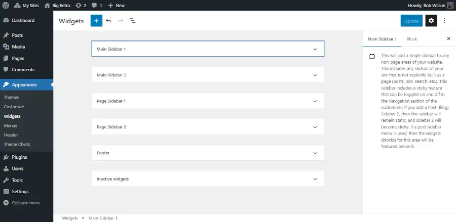
The best way to get a summary of how your theme’s widgets work is to look at your theme’s widget admin page. I’ll use the Big Chill theme to demonstrate how this works.

You can find the Big Chill theme in the admin center by going to Appearance > Themes > Add New > then type “Big Chill” into the search bar. Once you install and activate the theme, you can go to Appearance > Widgets. When you click on one of the widget areas you will see a description of how the widget areas work on the right side of the screen.

Clicking on a widget area in the admin center

How to Read Widget Sections

The best way to understand how your widgets work is to read each widget section description. You should click on each section and read what it says while paying attention to how it is distinct from the other widget areas. It may be helpful to open up a second tab in your browser and look at the customizer. This will be discussed in greater detail below.

Inactive Widgets

The primary reason that you have inactive widgets is that you created widgets in another theme and your new theme no longer supports those widget areas. You can use the inactive widget section to copy and paste your widgets or blocks into your new widget areas.

Viewing Widgets in the Customizer

Once you become familiar with how your widgets are placed into the different sections of your site, you may find that you no longer need the widget admin area, and you can rely exclusively on the customizer for managing content in your widget areas.

You can find the Widgets section of the customizer from the admin center in the Big Chill theme by going to Appearance > Customize > Sidebar and Footer Blocks.

Screenshot of adding social media blocks to the widget footer area.

In the customizer you will find that there isn’t as much working space, and you will only see widget options that are actively available. I have written about how to add sidebars and how to add footers by using the customizer in other posts, including how to add an advertisement.

Examples of Menu Areas

There are three areas where menus tend to be displayed.

  1. Navbar
  2. Sidebars
  3. Footer

The great thing about using menu areas is when you add a menu using a menu area (as opposed to using a block), the theme takes care of all of the styling for you based on where you set the menu.

Viewing the Menu Admin Page

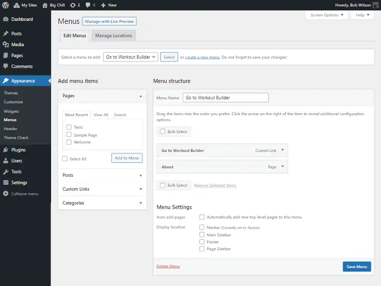
Using the menu admin page is a great way to get an overview of how your theme sets up its menus.

Main menu admin page

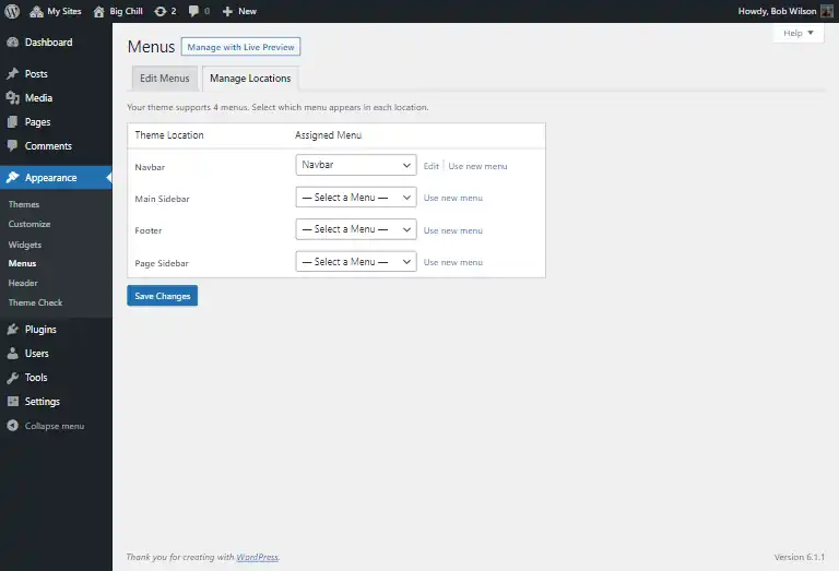
The controls are pretty intuitive, but it is important to pay attention to which menu is going where. So it can be helpful to look at the manage locations tab.

Managing the menu locations.

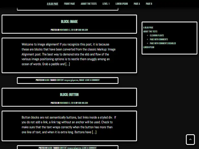
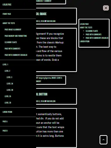
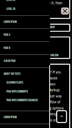
The important takeaway is that each menu location utilizes a unique menu. If you set the same menu in two different locations, then the same menu will appear in two different places. For example when using the Big Chill theme, you can add one menu to your navbar, then add another menu to your Main Sidebar and Page Sidebar areas. This would create and an extended sticky navbar. And it would collapse into the slide panel on mobile.

Full screen extended sticky menu
Extended menu on a tablet with the slide panel open
Extended menu on a phone in the slide panel

Viewing Menus Through the Customizer

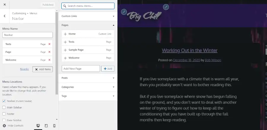
Once you have become familiar with how your menus are added by viewing the menu admin page, you can probably rely on the customizer menu section to manage your menus. The menu options in the customizer are a lot more extensive than the widget options.

Screenshot of Menu options in the customizer

The Relationship Between Widget and Menu Areas

You should pay attention to how your menus and widgets are juxtaposed against each other. The existence of one can impact the position of the other. Assess all of your options before you start adding most of your content.

Questions About WordPress Widget and Menu Areas?

If you have any questions, then please post them in the comments area.