Computer screens keep getting larger. This can create awkward and convoluted compromises if you’re trying to create a mobile first web design. Add to that problem the need to push out new content fast, and you may come to realize that adding a maximum page width to your web pages is the solution to solid design with efficient productivity.
Can’t Somebody Else Deal With This?
If you don’t have the time or patience to dive down the DIY rabbit hole, and you would rather have somebody solve this problem fot you, then feel free to contact me about my professional services.
The Fundamental Dilemma of Modern Web Page Dynamics
Picture the screen of your smart phone. Now picture one of those great big curved gaming screens that take up the top of a whole desk. Next try to picture the web page that looks good on both of those screens. Finally picture adding lots of new content to those sites over a short period of time. Can you see how if you don’t manage this properly, it can become difficult to deal with?
Understanding Mobile First Design
Purist mobile first designers will tell you that you should literally design the mobile layout first, then figure everything else out after. Sometimes that works. But often that isn’t the most realistic or exciting way to design a website. So an alternative design method is warranted. Another way to view mobile first design is to recognize that in every instance of page design, you must prioritize a way to get your web page looking good on the smallest mobile application that it may be featured on.
Mobile First Design and Maximum Page Width
Now that we have a standard for mobile first design, we have to consider how a site will feature a page on the largest screen imaginable. Keep in mind that a layout that loads well on a mobile screen can leave too much negative space on a large screen, and an layout on a large screen can run out of room if it is not repositioned on a small screen. So what do you do?
Using a WordPress Theme to Manage Page Width
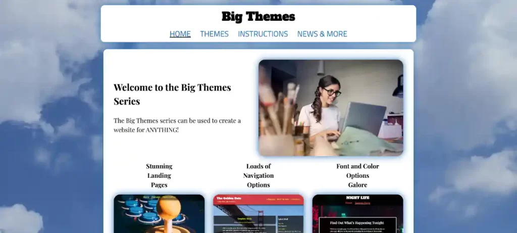
In this article, I am going to show you how to use one of the Big Themes to manage width. The particular theme that I am going to use is the Big Chill theme. It is free through the wordpress.org repo.
Foreground Page Width Limits
A simple way to set a page width limit is to create a foreground that holds all of your content, then set a maximum width for that foreground.
Hypothetically, a foreground page width limit can be any value. However, I would consider two values in particular. The 1200px width limit is a conservative limit that is great if you want to be able to add content quickly without spending a lot of time making adjustments for edge cases, while still leaving yourself a lot of room for page design. The 1800px width limit is also a good limit that requires more management than the 1200px limit. But it is a good choice if you think that you will spend a lot of time serving your website to large screens. You can move beyond this limit. But ultimately you will want some kind of absolute limit because on a large enough screen almost any section of content will start to look awkward no matter how it is sized.
How to Set the Limits with the Big Chill Theme
You can download the Big Chill theme directly from wordpress.org, or you can go to your main admin page then go to Appearance > Themes > “Add New”, then type “Big Chill” into the search bar, then select install, then select activate.
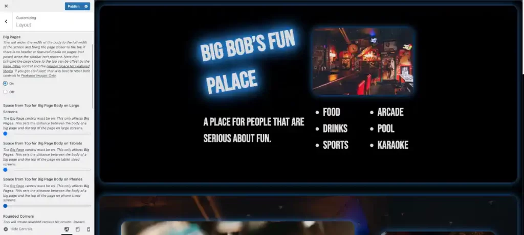
To access the customizer from the main admin page. Go to Appearance > Customize. Page limits can easily be updated using the Big Chill Customizer. Find the Layout section, then scroll down to the control titled “Big Pages”.
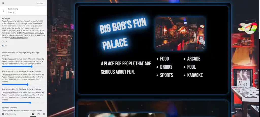
Once you are in the customizer, you can set the “Big Pages” control to on or off. The default setting is off. When the default setting is off, the page limit will not exceed 1200px, and margins will always be present surrounding the foreground. If the “Big Pages” control is turned on, then the foreground page width will only show margins when the page width exceeds 1800px.
You’ll also want to set the top of your foreground body based on how you set your navbar. You should note that if “Big Pages” is off, you’ll use the top space controls above the “Big Pages” control. If “Big Pages” is on, then you will use the controls below, except on your blogging pages (posts). You will always use the top controls to define the blog pages. This allows you to create different page width standards based on the kind of content that you are publishing for a given page type.
Managing Negative Space in the Background
You can use a background image or even just a quality background color to fill in the remaining negative space on a large screen. The 1200px limit is the ideal limit for a background image.
Managing a Background Image
If you are going to use a background image, then you need to consider page load speed with particular attention being paid to your page’s load time in a mobile environment. Converting your images to webp is a great way to start to improve page load speed.
Managing Page Width With Columns
If you have a lot of content, and you need to serve a lot of links, a sidebar is a great way to solve both of those problems with one layout decision. Adding a sidebar using the Big Chill theme will set your total content maximum width to 1800px. This total content width includes the sidebar. So your main content width will never get too large. This works great for blogging environments.
Managing Page Width at the Section or Block Level
Theme developers will often design content to spread from one screen to the other by using a percentage value for content items. However, this can introduce a lot of problems. If you are considering future proofing your web page, you need to consider that a page screen has limits as to how small it can be before it becomes unusable, so you know that screen sizes are unlikely to get smaller than they are. However, there is hypothetically no limit to how large screens might become. Think of the side of a wall. A prudent web page ought to serve a layout that is ready to handle a visitor using a screen that is excessively large.
If you don’t use page width limits, then you will need to create custom section width limits using class names. And if you create custom content, then you may need to do this even if you are using page width limits.
Page Width Limits Allow Reduced Content Width Limits
It behooves you to always set some kind of width limit for every piece of content. This increases load speed, especially on mobile. Dealing with a background image is a good example of how to manage this problem. You should set your image background width to about 2560px. And it is also probably a good idea to not display the background image on mobile devices since it will be barely seen anyway, so it only serves to slow down the page load. You can make this update using Additional CSS.
For example, you could try the following with the Big Chill theme:
@media screen and (max-width: 600px) {
	#bb-back-image img,
	#bb-preloader {
		display: none;
	}
}
#bb-preloader{
	z-index: -999;
}
#bb-preloader:before {
	content: none;
}
A background image requires an inherently large file size that causes loading slow down on smaller screens. Now imagine having to deal with that problem for every image that you load.
When you use maximum page widths you know your image widths will not exceed certain sizes. You can then set image width at that size, and if the image size is mobile friendly, then there is nothing else to worry about.
The other major benefit of content width limits is it allows you to avoid creating too much negative space or rely on inappropriate font sizes.
Further Fine Tuning With Additional CSS
Everything above will give you what you need to know to get your page publication ready. But you can also explore page width management even further using Additional CSS with the Big Themes.
Questions?
If you have any questions, then please feel free to post them in the comments area. If you would prefer to have somebody build this kind of site for you, then feel free to contact me about my professional services.