A number of people have asked me about Big Themes advanced navbar control. This post will show you techniques that you can use to facilitate that.
If you want greater control over your navbar, my first piece of advice is to upgrade to the Big Chill theme (or whatever the latest Big Theme may be when you read this). Once you have done that, you should review all of the navigation controls in the customizer to see if they satisfy your needs. If you need further control over your sticky navbar, then you can add snippets from the code below to your Additional CSS section to make further modifications.
This code was tested with the Big Chill theme. Most of it if not all of it will probably work well with the Big Lights theme, but if you use any of the other themes, then some of the code snippets after solution 2 may have issues with managing spacing.
Consider Why You are Trying to Make the Change
Before you decide that you don’t want the animation ask yourself why. Is your dislike of the animation specific or general. Specific problems can be resolved with specific solutions.
What don’t you like about the performance of the current navbar? If you don’t like the animation, then why don’t you like it? Is it that you don’t like the way that it looks, or is it that it doesn’t perform properly under certain circumstances. What made you choose one of the Big Themes?
In particular, you may find that the performance isn’t to your liking on IOS systems. If this is the case, then you can probably easily resolve your problem with solution 1.
Performance Distinctions on Different Browsers
Like any website, there are always subtle distinctions interpreted by different browsers. In particular, you may notice that IPads tend to yield a unique performance response when the navbar is adjusting its size. It tends to look a little choppy. This look really doesn’t look that bad. And the IPad is a rather obscure device. But if it really bothers you, a simple solution is to just increase the animation speed.
Big Themes Advanced Navbar Control Solution 1: Change the Animation Speed
By default the animation speed is designed so that you can see it animating slowly. However, you may find that you prefer a more rapid transition. You can use the following Additional CSS on any of the Big Themes:
@media screen and (min-width: 1065px) {
	#site-navigation.bb-scrolled .custom-logo-link,
	#bb-toggle,
	.custom-logo,
	#site-navigation,
	#site-naigation.bb-scrolled,
	#bb-site-title-top,
	#bb-site-description-top,
	#site-navigation ul,
	#site-navigation.bb-scrolled ul,
		#site-navigation.bb-scrolled .custom-logo-link,
		#site-navigation .custom-logo-link,
	.nav-menu {
		transition: 100ms ease !important;
	}
}

@media screen and (max-width: 1064px) {
	#site-navigation ul {
		transition: none !important;
	}
	.nav-menu {
		transition: none !important;
	}
        .custom-logo,
	#bb-site-title-top,
	#bb-site-description-top {
		transition: none !important;
	}
}
You can adjust the transition value to serve your personal preference.
Big Themes Advanced Navbar Control Solution 2: Upgrade to the Big Chill Theme
The Big Chill theme offers more customizer controls than any of the other Big Themes. One of the reasons that the Big Chill theme has been around for as long as it has without having a new upgrade follow it in the Big Themes series is Big Chill uses front and back end scripts efficiently while giving users the option to add many of their own custom controls using Additional CSS.
To upgrade your website to the Big Chill theme go to Appearance > Themes > “Add New”, then type in “Big Chill” into the search bar, then select install, then select activate.
Big Themes Advanced Navbar Control Solution 3: Override the Sizing in the Navbar
You may decide that you don’t like the sizing changes. The following technique will likely have problems if you are using one of the older Big Themes. The problem that you are most likely to run into is the spacing of the menu between the top and bottom. Try adding the following to your Additional CSS section of the customizer.
@media screen and (max-width: 1064px) {
	#bb-site-title-top {
		font-size: 35px !important;
	}
	#bb-site-description-top {
		font-size: 20px !important;
	}
}
@media screen and (max-width: 600px) {
	main p,
	main pre,
	main li,
	.entry-content p,
	.comment p,
	.comment pre,
	.entry-content pre,
	.entry-content li {
		font-size: 16px;
	}
	#bb-site-title-top {
		font-size: 25px !important;
	}
	#bb-site-description-top {
		font-size: 15px !important;
	}
}
@media screen and (max-width: 350px) {
	#bb-site-title-top {
		font-size: 20px !important;
	}
}
The above does not cover every instance. You may also decide that you wish to override on larger screens in which case, you can set the width and the font size accordingly. Keep in mind that font sizes will vary depending on the selections you make in the customizer. For example, if you wanted to update the font sizes on large screens after you have scrolled down the screen, you could add:
@media screen and (min-width: 601px) {
.bb-scrolled .bb-site-title-top {
    font-size: 70px !important;
}
}
@media screen and (min-width: 1065px) {
#site-navigation.bb-scrolled ul {
    font-size: 30px;
}
}
@media screen and (min-width: 1065px) {
#site-navigation.bb-scrolled .custom-logo-link {
	padding-top: 25px;
	padding-bottom: 25px;
	}
}
You would then also probably want to adjust the “Distance of Scrolled Right Aligned Menu Items from Top” control in the navigation section of the customizer.
If you need to determine what values you should use, then you should look up your values in your browser’s inspector.
Big Themes Advanced Navbar Control Solution 4: An Obscure Edge Case
I’ll preface this solution by saying it is unlikely that you or anyone else will likely ever notice the problem. But if you are as obsessed with detail as I am, then feel free to keep reading.
If you are using one of the Big Themes that offers foreground borders as an option, and you have it added to your navbar. When you are running your site on an IPad, and you are not sticking the navbar to the top on mobile screens, then you may notice if you go back to the top of the page after you have scrolled down the page that the border looks messed up. The solution is simple. Just add the following to the Additional CSS section of the customizer.
@media screen and (max-width: 1064px) {
	#site-navigation ul {
		transition: none !important;
	}
	.nav-menu {
		transition: none !important;
	}
        .custom-logo,
	#bb-site-title-top,
	#bb-site-description-top {
		transition: none !important;
	}
	#bb-site-title-top {
		font-size: 35px !important;
	}
	#bb-site-description-top {
		font-size: 20px !important;
	}
}
The font sizes may need to be adjusted to suit your specific settings. If you need to determine what values you should use, then you should look up your values in your browser’s inspector.
Big Themes Advanced Navbar Control Solution 5: Consider a Bootstrap Page
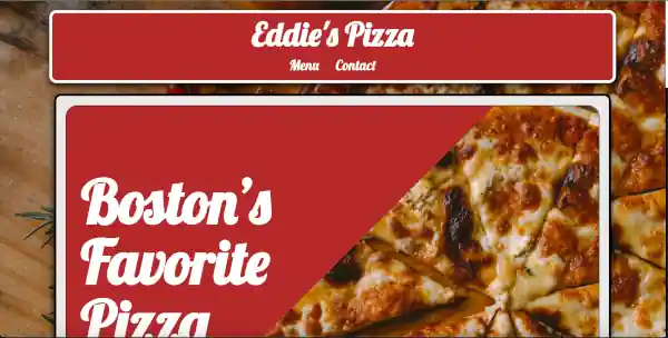
You may have decided that you would prefer a different style of sticky navbar because you saw my homepage and liked it. However, this page isn’t run by one of the Big Themes. It’s a Bootstrap page. There are benefits and drawbacks to Bootstrap pages. Bootstrap pages require you to know HTML, CSS, and JS to work with them fluently. So if this requirement intimidates you, then you should consider my premium services.
Big Themes Advanced Navbar Control Solution 6: Consider My Premium Services
I have a lot of people that write to me. And it isn’t possible for me to solve every problem through forums and email. If you want me to build your website for you, then you need to use my custom development services. I like to support the Big Themes DIY culture. But if you really want to do it yourself, then you can’t expect me to solve every problem you have.
You may also wonder why I don’t just add new controls to solve every problem. The first reason is the more controls that I add, the more controls you will need to consider using. This makes it more difficult for you to decide what to do. Also, controls that are added that are unused require scripts that will slow down your site and accomplish nothing if they go unused.
WordPress themes are not website builders. They’re designed to minimize the amount of choices that you have. And they maximize compatibility with other software. Themes tend to be faster to set up and easier to update and easier to change than website builders. But that’s at a cost of the number of options that you get.
The reality is even if I had more time, I simply could not create a control for every single use case. If that were realistic, then there would be no need for so many different WordPress themes to exist.
The bottom line is I always appreciate your feedback, and I like to provide as much opportunity as I can for you to do things yourself. But if your imagination exceeds your development skills, then you really need to hire a professional to do the work for you.
Thanks for reading. I wish you the best luck with your website no matter how you decide to build it.