
The Big Chill WordPress theme has a lot of controls. And if you are new to using the Big Themes series, then you may find looking through all of them to be a bit overwhelming. I realize that a lot of you may have no use for the default header media image in the Big Chill theme. So here is a quick tutorial on how to remove it.
To access the customizer from the main admin page. Go to Appearance > Customize.
Removing the Default Image From the Big Chill WordPress Theme
To remove the image, you need to select the Homepage Header Media option near the bottom of the left panel of the customizer.
Once you’ve clicked on it, scroll to the bottom of that section where it reads, “current header”.
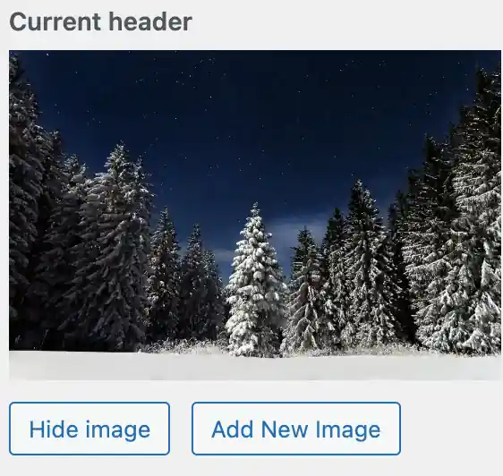
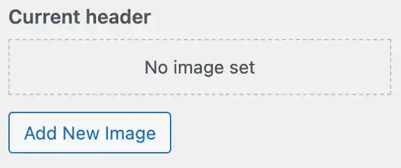
Then click on the “Hide Image” button underneath the image.
Questions?
Please let me know if you have any questions about removing the default image from the Big Chill WordPress theme.