Backgroound Image

POSTS

Add a “Search from the Bottom” Link to Your Website

The Big Themes has everything that you need to add a “search from the bottom” link to your website. Hypothetically, any WordPress site can add this kind of link, but sites that don’t use one of the Big Themes may not have the ideal resources to set the icon quickly.

What is a “Search from the Bottom” Link?

A “search from the bottom” link is a hyperlink that sends you down to the footer of your page when you click on it. It looks like this:

Why Use a “Search from the Bottom” Link?

If you have a really large page that is tedious to scroll down, but it has important information at the bottom of it, then you should consider adding a “search from the bottom” link. If you have a small one page site, then this icon probably isn’t worth the time and effort. However, if you have something like a large blog with an index with multiple long pages, then this tutorial is for you.

Assumptions

This tutorial assumes that you are familiar with the basics of building a website, and you know how to add to widget areas, and you are using a site that uses a footer. It also also assumes that you are using one of the Big Themes.

Building the Icon

You can build everything that you need directly from the customizer. An ideal place to put the icon is at the top of your sidebar.

Search from the Bottom
Loading the icon by using the customizer

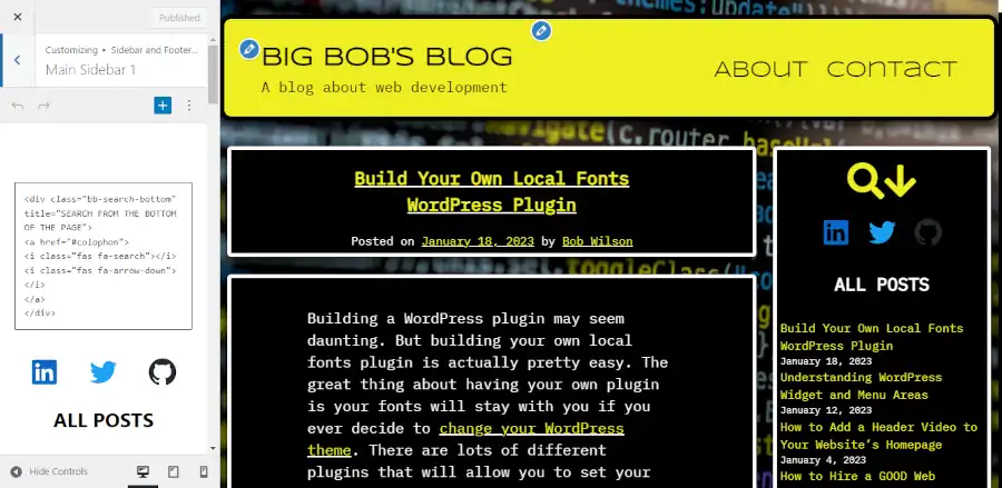
First you will want to add a custom HTML block that contains the following code:

<div class="bb-search-bottom" title="SEARCH FROM THE BOTTOM OF THE PAGE">
<a href="#colophon">
<i class="fas fa-search"></i>
<i class="fas fa-arrow-down"></i>
</a>
</div>

Then you will want to add the following code to the Additional CSS section:

.bb-search-bottom {
	text-align: center;
	font-size: 50px;
	letter-spacing: -15px;
	padding-right: 15px;
}

You may want to adjust the font size. You also may want to adjust the letter spacing to make the two icons closer or wider together. Note that padding-right is the inverse value of letter-spacing. So if letter-spacing was -20, then you would want to adjust padding-right to 20.

Questions?

That’s it. If you have any questions, then please leave them in the comments.

How to Use Web Safe Fonts with the Big Themes

Did you know that you that you can use web safe fonts with the Big Themes? By using web safe fonts you can improve your page load speed. The only catch is there are far fewer choices of fonts to choose from and your choices are inconsistent. Your visitors will only have access to certain fonts based on the operating system and the browser that they are using.

Assumptions

You should understand how caching and CDNs work before reading this article.

Google CDN

Using the Google CDN means that Google stores your fonts in its content delivery network.

The Google content delivery network is the primary way that you can display fonts with the Big Themes. It’s a great way to load your fonts because it gives you tons of choices, loads fast, and it is easy to maintain and update. However, it will almost never be as fast as using web safe fonts.

Hosting Fonts Locally

Hosting fonts locally means that your fonts are stored on the same server as the rest of your site, then they are proliferated to your CDN if have one.

There does not appear to be any meaningful performance improvement when hosting fonts locally. In some instances, you may see that your CDN loads fonts slightly faster than Google’s CDN, but in other instances you may notice that Google is faster. In either case, the performance difference is likely to be trivial, but hosting fonts locally requires you to install your fonts onto your website which is sometimes tricky and adds bloat to your site, then if you want to update your fonts, you need to delete your old fonts, then install your new fonts. And ultimately, the only difference is you’re using your own CDN instead of Google’s CDN. And if you don’t use a CDN, then your fonts are almost certain to slow down your page load speed in comparison to using Google’s CDN.

Bearing that in mind, there are some reasons that you may want to host your fonts locally, but this article is about web safe fonts. You can read about hosting fonts locally on my main blog.

Web Safe Fonts

Web safe fonts are fonts that are hosted by your visitor’s operating system or browser.

Using web safe fonts will speed up your page load regardless of whether you were hosting your fonts through your own CDN, or off of your local server, or off of Google’s CDN. When you use web safe fonts, you are creating a list of fonts called a font stack, and when your visitor’s page has loaded onto their browser, your website loads the first font on the list that is available in the user’s browser or operating system.

A Demo of a Web Safe Font Stack for the Big Themes

If you want to use a web safe font stack, then you should look up different web safe fonts on the internet. However, it can be difficult to find a stack of fonts that you think looks good and looks similar to each other.

The following is a sample stack of quality fonts that look pretty similar over a wide range of devices. All you have to do is copy and paste this into the Additional CSS section of the customizer:

/*Title Fonts*/
.site-title, .bb-site-title-top,
.bb-forest-cover h1,
.bb-forest-cover h2,
.bb-forest-cover h3 {
	font-family: -apple-system, BlinkMacSystemFont, "Segoe UI", "Roboto", "Oxygen", "Ubuntu", "Cantarell", "Fira Sans", "Droid Sans", "Helvetica Neue", sans-serif  !important;
}

/*Heading Fonts*/
h1, h2, h3, h4, h5, h6, .site-description, .bb-site-description-top {
	font-family: -apple-system, BlinkMacSystemFont, "Segoe UI", "Roboto", "Oxygen", "Ubuntu", "Cantarell", "Fira Sans", "Droid Sans", "Helvetica Neue", sans-serif !important;
}

/*Paragraph Fonts*/
body,
p, pre, textarea, .comment-author, .entry-content li, .wp-block-latest-posts,
.entry-meta,
.entry-footer,
.nav-links,
.comment-metadata,
.reply,
input,
select,
optgroup,
.bb-sideStick li,
#bb-sideSlide li {
	font-family: -apple-system, BlinkMacSystemFont, "Segoe UI", "Roboto", "Oxygen", "Ubuntu", "Cantarell", "Fira Sans", "Droid Sans", "Helvetica Neue", sans-serif !important;
}

/*Menu fonts*/
#primary-menu li,
#bb-sidebar-menu li {
	font-family: -apple-system, BlinkMacSystemFont, "Segoe UI", "Roboto", "Oxygen", "Ubuntu", "Cantarell", "Fira Sans", "Droid Sans", "Helvetica Neue", sans-serif !important;
}

If you like the way this looks, then if you are using one of the latest Big Themes, all you have to do is go into the Typography section and delete everything (including white space) from the input areas of the font sections. Once you have done that, the Google CDN will no longer be called.

You can also do a search for web safe fonts and see what other options are available to you.

Questions about Web Safe Fonts?

If you have any questions, then please post them in the comments section.

Set Your Video to Fill the Screen

If you have used a header video or a background video with the Big Themes, then you have probably noticed the videos are always centered and fit so that the entire video is fit within the screen. You may have wondered if it would be better to set your video to fill the screen, even if some of the video is cut off.

My experience has shown me that in most cases when you set the video to fill the screen, you will end up with a number of different screen sizes (like on mobile) in which the video is cut off to the point that it is indiscernible. My advice would be that anyone who is considering trying to do this is they should consider converting their video to .gif file, then cut the .gif so that it has versatility over a large number of screens. Once you have built the .gif, you can upload it the same way you would load an image.

You also have the option of setting your video into the body of your page instead of using a header video or a background video.

However, if you still truly believe in the versatility of your video, and you think that it will look good on a wide screen or a phone because all of the action is so well centered in the video, or if the video is abstract and can serve exclusively as a background video, and it doesn’t matter what gets cut off, then you can add the following code to your Additional CSS section of your customizer. This code will work for all of the Big Themes for both Homepage Header Videos and Background Videos.

Note that the original height and width of your video will impact the performance of this code. This will be noticeable with larger videos on mobile. It is generally preferable to make your video as small as possible without distorting video quality.

/*This will not work for YouTube videos*/

.bb-backVid, 
.bb-backVid video, .bb-backVid iframe,
.wp-custom-header, .wp-custom-header video, .wp-custom-header iframe{
	/*the maxes must be able to extend as far as necessary.  You may decide that one of the next two values makes the video look better if it is reduced to 100, even though it may produce negative space on some screens*/
	max-width: 1000000vw;
	max-height: 1000000vh;
	
}

.wp-custom-header,
.bb-backVid {
	background-size: cover;
    background-position: 50% 50%;
    height: 100vh;
    width: 100vw;
}

.wp-custom-header video,
.bb-backVid video{
	-webkit-transform: translateX(-50%) translateY(-50%);
    -moz-transform: translateX(-50%) translateY(-50%);
    -ms-transform: translateX(-50%) translateY(-50%);
    -o-transform: translateX(-50%) translateY(-50%);
    transform: translateX(-50%) translateY(-50%);
    top: 50%;
    left: 50%;
    min-width: 100%;
    min-height: 100%;
    width: auto;
    height: auto;
}

/*The video must be fixed, or it will protrude into the body*/
.wp-custom-header video,
.wp-custom-header img,
.wp-custom-header iframe {
	position: fixed;
	z-index: -999;
}

Set Your Video to Fill the Screen on Mobile

If you have a horizontally aligned video (a longer width than height), then you may find that it is helpful to also include the following at the bottom of your your new CSS update.

@media screen and (max-width: 1050px) {
	.bb-backVid, 
.bb-backVid video, .bb-backVid iframe,
.wp-custom-header, .wp-custom-header video, .wp-custom-header iframe {
	max-height: 100vh;
	}
}

This will make sure that the video area doesn’t push unnecessarily into the top and bottom when the screen height is short and narrow.

If you wanted to be fastidious you could also add the following for larger screens:

@media screen and (min-width: 1051px) {
	.bb-backVid, 
.bb-backVid video, .bb-backVid iframe,
.wp-custom-header, .wp-custom-header video, .wp-custom-header iframe{
	max-width: 100vw;
	}
}

You may need to play around with min and max width to coordinate with your particular video.

Vertically aligned videos (like the kind shot on a phone) are less likely to respond well to the above code, but if you do find a video that works, then you will probably want to swap out the horizontally aligned mobile and code additions with the following:

@media screen and (max-width: 1050px) {
	.bb-backVid, 
.bb-backVid video, .bb-backVid iframe,
.wp-custom-header, .wp-custom-header video, .wp-custom-header iframe {
	max-width: 100vw;
	}
}

@media screen and (min-height: 650px) {
	.bb-backVid, 
.bb-backVid video, .bb-backVid iframe,
.wp-custom-header, .wp-custom-header video, .wp-custom-header iframe {
	max-width: 100000vw;
	}
}

It is hypothetically possible to automate this with JavaScript, but this will likely require screen adjustment performed at runtime which could be seen by visitors. Using pure CSS insures that the video will be properly sized as soon as the page loads.

This code will not cover every scenario, but you should be able to modify it to suit your video.

Please leave any question in the comments section.

Big Chill is in Development

The new Big Chill Theme is in Development. This site and my blog are currently running on early versions of it. The Big Chill theme will introduce the following updates:

  1. The footer now has a standardized size.
  2. The sidebar now stays parallel to the body. It does not scroll parallel with the footer. This allows for improved compatibility with browsers.
  3. The custom logo was rewritten to allow users to upload logos with more reckless abandon. Cropping is no longer mandatory.
  4. There are now options to set a larger text title above and below the navbar.
  5. The default fonts and colors have been changed.

Check back soon for publication information.

The New Big Lights Theme is in Development

The new Big Lights theme is in development. It adds new lighting design options, and new block patterns, and it adds a number of new controls for designing the main navbar. The primary purpose of the new controls is to improve the layout when the menu is floated to the right, so users have more options when building smaller menus. This site and my blog are currently running on early versions of Big Lights. You can see a screenshot of some of the new customizer controls below.

Screenshot of some of the new customizer menu controls.

Building a Typing Feature Part 2

UPDATE: I have decided to remove the two typing features from the links below. I decided that I had too many typing features on my site. You should also note that the latest version of this plugin requires version 2.0.15. So you would want to download the latest script:

wp_enqueue_script( 'bb-typed-core', esc_url('https://unpkg.com/[email protected]/dist/typed.umd.js'), array(), true );

This article is a follow up to my original article about how to add a typing feature. I’ll discuss the new ways I add a typing feature on my homepage and my themes page. You can still download the core plugin from my github page.

Download my plugin from my github repository. Unzip it, then open the file until you find the file named big-typing-effect (all lower case). If the file name has been post fixed with anything such as “-main”, then you should delete it so that it just reads “big-typing-effect”. Go into your WordPress file directory and add the big-typing-effect folder into your plugins folder (wordpress > wp-content > plugins). Then go into your WordPress admin center (Plugins > Installed Plugins) and activate the plugin.

This implementation is distinct from my original post and the ReadMe instructions because it no longer relies on breaks. Instead it relies on minimum height. This should make it easier to implement and update.

The typing feature inside the cover block on my themes page was comparatively simple to implement. This is the custom HTML for the text on my themes page:

<p class="has-text-align-left has-white-color has-text-color has-x-large-font-size bb-coverType">The Big Themes series are designed for <span class="bb-text-slider-items">beginners., learners., developers., everyone!</span><strong class="bb-text-slider" style="font-weight:normal;"></strong></p>

I also set the minimum height of the cover block to 600 using the block editor. This was necessary so that the screen height didn’t adjust on mobile.

I also added the following additional CSS to complement the image:

.bb-coverType {
	max-width: 400px !important;
}

However, you may decide that your cover block doesn’t need it.

Adding a typing feature to a media and text block is a bit more tricky. You will probably have to experiment with different minimum heights based on your content. This site’s homepage is implemented using the following custom HTML:

<p>The Big Themes Series can be used to create a website for a <span class="bb-text-slider-items">blog., restaurant., nonprofit., band., bar., portfolio., business., gym., park.</span><strong class="bb-text-slider" style="font-weight:normal;"></strong></p>

And it relies on the following additonal CSS:

/*These first two are necessary because it is custom html.*/
@media screen and (min-width: 600px) {
.bb-four-images-text .wp-block-media-text .wp-block-media-text__content {
		padding-right: 20px;
	}
}
/*You could also adjust this in the html inline*/
.bb-four-images-text .wp-block-media-text p {
	font-size: 24px  !important;
}

/* These last two keep the screen size from adjusting when the typing runs over onto a second line.  You will likely have to experiment and adjust based on your content. */
@media screen and (max-width: 1000px) {
	.bb-four-images-text .wp-block-media-text .wp-block-media-text__content p {
	min-height: 120px;
}
}
@media screen and (max-width: 375px) {
	.bb-four-images-text .wp-block-media-text .wp-block-media-text__content p {
	min-height: 150px;
}
}

If you have any questions, then feel free to post them in the comments section.

Big Patterns is Live

Introducing Big Patterns

Big Patterns is live. The new Big Patterns theme is designed to make block patterns more accessible to users by combining their settings with the customizer. It also gives builders a lot more control over layout, especially with respect to setting the body’s distance from the navbar. You can see demos of some of the new patterns by viewing this site’s homepage. You can download Big Patterns by going into to your WordPress admin center, then select Appearance > Themes > Add New, then type “Big Patterns” into the search box.

The Big Patterns Theme is in Development

I’m working on a new theme with the working title “Big Patterns.” I hope to be launching it in the near future. The new major features are:

  1. Block patterns have been designed to work with the theme and the customizer. Unlike other block patterns, you should be able to focus on adding your content while only having to make a few (if any) changes to styling.
  2. You’ll have much greater control of the site’s body in relationship to the navbar. People have been asking about a feature like this for a long time. You no longer need to rely on the default settings or using custom CSS. You can now control how much or how little you want to expose the background directly from the Layout section of the customizer.
  3. A three column footer is available. If you want to create more than a simple footer, I’ve given you the tools that you need.

Check out the themes page for the latest release information.