Posts

How to Get Started with WordPress in 2023

You may be a bit confused about how to get started with WordPress in 2023. There are many ways to build your site with WordPress. But you would be wise to avoid trying to learn how to use all of the tools that WordPress has to offer. This post is designed for new and experienced WordPress users. It doesn’t cover all of WordPress’s features. But it covers all of the foundational features that you can use to build your site in 2023. If you are new to WordPress, then you may only need to read the first part of this blog to learn what you need to know.

What this Article Doesn’t Cover

This article is written more as a review than a tutorial. It is designed to teach which features that you are likely to want to use. But it teaches you very little about how to actually use those features accept as it relevant to whether or not you may choose to use them.

TL:DR

Just pick a theme like one of the Big Themes and rely exclusively on the block editor and the customizer.

WordPress Features that You Can Get Started with in 2023

There are five primary features that you can consider if you are learning how to get started with WordPress in 2023.

  1. The Customizer
  2. The Classic Editor
  3. The Block Editor
  4. Page Builder Plugins
  5. The Site Editor

The Customizer

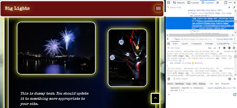
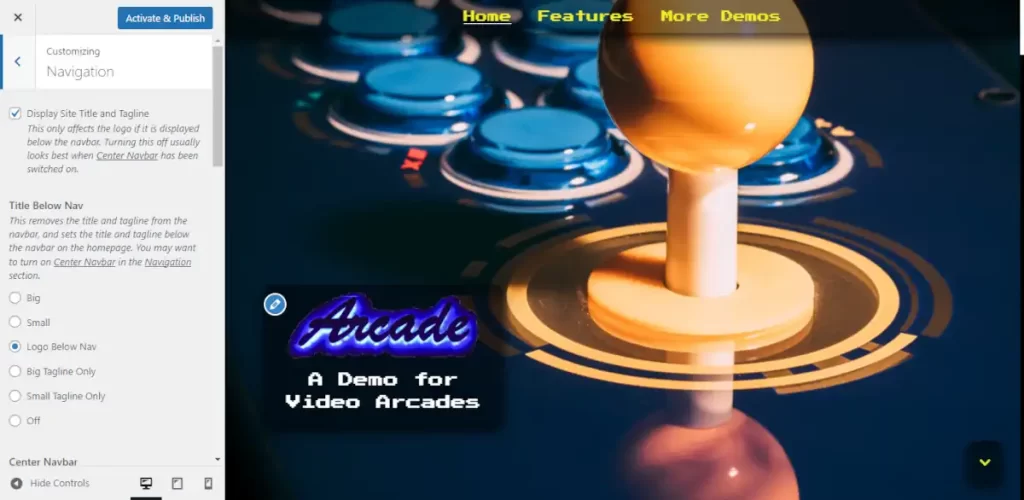
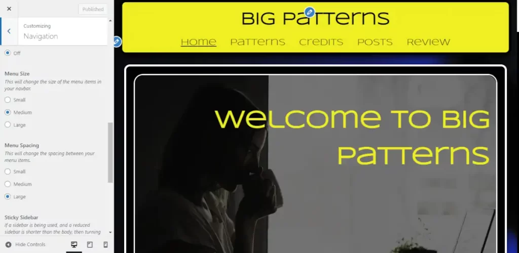
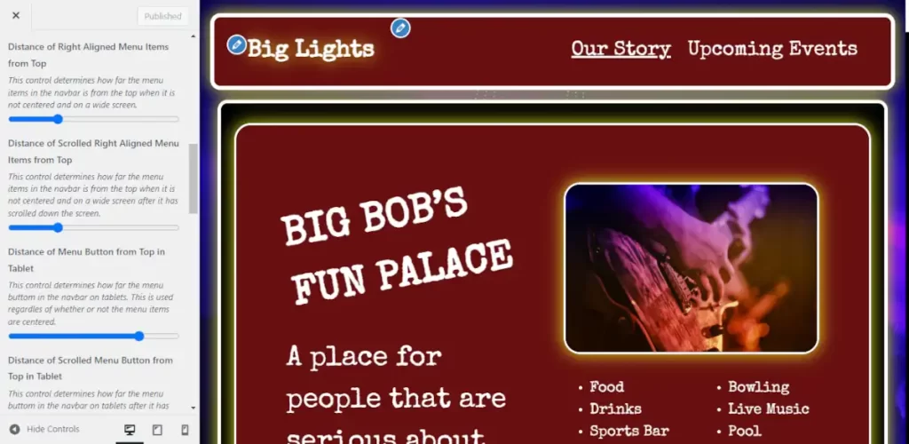
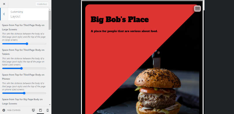
The customizer is the best way to set global values for your WordPress site in 2023. It contains controls that are written for your WordPress theme. The simplest way to think about a WordPress theme is to think of it as website template with layout and content controls. If you want to see some demonstrations of what themes do, then you can check out the Big Themes.

Screenshot of the customizer

The Classic Editor

The classic editor used to be the primary way to build content into the body of websites with WordPress. It is still supported, and it still works with a lot of themes such as the Big Themes, and there is still a loyal following that thinks it is the preferred way to build a WordPress page. When the block editor (discussed below) first came out, there were a lot of people that thought it’s user interface was awful and was an inadequate replacement for the site editor, however the block editor has improved since then, but its user interface still has a steeper learning curve then the classic editor. I would only use the classic editor if you are already used to it. If you are unfamiliar with the classic editor, then I wouldn’t bother trying to learn how to use it because the block editor is simply more powerful.

The Block Editor

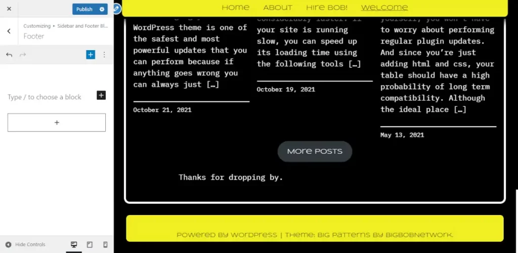
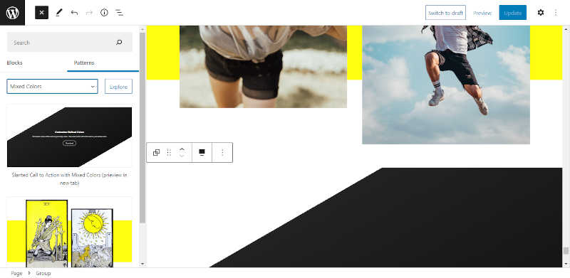
The block editor has foundational controls for building WordPress page body content. These controls can be enhanced by theme developers. If you want to see some demonstrations of what themes can do with the block editor, then you can check out the Big Themes. Themes like these often provide block patterns that allow you to load great looking content quickly. If you learn how to use the block editor and the customizer, then you will have everything that you need to build a site once you have picked a great theme. However, there are some other features that you may want to be aware of.

Screenshot of the block editor

Page Builder Plugins

People that find the block editor too confusing and the classic editor to be too basic will often turn to page builders such as Elementor to create their theme. There’s nothing inherently wrong with doing this, but you need to realize the kind of overhead considerations that you will have to endure by choosing a page builder.

  1. You still need a high quality theme such as one of the Big Themes.
  2. You’re going to need to pay a subscription fee if you want to use any premium page builder features which tend to constitute the bulk of page builder features.
  3. Page builders make your file sizes much larger, so you must make sure that you set your images properly, and you are using caching, and you may need a more expensive webhost.
  4. You need to continue relying on your page builder and pay for its subscription as long as you want to use the pages that you have built.
  5. The user interface has limitations and often makes it difficult to build custom designs into it. The block editor gives developers and DIY users more options to extend its features.

The Site Editor (This section was updated on 3/21/23)

The site editor (formerly known as the full site editor) has been out for over a year, and it is still in its beta stage (although the beta tag will be removed for version 6.2). While it seems like it may have potential for use in the future, it currently has a number of problems that make it difficult, dangerous, and unnecessarily complicated. Its potential seems like it is based in it’s user interface, but it still seems like it needs a considerable amount of development before it becomes worth using.

Problems with the Site Editor

  1. I haven’t seen any features that can be added to a website with the site editor that can’t be added to a website with the customizer and the block editor.
  2. It’s user interface is still clunky, and it is certainly inferior to page builders, and it doesn’t seem to provide any meaningful benefit over just using the block editor.
  3. It relies on page templates that could be reproduced by block patterns; but unlike block patterns, once you have implemented them, they seem to disappear when you change themes.
  4. I have seen site editor driven themes delete content from customizer driven themes when the theme is changed, and the content needs to be rewritten if you want to switch back to the customizer driven theme.
  5. A site editor driven theme has far fewer controls and options than your typical well written customizer driven theme. Theme developers have fewer resources with the site editor.
  6. You still seem to need to rely on the block editor to add content.
  7. Most versatile themes still need to rely on the customizer for support, so instead of editing your site with two different interfaces, you now have to use three different interfaces.
  8. The front page can only be updated in settings. And there seems to be issues with the site editor properly displaying the content of an updated front page. If the front page is changed, then the block editor front page, the site editor front page, and the live front page will all produce inconsistent content.
  9. The block editor and site editor look very similar, and it can be difficult to tell which one you are using. See problem 6.

Perhaps one day people will refer to the history of the site editor to be similar to the history of the block editor. But if I were you, then I would let other people experiment with the site editor with their sites and wait to see how it is improved in the future. It is worth noting that version 6.2 is removing the beta tag from the site editor, but I discovered many of the problems above during my testing of the release candidates still exist. I did not retest every problem, but I did not find any problems that had been resolved.

Questions?

If you have any questions, then please provide them in the comments section below.

Adding a Custom Class to Your WordPress Page

You pick a WordPress theme because you want most of the design to be taken care of for you. However, you may have something that you want to be an exception to your design within a particular page. The solution to your problem is adding a custom class to your WordPress page.

Why Add a Custom Class to Your WordPress Page?

You can make small modifications to your site’s CSS when you add your own custom classes. WordPress offers a lot of controls in its user interface that allow you to make changes to specific blocks, and theme developers will often add custom styling to enhance those options. But it is inevitable that you will eventually want something that is not provided for you by the user interface options.

Assumptions

This tutorial assumes that you already know how to set up a WordPress site, and install a WordPress theme, and you are familiar with the block editor.

Understanding Basic CSS

Nobody knows everything that there is to know about CSS. There are entire websites and books that are devoted to teaching people the subject. Fortunately, you don’t need to learn most of what there is to know about CSS to use it. You don’t need a computer science degree, and you don’t need to be a full on hardcore developer.

How to Determine Existing CSS

If you want to update existing CSS, then you first need to learn how to use your browser’s developer tools. If you want to follow along with what I am doing you can open up a copy of the Big Lights theme, then add some block patterns. Once you have added something with images, you can open up a preview page or a published page, then right click on one of the images and select inspect. It should produce a screen that looks something like this:

Screenshot of the developer tools.

Highlight the img tag the same way as it is shown in the image above, then click on the checkmark next to the attribute that reads “box-shadow.” Do you see how the lights surrounding the images disappear? You can use this technique to see how different attributes are assigned to different classes. So you can add your own classes and write your own updates.

Adding a Custom Class

Next go into the block editor and add a new image, then add a new class name by selecting a block, then open up the settings panel, then select the block tab, then go into advanced and add a new class name:

Adding a new class name in the block editor

Finally, you want to go into the customizer and add your custom CSS to make your update:

.bb-no-highlight-image img {
	box-shadow: none;
}
Lights out for the chicken sandwich

You can now add this same class to other images if you want them to share the update.

It’s okay if you don’t know what the exact syntax is to make the update. It isn’t something that most people try to memorize. If you need to look something up, you can find pretty much everything that you might need need at W3 Schools.

Less is More

You should use the tools provided to you by WordPress and your theme developer. Get familiar with all the existing controls before you start adding custom classes. Some people will use this new found knowledge to try to completely overhaul their site. If you are reading this tutorial, then it is expected that you are not an experienced web developer, so I would discourage you from trying this. I’ve seen a few people try it, and they always end up ruining their site. However, it’s pretty safe to do this for single blocks because the area that you are updating is small, and you can always remove the CSS if you don’t like it.

Questions?

If you have any questions, then feel free to leave them in the comments section.

Adding a Sticky Navbar to Your WordPress Site

Sticky navbars can be tricky to implement, maintain, and update. This is why that although they have tremendous practical and visual value, many sites don’t bother to include them. The best way to implement a sticky navbar is to utilize a theme that provides a sticky navbar feature because, as you will learn in this tutorial, sticky navbars will change the layout of your entire webpage.

Pick the Right Theme for Adding a Sticky Navbar

I’m going to show you how to implement a sticky navbar using the Big Lights theme. You can download Big Lights by going into to your WordPress admin center, then select Appearance > Themes > Add New, then type “Big Lights” into the search box. You can also use the Big Chill theme to build your sticky navbar. The Big Chill theme is similar to the Big Lights theme except the Big Chill theme has different default settings and more features. The instructions below should work for either theme.

Assumptions

This tutorial assumes that you have already established the bulk of your content. If you haven’t determined what content will be presented in your site, then you should determine that before you begin this process. Once you have determined what content you want to use, then you should get a good idea of how to present your content using block patterns. You can read a recent tutorial that I wrote about how to do this here. After you have established what content will go into different pages, you can determine how many page links you will need in your navbar which will serve as the foundation of your site’s sitemap. In addition to determining content, you should also determine your site’s fonts and colors which you can learn about here.

Starting Your Navbar

Now that you have determined an at least approximate layout of your site’s sitemap, you can begin adding content to your site’s navbar. From your admin center, you can either build your menu by going to either Appearance > Menus, or you can go to Appearance > Customize > Menus. Feel free to use whichever user interface is the most intuitive to you.

Don’t worry too much about how well your menu items fit. Just figure out everything that you want to be in there. The only limitations that you want to keep in mind is that you should make sure that you don’t have so many menu items that they become squished on small screens, and if you use a logo, then you want to make sure that it fits properly. Make sure that you use the cropping feature.

Adding a Sticky Navbar to Your WordPress Site (Screenshot of cropping demo)
Screenshot of cropping a logo

Choose Whether or Not Your Navbar Content Should be Centered

After you have decided what your navbar’s content will be, you should have an idea of how much space you have to work with. If your menu is long, then you should choose the default centered navbar. You can also decide if you want to set the title below the navbar on the homepage, which will leave just the menu items in the navbar.

Adding a Sticky Navbar to Your WordPress Site (Screenshot of title below nav)
Screenshot of title below nav

If you are electing to choose a centered menu, then all you have left to do in the Navigation section is choose your menu size and determine if you want to add a tagline.

Adding a Sticky Navbar to Your WordPress Site (screenshot of menu sizing)
screenshot of menu sizing

You can skip ahead to the determining the body position section of this tutorial if you have decided on a centered navbar. But if you want to try for a more space efficient navbar, then keep reading.

Using a Smaller Navbar

If you don’t have that many menu items, then you should consider floating you title or logo to the left and floating your menu to right. To do this, you will find a Center Navbar control in the Navigation section. Turn it off. Once you have turned it off, you will want to make sure that your menu items fit on smaller screens. If they don’t, then you can use the menu sizing controls referenced above to give yourself more room.

If you can’t achieve enough room, then you should switch to a centered navbar. If you have enough room then you should decide if you want your tagline in your menu with the “Add Tagline When Title is in Navbar” control. Once you have done this, then you should determine the menu’s position, as well as the menu button’s position for mobile browsing. You will need to determine the position under five circumstances:

  1. At the top of large screens.
  2. After it has scrolled down large screens.
  3. The top of tablets.
  4. Scrolled down tablets.
  5. Phones
Adding a Sticky Navbar to Your WordPress Site (Screenshot of menu positioning)
Screenshot of menu positioning

You can switch between different screen sizes by using the three display controls in the lower right corner of the controls window on the left side of the screen.

Determining Body Position when Adding a Sticky Navbar

The final step of building your sticky navbar is determining the position of your site’s body. You can do this in the Layout section of the customizer. You’ll have decide how to set your position on three different screen sizes (large screens, tablets, and phones). And if you decide to use big pages, then you will have to determine three more placements for your big pages. How you determine the placement is highly subjective. You will want to consider things like the size of your navbar, how much you want to expose the background, and what your personal preference for spacing is.

(Screenshot of spacing body from top)
Screenshot of spacing body from top

That’s it. If you have any questions, then please post them in the comments section.

Convert Your Images to WebP

The WebP image file type is a way for you to set higher quality images onto your website. WebP images look better at smaller file sizes than other image file types. This means that your images will look better and load faster when you convert them to WebP. WebP was actually invented by Google over a decade ago. But it took quite a while for it to catch on because it needed time for browsers to become WebP compatible.

How Important is it to Convert Your Images to WebP?

If you have already been doing a good job of setting web friendly images, and your site contains a lot of images, then I wouldn’t go through every image and convert each one to WebP. However, you should consider converting all of your new images to WebP. However, if your site is running slow, and you have already done a good job of caching your site, then you may find that reducing the dimensions of your images and converting them to WebP may improve your loading times.

WebP and WordPress Compatibility

This tutorial will reference WordPress, however it will show you how to convert your images to WebP without using WordPress tools.

WebP has been compatible with WordPress since version 5.8. So if you don’t have WordPress 5.8 or higher then you will need to update if you want to use WebP images.

In addition to WordPress version compatibility, you should also consider WordPress theme compatibility. Some themes do a better job of managing image sizes than others. You want to pick a theme like one of the latest Big Themes that sets clear limits on how big an image can be. That way you can set your image to a maximum size that you know won’t get so large that it becomes distorted.

Update Your Images to WebP with GIMP

GIMP is free software that you can use to amplify compression and convert file types.

GIMP is a full service image editor that has capabilities that extend well beyond what you will probably need for WordPress. But if you are just using GIMP to compress your images, then it isn’t that difficult to use. Just follow these instructions:

  1. Download GIMP if you haven’t already.
  2. In Gimp, go to File > Open, then choose the file you want to open.
  3. Go to Image > Scale Image. A good rule of thumb is if you are using one of the Big Themes, then set the width of your images to one of the following sizes:
    • 900 for images half the body or smaller.
    • 1200 if you are using a standard page width and you have an image that traverses the entire body width.
    • 1800 for full body width when using Big Pages.
    • 2560 if you are using a background image, a header image, or a featured image.
Using image scaling to convert your images to WebP
Screenshot of image scaling
  1. Once you have set your image width, go to File > Export As.
  2. Replace the current image file extension (probably .jpg or .png) with .webp. You may also want to rename the file so that it includes a reference to the width.
  3. Click export, then lower the image quality to 50 percent. You can experiment with even lower image quality if you think the image’s appearance won’t suffer too much.
  4. Click Export.
convert your images to WebP
Screenshot of exporting to WebP

That’s it. If you have any questions, then feel free to post them to the comments section.

Building a WordPress Site with Block Patterns

Using block patterns with the right theme can make building a website a lot easier, but using block patterns with the wrong theme can make building a website a lot harder.

What’s a Block Pattern?

If you’re reading this, then you probably already know what a WordPress block is. It’s a piece of content, like a paragraph or an image. A block pattern is just a preformed arrangement of those different pieces of content into a section.

The Advantage of Using Block Patterns

You can build a site a lot faster with block patterns, and it often looks a lot better than something you may have tried to build from scratch. You can build patterns on your own using blocks, and this may be a good idea if you have something specific in mind. But if you have a lot of content, then it is often more effective to just set your content into block patterns.

Pick the Right Theme for Block Patterns

There are a lot of themes out there, and it may be difficult to discern which ones do a good job of supporting block patterns. Don’t assume that every theme does a good job with this. If you pick the wrong theme, then you may find yourself spending as much time updating the pattern as you would if you had built the pattern yourself from scratch.

I recommend using the latest Big Theme. For example, you can download Big Chill by going into to your WordPress admin center, then select Appearance > Themes > Add New, then type “Big Chill” into the search box.

Set Your Header, Footer, Background, and Colors

It’s a good idea to set up your header and footer before you set up your page body because you’re going to see your header and footer on every page, so it will impact how the body of your page looks.

Once you have turned on your theme, you will probably find that it is most efficient to open up three tabs on your browser. First, open a tab for your admin center. Second, open a tab for the page that you want to work on. Third, open a tab for your customizer. Right now, you are going to work in your customizer tab.

It may be difficult to decide exactly how you want your site to look. It’s fine if you just want to stick with the default setup for now. But there are four key areas that you should look at and consider for experimentation:

  1. Background Image: If you have an image that you think would make a good background image, then this can serve as a great foundation for the look of your site.
  2. Colors: There a bunch of color options. Don’t be afraid to change the colors to something more consistent with your message. The colors you pick will influence how your block patterns colors are chosen.
  3. Header: Think about how big your navbar will be. You can try reducing the navbar size by turning off the center control in the navigation section. If you turn off the center control, then I recommend experimenting with menu sizes. If you change the navbar size or add a background image, then you may want to experiment with how far you want to set the body from the top of the page. You can do this in the layout section (see image below).
  4. Footer: It’s okay if you wait until later to fill out the footer. For now, just be aware that’s it’s there, so you can see how it looks juxtaposed with the body.
customizer screenshot

Building a Page Body

This is where the efficiency of block patterns comes into play. To add block patterns go to the block editor in your new page tab. You can set a new block pattern by setting a paragraph block in the block editor in the location where you want to add the pattern. Don’t add any text. It should read “Type / to choose a block”. Next, hit the “+” button in the upper left hand corner, then select the patterns tab.

block editor screenshot

I recommend just trying a bunch of random patterns, then throw your content in to see how it looks. Consider using spacer blocks to add space between patterns.

Consider a More Advanced Footer

Some footers need to hold more content than others. You can build a three column footer pattern in the block editor than paste it into the customizer. The easiest way is to open up a block editor page in one tab and a customizer page in another tab. You can create the block pattern in the block editor, then copy the pattern from the block editor (make sure you select the entire pattern), then add a new block area to the footer in the customizer by selecting a new paragraph block in the same manner discussed earlier.

Then paste the pattern into the new area. It is usually easiest to build the block pattern in a block editor draft page while keeping a customizer tab open and pasting and deleting the entire pattern until it looks the way you want it to. Keep in mind that the styling is distinct in the footer as compared to the body. So you probably want to avoid testing your footer in the body on the preview page.

Any Questions about Block Patterns?

If you have any questions about what you have just learned, then please post them in the comments section.